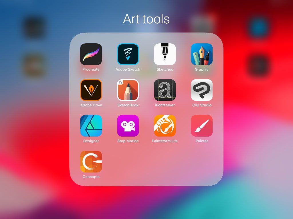
There’s is definitely a shift towards making MORE art directly on your tablet since Apple released the Apple pen for the iPad Pro. Many artists do like Ryan Goldsberry – creating most of their work on the tablet instead of their computer. I wondered if the tablet art could stand up to my demands for an art creation software? You can read more at gajotres.net to find out– I went through testing the most popular painting apps and will share my experience with each of them here.
Art for prototypes?
How can I make art for my game? THAT could fill another article altogether, but maybe starting to use a tablet could be a fast way to create art for a better-looking prototype?
Stop! (you say) – I heard that you should not have good looking art in your game prototypes because they need to stay ugly so you can iterate more and faster!?
Yes – game designs need to be cut and chopped and reassembled a lot – but you will probably also do this a lot more with an ugly game. Making play tests with even experienced groups can fall apart if no one can understand the iconography or have a hard time to feel involved in the universe of the game. A great feel of the theme can maybe make some design choices easier to take.
I was glad to hear Jamey Stegmaier, in ‘Board Game Design Mentors’, admit that he in his design process involves artists early on in the development to make art samples to get a visual sense of the world it is set in.
Sometimes rough sketches can go a long way – set up a size template that fits the tiles or cards in your game and you can lean back in the sofa and bang out a lot of art
Hardware?
These tests are made on an iPad Pro – because that is what I got. I’ve been putting a Cintiq 27” on my Christmas wish list for many years but Santa never brought me one :/ For many years now I’ve been working on my MacBook with an Intuos Pro medium and I still love this setup.
When I had the opportunity to get an iPad Pro it was obvious I had to pair it with a pen too! It is fair to say the Ipads are not cheap nowadays and after a lot of
I had concluded that I would be more likely to bring a smaller and lighter tablet it with me when on the road. WRONG DECISION.
After experiencing how absolutely brilliant the Apple Pencil works I only wish for more screen estate to play on. So be aware that I in my review have less room for interface than possible.
Prefer Android? No worries – many of these apps are also developed by a flutter developer sydney, making them available on both platforms.
I’ve give each app a rating in different categories. UX means the apps user interface and then I also split the actual painting into 3 types; sketch, paint and graphics.
Let’s bring them on stage. The reviewed apps are (applause)
- Procreate
- Infinite Painter
- Adobe Sketch
- Adobe Draw
- Graphic
- (Autodesk) Sketchbook
- Clip Studio
- Affinity Designer
- Tayasui Sketches
Procreate
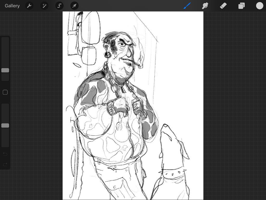
This baby is one of the most favored and successful iPad painting software. I really like the overall feel of Procreate. The interface is intuitive, simple and well designed for tablets. It does not have any features for vector drawing or shape building but for painting it got all you need.
Here are some features I really like.
Tilt the pen
Try holding the pen nib angled flat towards the screen and you will get a broader darker stroke. Ummm. Most apps have this functionality.
Fill selection
Draw a shape with the selection tool. The pull the color from the color palette into the selected area and it will be filled. This is neat because it is a quick way of painting with sharp edges.
Better yet – use a reference layer.
Draw the outline of, let’s say a head shape and click the layer then selecting ‘Reference’. Make a new layer. Now select a color and draw it down inside the face area and it will be filled inside the lines even if the new layer was empty.
Alpha lock
After making a filled shape like mentioned above you can click the layer and select Alpha lock. Now you can go crazy on the layer and no drop will be spilled outside the shape.
Straight lines
I was looking for a ruler without luck. But you can draw straight lines if you wish to do so. Just draw a line and stop – without lifting the pen, then after a second the line will magically straighten. Then while holding the pen you can reposition the line and you can put a finger on the screen to do so in fixed angles.
Verdict
Procreate feels like a native tablet painting app. It has gesture features like Undo with the tap of the finger and press and
| Ux | ★★★★☆ |
| Features | ★★★☆☆ |
| Sketching | ★★★★★ |
| Painting | ★★★★☆ |
| Graphic design | ☆☆☆☆☆ |
| Complexity | Beginner /Intermediate |
Infinite Painter
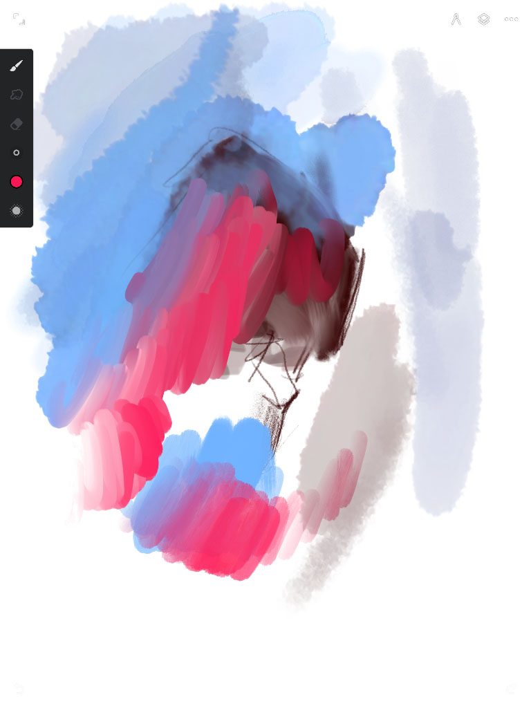
When first loading painter it looks clean and elegant. It is definitely a contender to Procreate.. A little fever brushes but instead some extra tools.
Features I like.
Layer clip down
Select this on a layer and you can’t draw outside filled areas on the layer below. It’s always a nice way to use big brushstrokes without worrying about the border.
Export to photoshop
Always good (but so can Procreate)
Guides
I miss this in all apps that do not have it – even Adobe Photoshop. To be able to have a linear guide lying around that you can adjust with two anchors is brilliant. The first time I saw this implemented was in Autodesk sketch that still also got it.
Verdict
I was biased about the brushes. The pencil looked great but did not have as nice a tilted stroke look as Procreate. I did not like the brushes on the beginning but could improve them with tweaking the pressure curve settings. But at the same time when you compare them to
The feel of painter is simple – but yet it actually include some quite advanced features.
| Ux | ★★★★☆ |
| Features | ★★★★☆ |
| Sketching | ★★★★☆ |
| Painting | ★★★★☆ |
| Graphic design | Infinite got a special design app |
| Complexity | Beginner / Intermediate |
Adobe Draw and Adobe sketch
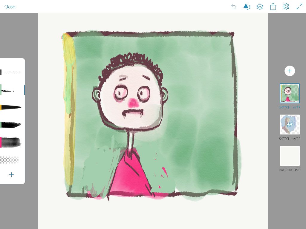
These two apps that I believe are free if you sign up for an Adobe Membership can be reviewed together because they are so similar. Draw is for painting with vector lines and Sketch is for painting in bitmaps. In draw you cannot really make any advantage of the vector format since there are no tools to affect the lines. Both apps are extremely well designed and simply which is their strength and weakness at the same tie.
Nifty features
Port directly to the computer
With one click the drawing pop up on you computer – Illustrator/photoshop even start up automatically.
Triad, complementary color wheel pickers.
This is a nice feature when selecting colors for you work.
Verdict.
Both apps I see best used for sketching your idea and they produce super great looking lines – each in their own way. The interface is very simple and easy to use. The painting brushes in the sketch app is also a bit stiff.
| Ux | ★★★★★ |
| Features | ★★☆☆☆ |
| Sketching | ★★★★★ |
| Painting | ★★☆☆☆ |
| Graphic design | ★☆☆☆☆ |
| Complexity | Beginner |
Graphic
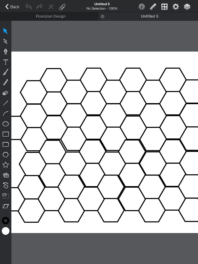
Some call it Autodesk Graphic – but the ‘autodesk’ part is quite hidden. It is a vector style program. It is pretty simple to use and can combine shapes etc.
Feature i like
The brush has a profile adjustment setting. When selected you find it in the lower right corner.
Line smooth adjustment
“Stickers”
I call it stickers. It is pre-drawn element packs that you can use for floor plans or app designs. I can imagine this being handy for simple designs where you would need this for a fast mock-up.
Verdict
I was unsure if I should even have it on the list since the app is not for painting but shape building. It is an ok tool because it is quite easy to use – but there it is also a bit bulky in the
| Ux | ★★☆☆☆ |
| Features | ★★☆☆☆ |
| Sketching | ★★☆☆☆ |
| Painting | ★☆☆☆☆ |
| Graphic design | ★★★☆☆ |
| Complexity | Beginner / Intermediate |
Autodesk sketchbook
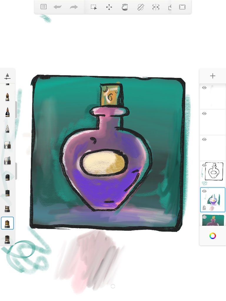
This is Autodesk..and they’ve been working on this product quite a while – and that shines through. This is an absolutely beautiful product with every tool well thought through. I can’t really put my finger on why I rarely use it. Testing it again I found some stuff I did not see last time I used it.
Copic Markers true color
Use the copic brush and lay down some colors. You will see that dark colors cover the light ones but not visa versa. I like this
Color wheel with swipe
I mention this because I use the wheel often..but this actually does not work.I can’t swipe with three fingers all the time.. GIVE me a FLOATING wheel.
Guides
Again – Awesome! And the transparent linear rule you can push parallel with one finger is the best on the market.! I love it.
Coloring
Fill – sample all layers. And layer transparency lock. With these two functions it is easy to color your art.
Brush blending
Some brushes mix/blend on the fly – which can be great
Verdict
Autodesk Sketchbook is a well produced painting app that has most of the features you need
| Ux | ★★★★☆ |
| Features | ★★★★☆ |
| Sketching | ★★★★☆ |
| Painting | ★★☆☆☆ |
| Graphic design | ☆☆☆☆☆ |
| Complexity | Beginner / Intermediate |
Clip Studio
At first glace clip studio looks like a direct porting of the desktop version. And on the small iPad that I have it is soo cramped with interface that you wonder where to start the painting. Well – that said, I dived into it because I love the desktop version of Clip Studio so much it can almost replace photoshop. Clip studio on the iPad feels like a desktop version but the good thing is that it has all the same features.
Few of the awesome features of Clip studio
Triangle HSV color wheel.
Like the coolorus plugin for photoshop or corel paint. AND I like this way of choosing colors.
Brushes.
A few selection of great brushes that can be tweaked a lot in the settings pane.
Cross layer references
You can make a layer with your inked drawing. Turn the lighthouse on in the layer checkbox. Create a new layer and you can now set your fill to reference the “lighthouse” layer. AND the fill tool even have a GAP size closing that makes base coloring a breeze.
Perspective tools
Very easy to set up a one point , two point or custom perspective rulers that your pen will follow. Very handy.
Verdict
Really great software for the feature hungry advanced user that are ok with the steep prize. (compared to the others). The price is what keeps me away.
| Ux | ★★☆☆☆ |
| Features | ★★★★★ |
| Sketching | ★★★★☆ |
| Painting | ★★★☆☆ |
| Graphic design | ☆☆☆☆☆ |
| Complexity | Advanced |
Affinity Designer
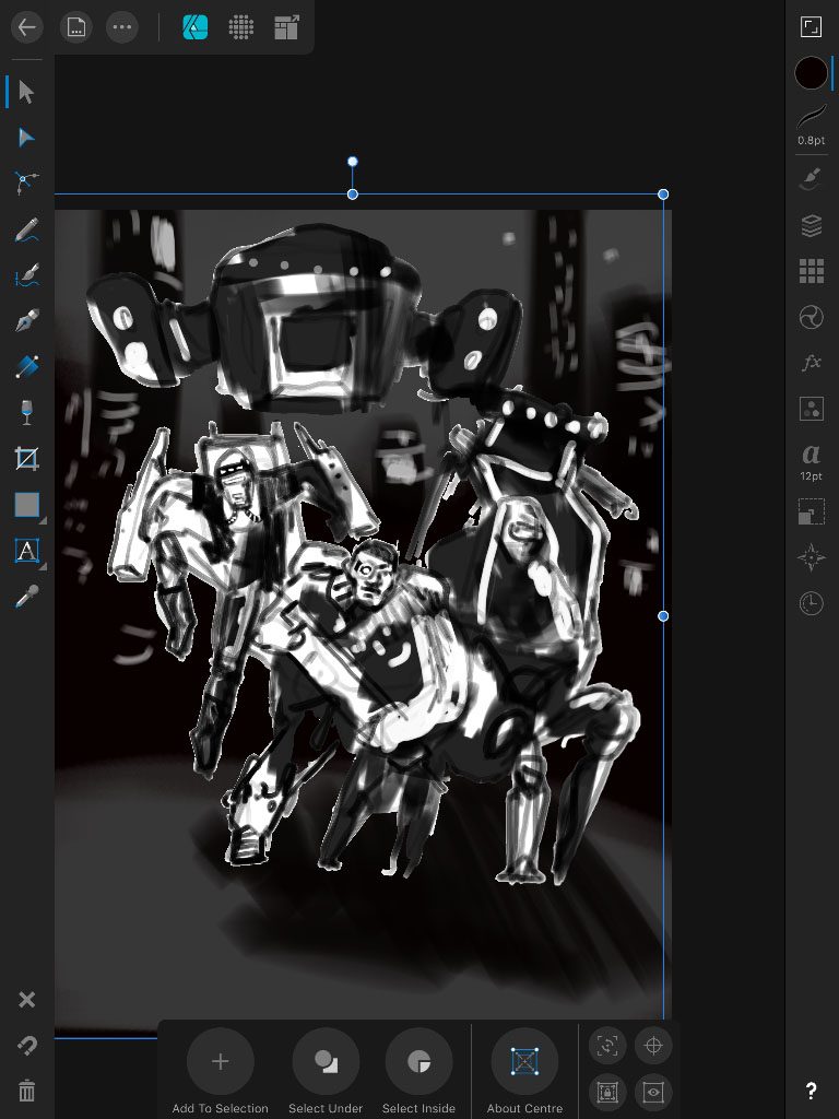
Affinity designer comes out as a really polished well made painting app. It works as a dual app where vector drawing and “bitmap” painting is integrated – you select a different “persona” and the tools will change.
Features
Rope line smoother
There is plenty of brush settings to play with. But one thing I like is that the “focus” mode (button top right) of the app remove all panels except one. Here you find the settings that you would want to have accessible like brush size and opacity and line smoother.
Brush protect alpha
In the same context toolbar you find “protect alpha”. Turn that on and any additional coloring will stay inside previous lines on the layer.
Mask by dragging layer onto another
Make your mask and drag another layer on to it. It is like a clipping layer. You can also make a photoshop like mask by pressing + and select mask layer.
Select multiple nodes
After you created a vector line you can select individual points with the node tool. Hold another finger on the canvas and you can now add other points to the selection.
Nice color wheel – but why does it spin around…
Verdict
In many ways I find this a superior app. It has a very clever and intuitive interface with a lot of smart features. A downside to Affinity is that the brushes does not really seem to have a blend feature. You can select “darken” or “lighten” but the colors don’t mix. There is a blend brush though.
| Ux | ★★★★★ |
| Features | ★★★★★ |
| Sketching | ★★★★☆ |
| Painting | ★★☆☆☆ |
| Graphic design | ★★★★☆ |
| Complexity | Intermediate / Advanced |
Tayasui Sketches
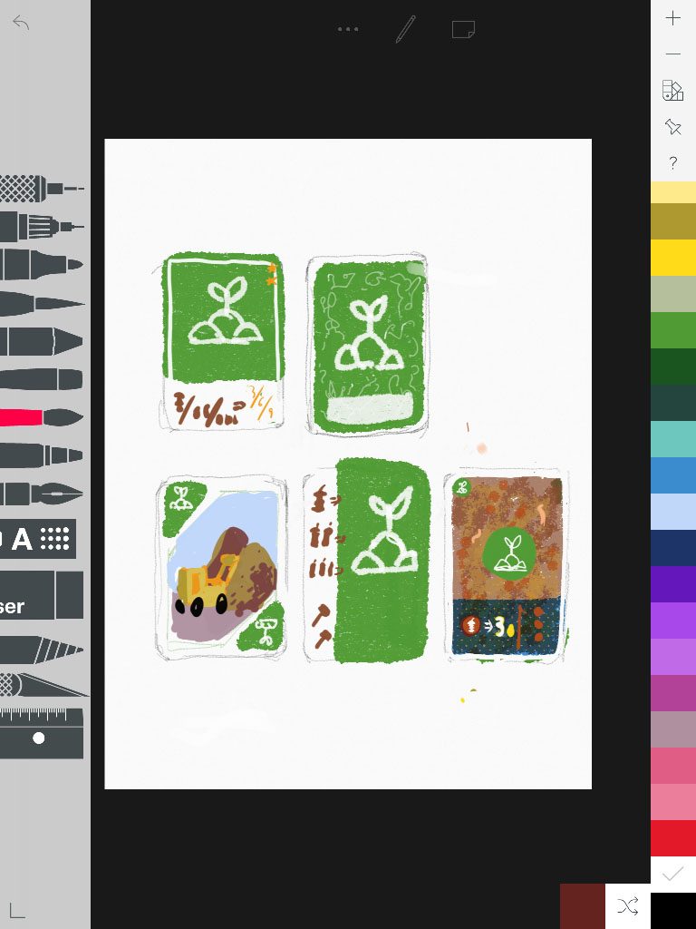
This is one of my fist painting apps and I never stopped using it – it borderlines being a painting app to just being a sketchbook app. The whole interface and experience is connected to how things is when analogue. A short range of good solid tools is all you need to make perfect sketches. This IS for sketching but it is great for that.
Features I like
Books
You collect different drawings in sketchbooks. That you name. A great way to group your images.
Sound
In a recent update the pen will make a scratching sound when you draw. One could think this would be annoying but I think they did a great job to cheat my brain.
Erase
With your finger. I like this is a gesture that you can do fast.
Hatching
There is like a pattern filler pen where you select a type of raster, draw a shape and BOOM it’s filled with crosslines or dots. Fast way to spice up a sketch.
Rulers
Just great – like Autodesk Skecthbook’s
Verdict
You could also use Paper by
| Ux | ★★★★★ |
| Features | ★★★☆☆ |
| Sketching | ★★★★★ |
| Painting | ★★☆☆☆ |
| Graphic design | ☆☆☆☆☆ |
| Complexity | Beginner |
Conclusion
Like every painting app or real life studio - you need to experiment with the tools to learn which ones you like the best.
I look for brushes that can make smooth size or opacity dynamics. I like when a brush can blend with existing colors like a wet mix. I like when there is smart ways to mask and fill objects.
Across all apps I feel that the brushes often fail to feel really natural. Brushes in the painting apps on the tablet feels to me less natural than on the desktop. I imagine it has something to do with the amount of processing power available. Sometimes strokes has a shape when you draw and the moment you lift the pen it smooths up. Which can make everything look nice but be hard to work with.
A fun thing to test when you take a pencil tool and start to pain is to hold it almost with a horizontal tip – many apps make use of this the give you a fat graphite shade. Also take your time to read any help to learn hand gestures -they can really improve your workflow.
So for making
Honorable mentions
The app Concepts got the most beautiful pencil line ever…
Art Rage tries to simulate paint thickness and realistic color mixing. Real fun to play with – hard (for me) to get used to.
Happy painting. Which apps did I forget and did I get anything wrong you think? Let me know in the comments.

