7 visual styles I would love to see used for board games
The visual style of a game can make just as much of a difference as the choice of theme that a creator choose. Within animation and video games, there have been a wide exploration of different visual styles.

Board games has a tradition for classic illustrational work topped with some graphic design. Probably because games must be decodable for the viewer -high contrast between flavor and information is great.
Here on the site I have interviewed a lot fantastic artist that each bring their personal take on the art of games. But there is still a lot of room for exploring interesting visual universes for your game. A visual style can set the tone to be less or more serious, make it warm or cold.
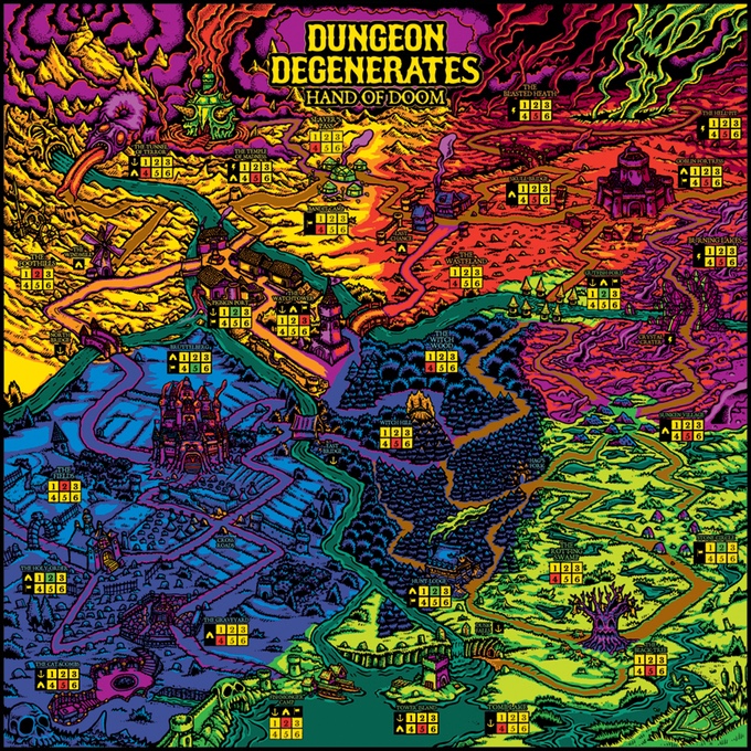
See this wonderful board from Dungeon Degenerates. My head might explode while playing but it is still awesome and fresh.
I created a small list of styles that could be fun to see more of used in board games. They all share some kind of 3-dimensional depth.
- Low poly 3D
In past decades, there have been millions of implementations of this 3D style in digital games since it was a hardware necessity. I have seen many pixel styled games, but I think it could be fun to see some low poly 3D illustrations. It would speak directly to my gamer heart. Would fit perfectly for items.
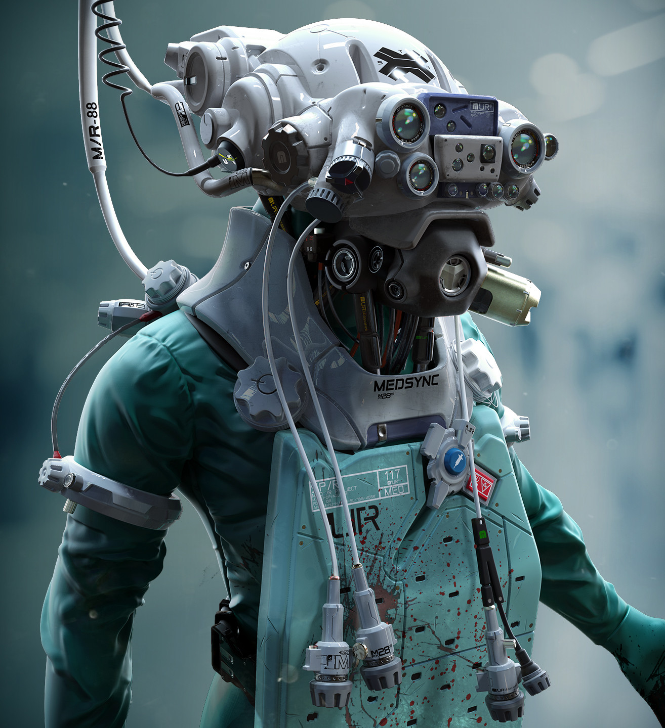
- High-end 3D work
Making a 3D environment has a great benefit – it looks awesome and has some realism in depth and lighting. The game Adrenaline seems like they use 3D art – which fits the Quake look

- Plush
How cute would it be with photos of handcrafted plush objects?
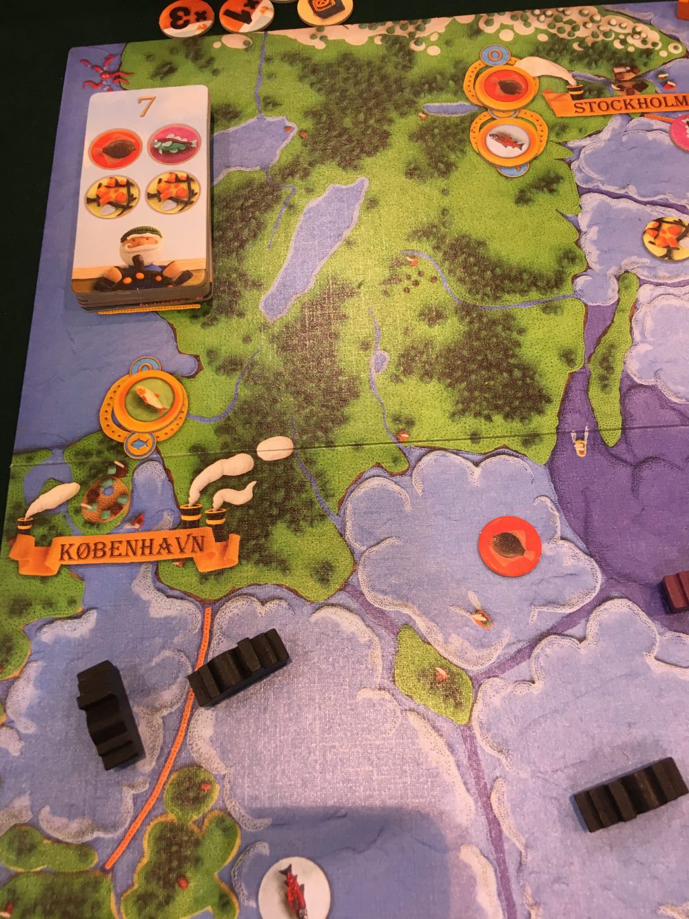
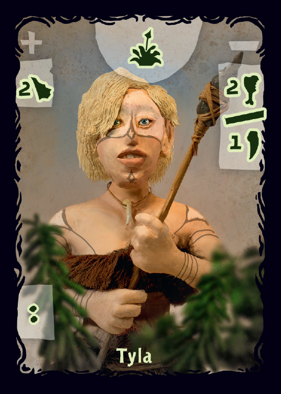
- Clay and puppets.
I really want to try this myself. I actually saw a game “Mare Balticum” at Essen that used this style. It was brilliant! Also recently discovered “Quest for Fire” that goes all the way!.
- Augmented images
It is quite easy to have setup an image recognition system to let your phone give extra depth to images. It could be fun. It could be used to make the theme more immersive or it could be used for rules. Like a chess game where every piece would show its allowed movements.
- Layered paper collages or flat 3D.
Layers create depth and can be beautiful as design. Just run a search on pinterest to see all the fantastic images. Here is Tania from Lissova crafts papercacti.
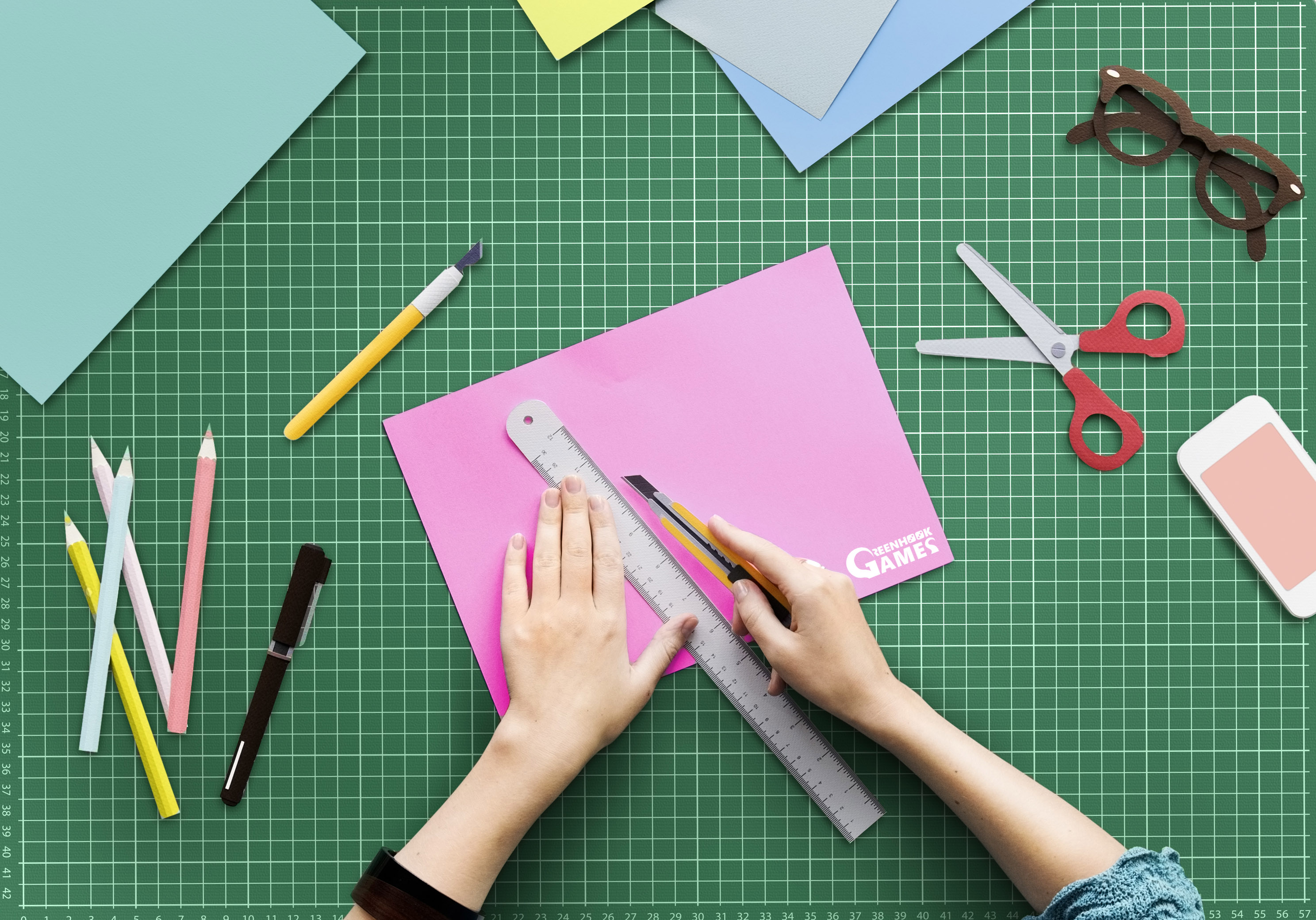
- Paper craft
A style seen a lot in motion art but not so much in board games. I love the analog feel to paper objects.
I still love great 2D artwork or design, even if my ideas above are all trying to add a third dimension to your game. Maybe this will give you other great ideas to explore! If you are working on something different – I would love to hear about it here.

