You all know that feeling when you look at a tabletop game while drool drips from your lower lip because you forgot to close your mouth in mere awe. That is the result of great tabletop and board game art?
The question ‘What makes great tabletop and board game art?’ is almost as subjective a subject as ‘What is great art?’. But there is a small difference. Unless you buy board games exclusively to exhibit on your shelf as an art piece, there is a purpose to the art of the game. Games are usually an interwoven web of design and illustration that holds the objective of helping immerse you into the game’s universe, guiding you along with the rules, without working against them. Take a look at some cards below from three very succesfull games – is it great board game art?? They all create a feeling that match gameplay.
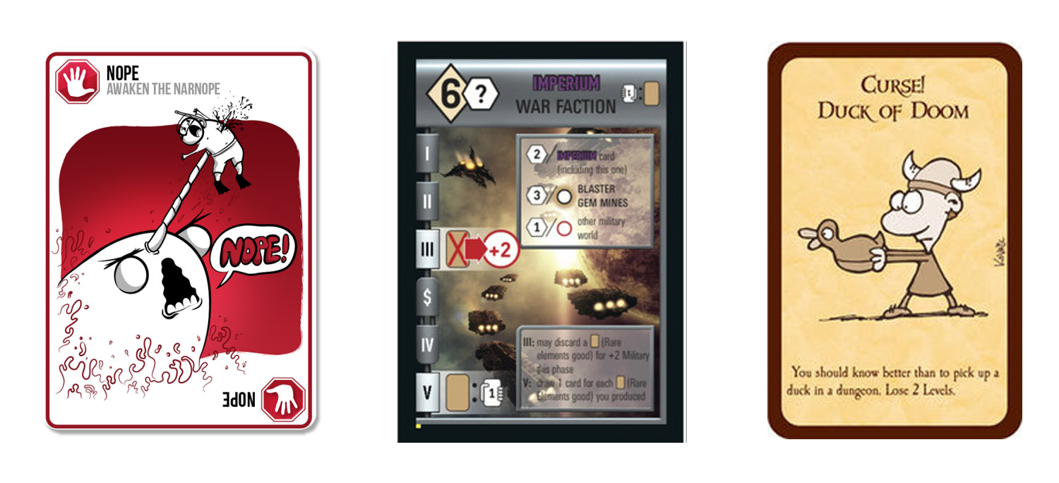
Since our mission at GreenHookGames is to uncover the art behind board games, we will look a bit into what makes great tabletop and board game art. Since this is a vast topic, we shall try to attack it from different angles. We’ll begin with the intangible aspects of board game art, and afterwards try to discuss how the mapping of board game art can work either for or against you. Lastly, we will conclude with some design principles to follow when creating art for board games.
Illustration versus graphic design
Sometimes, board-game designers develop a game and a working prototype and immediately start looking for an artist to make the game art. What many board game designers do not realize, however, is that they probably need both a good graphic designer and a good illustrator to make the best art for your game. The illustrations of a game are the images that communicate the universe of the game to the players, whereas the graphic design involves making decisions to ensure that everything is readable, mapping information and framing it to look even better. If you game has not yet been through blind playtesting you should consider waiting with the art until you are absolutely sure what you need. Art is expensive and takes time. I will make another post about pricing and briefing later.

Above we see thee cards from different editions on Innovation. I would argue that the original game is purely graphical design since there are no emotional elements other than the icons. It is a minimalistic and beautiful design in my opinion. To the left we have a new edition from IELLO and this is a remake with a more illustrative approach – maybe to reach a wider audience by guiding the players imagination. To the right we see the deluxe version that is without border and more detailed than the original. Chris Cieslik writes this about the deluxe version:
As you can see, we’ve kept the spirit of elegant simplicity that people have enjoyed about our Innovation. The new cards will be more vibrant on the table, and the pattern created by the latticework looks really neat on a table with lots of splayed piles. The new colorblind-friendly card color indicator is the shape of the box around the value. This is a more visible location when fanning your hand out, which should increase usability for many of you. Usability is a top priority, as Innovation is a game we hope you play hundreds of times!
On the premise that game art should immerse and guide, the illustrations usually address the first part (immerse) and the design and layout the latter (guide). It is possible to find artist that cover all aspects of game art, but not all illustrators can layout cards so the text is readable and make understandable icons.
The intangible part
When we visit art exhibits, induviduals are often divided on what makes good art and what does not. Many agree that it is an individual choice whether you like a piece of art or not, and the same goes for board games. Some people love the minimalistic style of the game Innovation, while others find it drab. Still, there are art schools that teach the principles of art and give artists tools to create better art and convey their messages to an receptive audience. A realistic painting can often impress an audience more than a naive minimalistic painting. But sometimes, the more simple art can express humor, speed, and even ignite the viewer’s imagination. This is why it is hard to disqualify game art on style. When artists unintentionally use bad proportions and disharmonious, oversaturated or plain bad coloring, it will be interpreted by many as bad art, and the game will be difficult to enjoy.
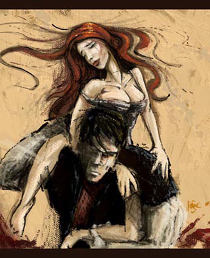
One notable difference between some pieces of art and board games is that the game art is usually a series of works trying to tell a common story. If the series is made by the same artist, but does not speak the same language on all images, it is not good. When we say speaking the same language, we are referring to the line styles, coloring, sizes, and so on.
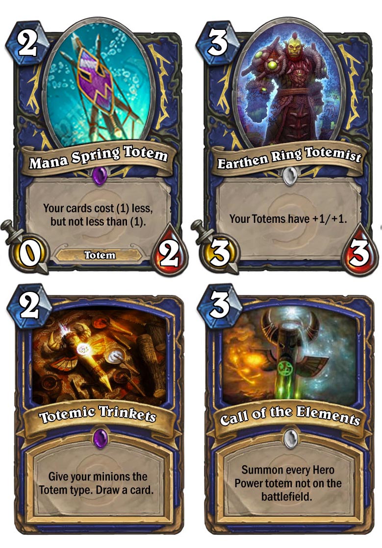
Sometimes, publishers and designers use a plethora of artist to illustrate a fictional universe. It should then be a distinct choice whether they just commission different paintings or if the artists should follow a common style, like they do with Hearthstone. As we can see above there us slightly different styles in the illustration but they are nicely brought together by the surrounding interface. We believe that if you choose artists with different styles, it is important to develop a strong graphical layout to bind everything together. Also consider making a style manual you can hand out to all artists. The manual should explain the amount of details, the color schemes allowed, the use of outline and so on.
Devil in the details
Sometimes artists who normally work on canvas and are accustomed to having the space to add many details are not proficient in creating art that works in smaller sizes, like cards and tokens. Sure, any canvas masterpiece will look good on a card, even if it is scaled down, but it is not necessarily the best choice for game art. Game art should just have enough detail to paint a picture. In this interview, Marco Bucci describes how he added some detail to his images for Karmaka.
Go for less
The two main reasons for including less detail on board game card components are: Less detail saves artists time and costs less. Details are lost anyway, and too much detail rendering for the inexperienced artist will often end up in disagreeable proportions or distasteful coloring. Have more details in points of interest, like faces. It also makes a more interesting piece if you vary the amount of details. Feng Zhu has multiple superb painting tutorials where he teach you to stay at distance when painting and no go into details right away.
Storytelling
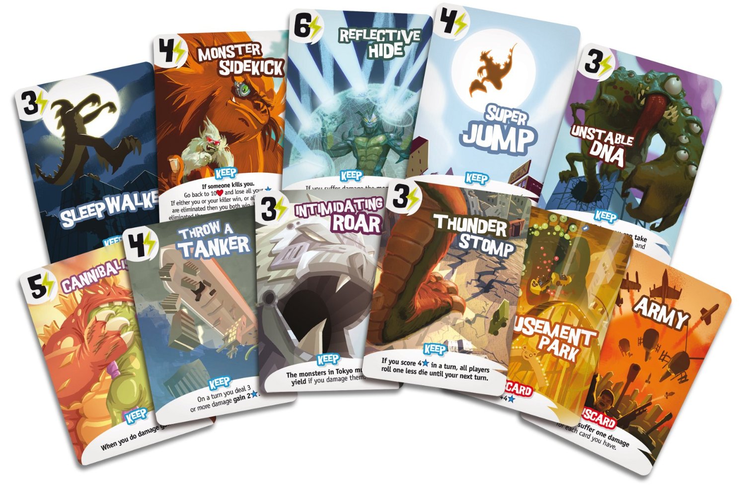
Illustrations for board games should tell a story. Use depth, contrasts, composition, and movement lines to tell the right story. Color your artwork in a way that underlines and strengthens the feeling of the universe. No wonder the artist behind London Dread is also a professional film storyboard artist.
By making good use of shadow and light, you can compose a specific expression, but you can also create contrast. Contrast is often what makes a piece of art more interesting. When you make games, it’s wise to consider looking at all elements together as one big piece of art, thus trying to create contrast between elements for a memorable effect.
Design mapping
The part of game art that is (usually) the same across several elements of the game is the graphic design and layout. Maybe you will paint a white square to hold card-specific rules. Usually, you will not change the look of this square, because you want the user to understand, learn, and remember where to find this information. Let’s say two different symbols in a game had the same rule applied – this will surely be a difficult game to learn, and that is rarely what we aim for as designers and artists. This is what the engineering world calls ‘design mapping’, or what web design calls ‘user experience design’. We want to make it as easy as possible for the user to figure out what to do.

Basically, design mapping is about creating a design that will work with our instincts and cultural behaviours and not do the unexpected. We have built-in instincts that tell us that light is up and dark is down, and that things that match in shape should be organized or put together. We culturally learn that red means bad and stop, while green means good or go. We learn that cards can be held in hand like a fan or placed on the table, and so on. If you choose to draw a point ladder on your game board that goes counterclockwise, you work against our natural urge to move everything clockwise.
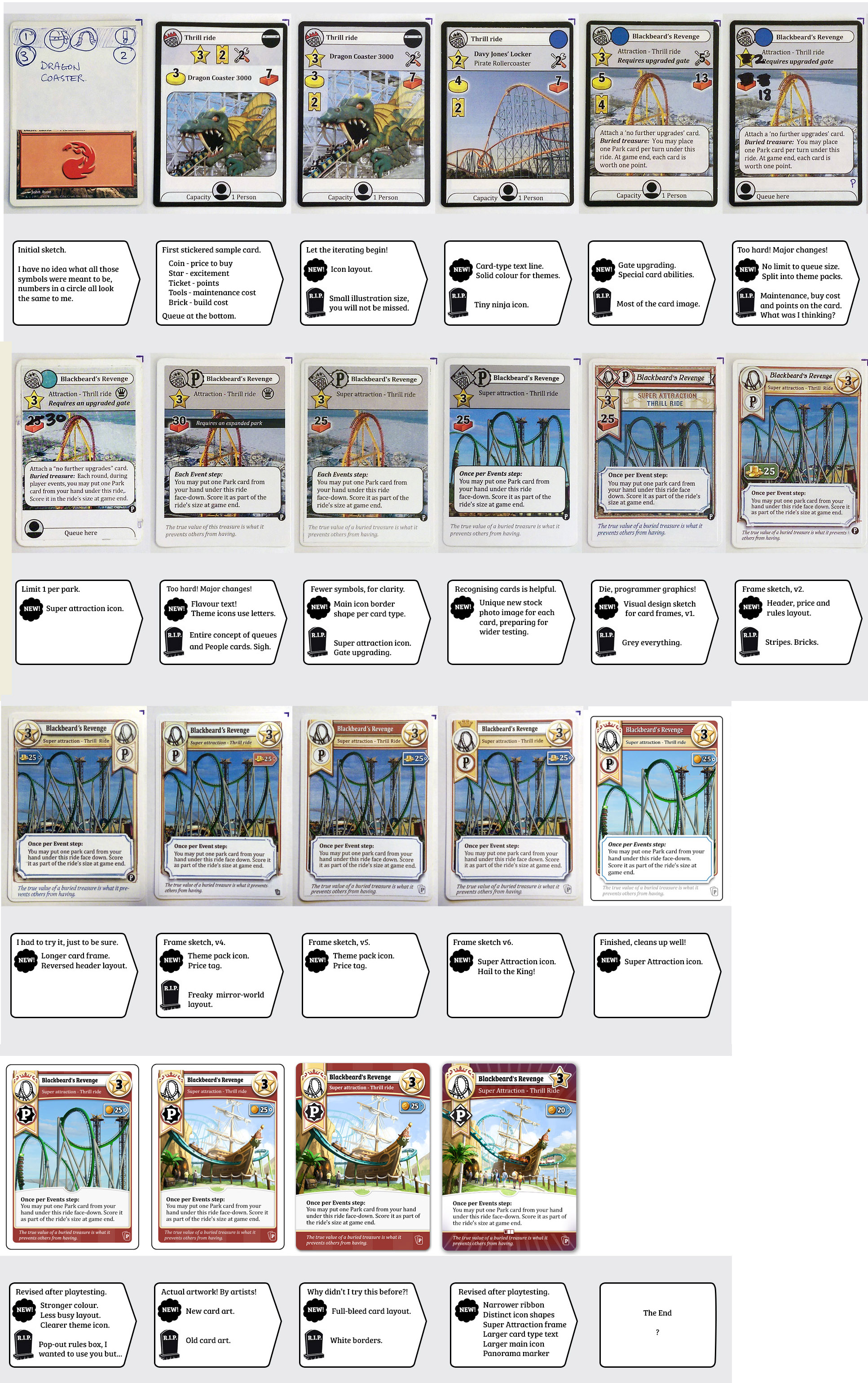
Take a look at the design process behind the game UnFair by Joel Finch. The final result is a piece of art.
Working with materials
When designing for board games, you should first understand how the art will be used. Commonly, you should make the sizes of icons and text be readable from the distance it will be viewed from. If a card is always placed in the center of the table, it will be a problem if all information is printed in a tiny or hard-to-read font. Choosing white borders rather than printing to the edge of your cards, helps avoiding wear and tear on the images by long term usage.
The language of games
There are not many places in the world where symbols and icons play a greater role than board games. Most games incorporate some form of iconography, even if it is only in an abstract form, like hearts and clubs, to group items together.
Icons and symbols are tools often used in game design because:
- They can boil down rules into a single piece of art that takes up minimal space.
- Text that is repeated a lot can be replaced with icons saving layout space – allowing for larger fonts.
- They can be read quickly and at a distance.
- They can sometimes strengthen the storytelling or convey a feeling (Ex. skulls and wrenches).
- Designed correctly, they can help guide the player.
- They are an independent language.
- Framing or connecting different icons can reflect multiple meanings.
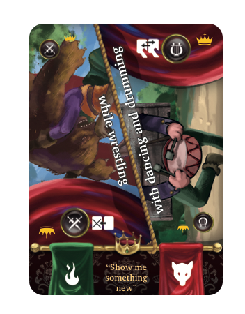
When you choose to use icons in your game, you should be aware that:
- There is usually a limit to how many icons a player can grasp.
- Make distinctions that is readable, even if you are colorblind.
- Culturally, we derive much information from pictography.
- Shapes improve readability from distance. Details do not.
- An icon does not necessarily need to be a silhouette of an object – it can be anything one imagines.
- It is easier to use icons to show adherence and much more difficult to indicate actions or reference rules. Like the UNO symbols – it needs to be simple.
So what makes tabletop and board game art great?
You decide!
No, seriously…
You do decide! But if you aim to win the Golden Hook Award (link), you should consider this:
- Does your art style match the theme and story?
- Is it immersive?
- Do all elements feel like part of the same visual universe, from card to card to rules, etc.?
- Do all your individual elements come across clearly and not mix together into an unintentional mess?
- Does it look like a masterpiece? Then feel free to contact me so I can interview you 😀
Happy painting fellow artists!
Written by
Niklas Hook, Long time professional artist and amateur game designer.
[easingslider id=”836″]

Really great article! Just found this site today–looking forward to reading more of your insights.