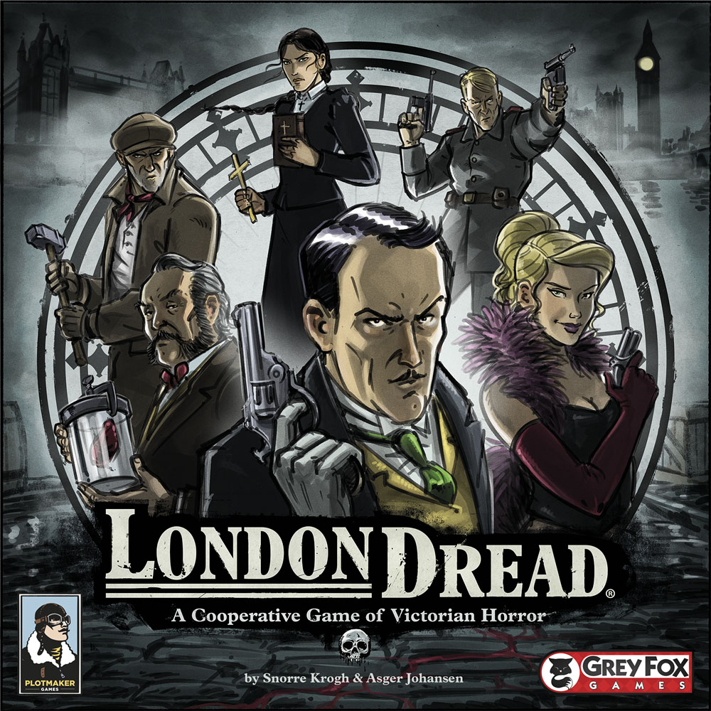
Working out of Copenhagen in the field of Danish advertising everyone knows the storyboard artist Snorre Krogh – or at least I do! But I did not know that he is part of the game company Plotmaker Games and artist on their latest game London Dread. It is a is a dark and gritty cooperative game set in Victorian England designed by Asger Johansen. Players take on the role of investigators trying to uncover plots on the way to confronting a story specific finale. Snorre’s art is all about telling a story and is highly immersive. So I am very proud to present a glimpse into the quick, gritty and intense visuals from Snorre Krogh on London Dread – in this extensive interview. Enjoy!
What is your artistic background Snorre Krogh?
After high school 1997 – I started working with storyboards for puppet and stop-motion animation. Soon after I started doing presentation storyboards and shooting boards for advertising agencies in Copenhagen, feature films and animated TV-series. I have not attended any art school but learned as I went along picking up tricks and work methods from various projects and the people I met and worked with. I have attended a couple of workshops here and there but is mainly self-taught.
How did you get involved in Plotmaker Games – and have you worked on other board games before?
Plotmaker Games was founded by Asger and me September 2014. Before that I knew nothing about modern board games.
We met December 2013 when I asked Asger out for a cup of coffee. I had for some time been looking to hook up with a writer to start doing either comics or to work as a pitch team. My one rule for these coffee dates was that we had a hour to see if we could get a spark going. I talked straight for about 45 minutes, showing Asger a bunch of doodles and sketches on vague ideas or rough frameworks for a story.
When I finally had to catch my breath Asger said that he wanted to do a board game set in Victorian London 1890, called London Dread. A co-op game with horror elements.
I had no idea that board games was a big thing. The last board games I had played was Ludo and Monopoly. From there on I had no problem getting started sketching on London Dread. The title was definitely what got my attention.
A quick visit on your Tumblr and Instagram that you are fond of sketching and making black and white images. Would you say you work more traditional or digital?
All my professional work is digital. From 2005 I have used a Cintiq and from there on all storyboards and now board games are done digitally. I find the process of adjusting and making corrections much easier.
That being said I really enjoy sketching with pen and pencil on paper and in sketchbooks. To me, it doesn’t seem as formal. Pencil and paper add to some level of freedom and I feel a different flow. I get a different texture and feel than from a computer.
London Dread takes place in Victorian England. You seem to have captured a nice dark and gritty style. Do you feel London Dread is your style or did you do something different than before?
I picked that style for London Dread. I had a visual idea of how it should look and the tone of voice. I wanted it dark and foggy with a lot of texture. I wanted to place the players in London 1890.
I sketched out all our ideas as we developed the story. Whenever a new card or a new character was introduced or we made a story twist I quickly roughed it out. So all along the game and story was visual to us.
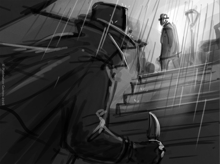
When I began doing final artwork I tried a couple of different directions but the energy in the original sketches got lost. I am not very patient when it comes to do illustrations and I really like to draw fast. Maybe a thing I picked up from doing all that storyboarding. So I tried to keep it looser and more sketchy and it worked out good with the gritty style I used for the general art direction.
Can you tell us more about how you make these ‘loose’ images from your initial thought to the end?
Since a lot of the art was sketched out rough over a long period of time it made it easier when I started to do the final illustrations. It was easy to see what small tweaks could be done to keep it as it was or what to do as a second GO as I viewed it with fresh eyes.
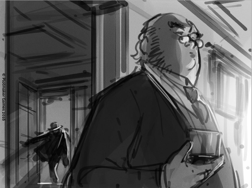
I make the composition with a big broad brush in light grey. It is the same Photoshop brush I use for all sketches I make. Nothing fancy. Some standard brush I tweaked a while back and it stuck in my brush library. A smaller version of that same brush is then used to indicate details.
Then I clean up the image on a new layer doing the line work. Again starting with the broadest lines needed in the illustration and then a smaller brush for details, faces, and expressions. On most of the illustrations, I used a timer to stress myself a bit and not fall into too many details.
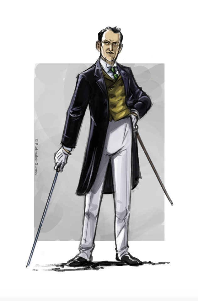
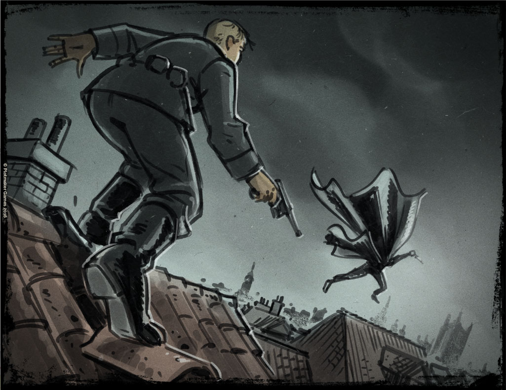
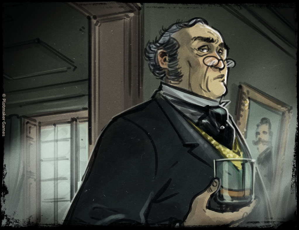
After that a layer with grey values to show light and shadow and a layer with color. Some of the images got a soft white-yellowish blob on top in one corner as a light effect and others got an overlay effect to get some attention to color in a specific area of the illustration.
All card illustrations have a black border made with a gritty brush, a multiplied layer with some scratches and a layer with some grain on top (can’t really tell if it shows in the print). But all to match the style of the game board and the other elements.
I wanted everything in the game to come across as if the investigators sat in the corner of a dark pub in London 1899 and planed their actions and investigated further into the story.
What is in your opinion important for making good board game artwork?
Coherency. So the art supports the story and vice versa. Also I like when something is hiding. In London Dread – it is what is hiding in the shadows. In the dark. The idea of the distant mountains so you don’t show everything. That leaves more to the imagination of the players.
Also I like when something is hiding. In London Dread – it is what is hiding in the shadows. In the dark.
With you background as a storyboard artist you might have a tip for creating a good composition on a card illustration?
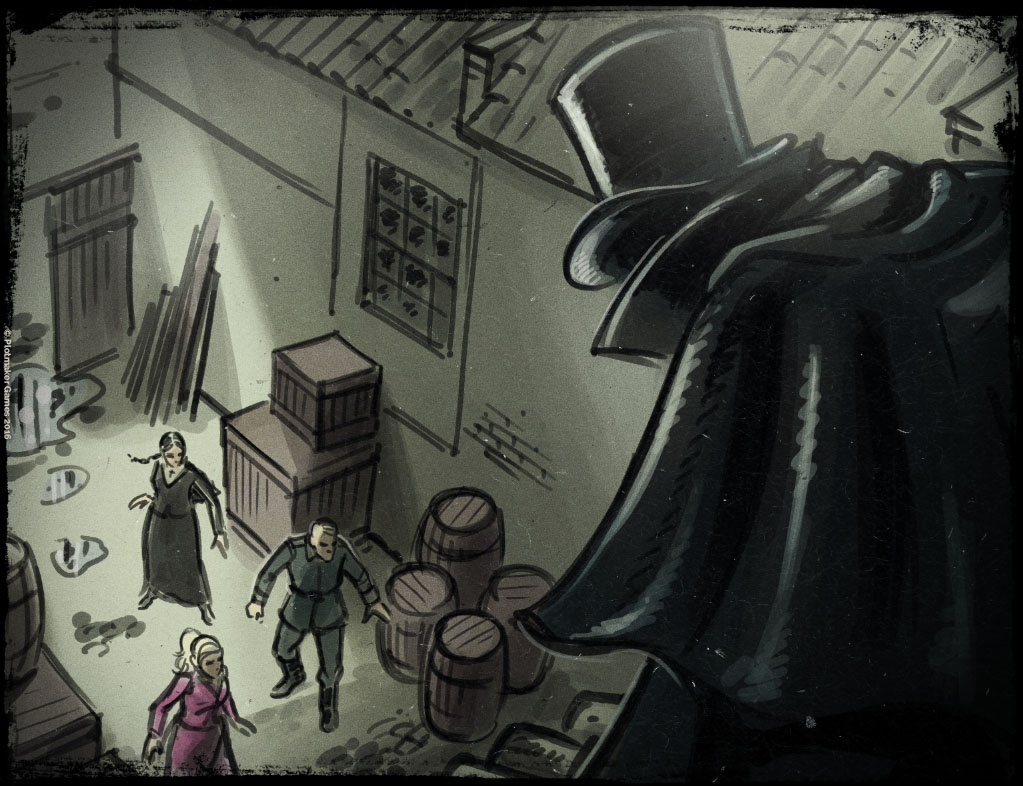
For London Dread I liked to think of the cards as small scenes and windows into the world of London Dread. Placing an imaginary camera in a scene and imagining what the camera sees. In London Dread I wanted to make the universe feel rich. Using big scenes where you see the city, buildings, ballrooms, alleyways, rooftops and horse carriages and other illustrations that is close up on what is going on. Almost as images for a comic book.
What is your favourite hardware and software, you use and what is in your opinion the best quality/assets of that software?
I use a MacBook pro with a Wacom Cintiq 22” (no touch!) and a regular Intuos A5 for working in InDesign and Illustrator. I have tried using the 13” Cintiq that is more portable but I never got comfortable with it. Probably because I was used to the larger 22”. I have started using an iPad Pro and Procreate and really enjoy it for sketching when developing stories and making pitch documents.
I have an old CS Adobe suit and we use Dropbox a lot. Again I haven’t tried using anything but Photoshop. I would like to try Manga Studio.
You would probably love Manga Studio since it is great for inking. Do you digitally like to have many layers (working non-destructive) or few layers (work more intuitively)?
I am the ’many-layers-guy’. At least a layer for line art, one for grey values, one for color, and a couple of layers with effects. If I add elements or edit an illustration I will do that in a new layer, a new folder or a save-as document.
Off the top of your head, do you have any tips on inking an image you would like to share?
I love the feel of sketching and find it hard to keep the energy from the sketch to the final image. But a timer like 25 minutes for linework and 25 minutes for grey values and color works well for me. As mentioned before, that way I don’t get caught in details and the illustration seems to keep the energy. Sometimes if more time is needed I add 5 or 10 minutes.
But a timer like 25 minutes for linework and 25 minutes for grey values and color works well for me.
I understand that you and Asger work closely together on the game, do you feel the prototype art at any point affects the game design choices and made you take a different direction?
The development process is, of course, a lot of back and forth. But since we believe that the story is a very important part of the games we make in Plotmaker Games it was always the story that dictated the choices both on art and mechanics in London Dread.
It also makes choices easier because if a specific choice in art or mechanic doesn’t support the story or the feel we want to come across – it is out.
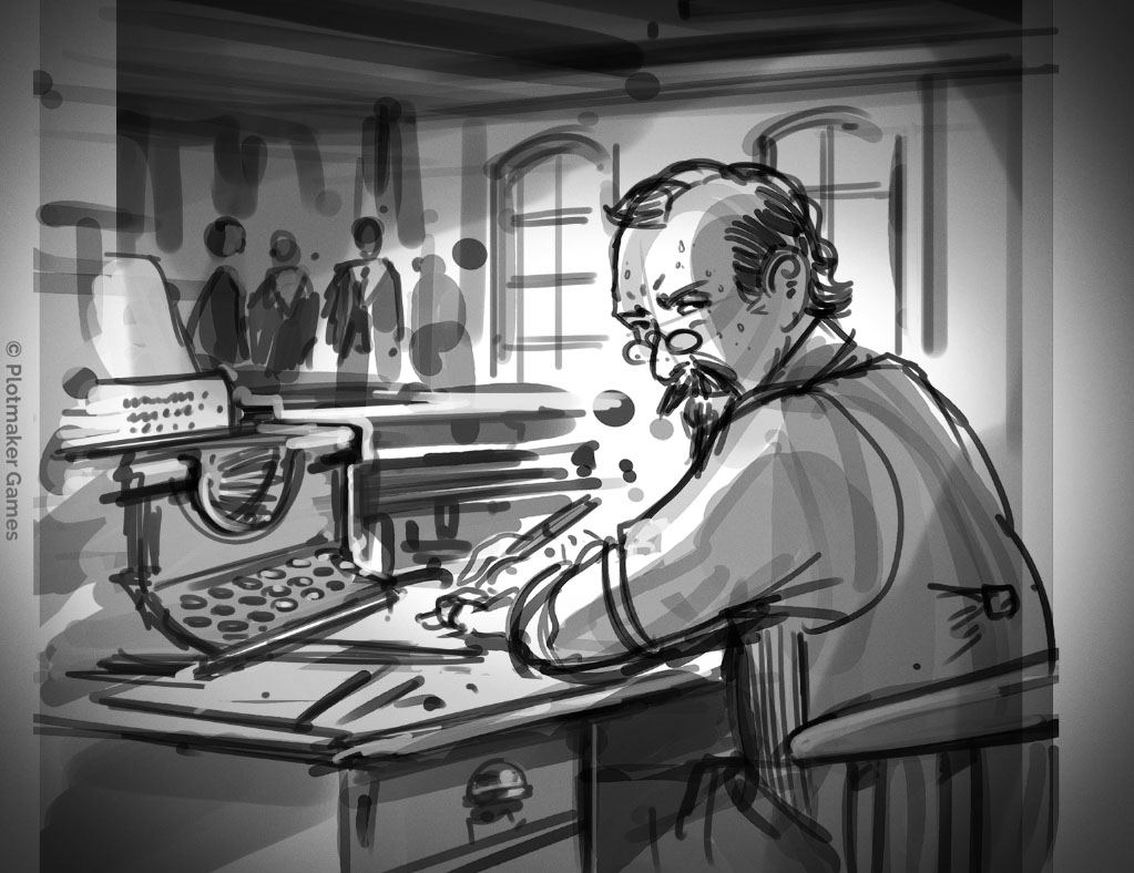
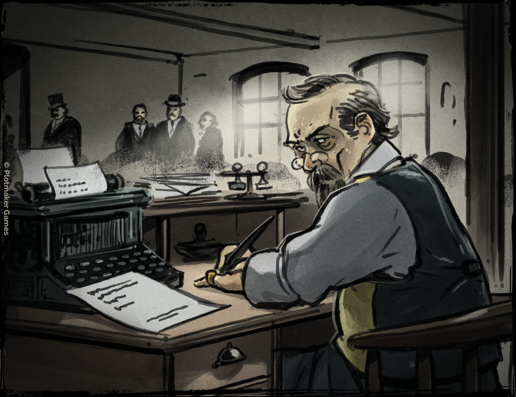
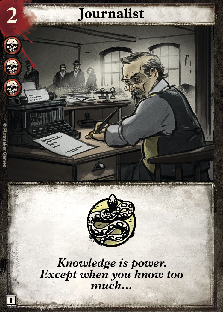
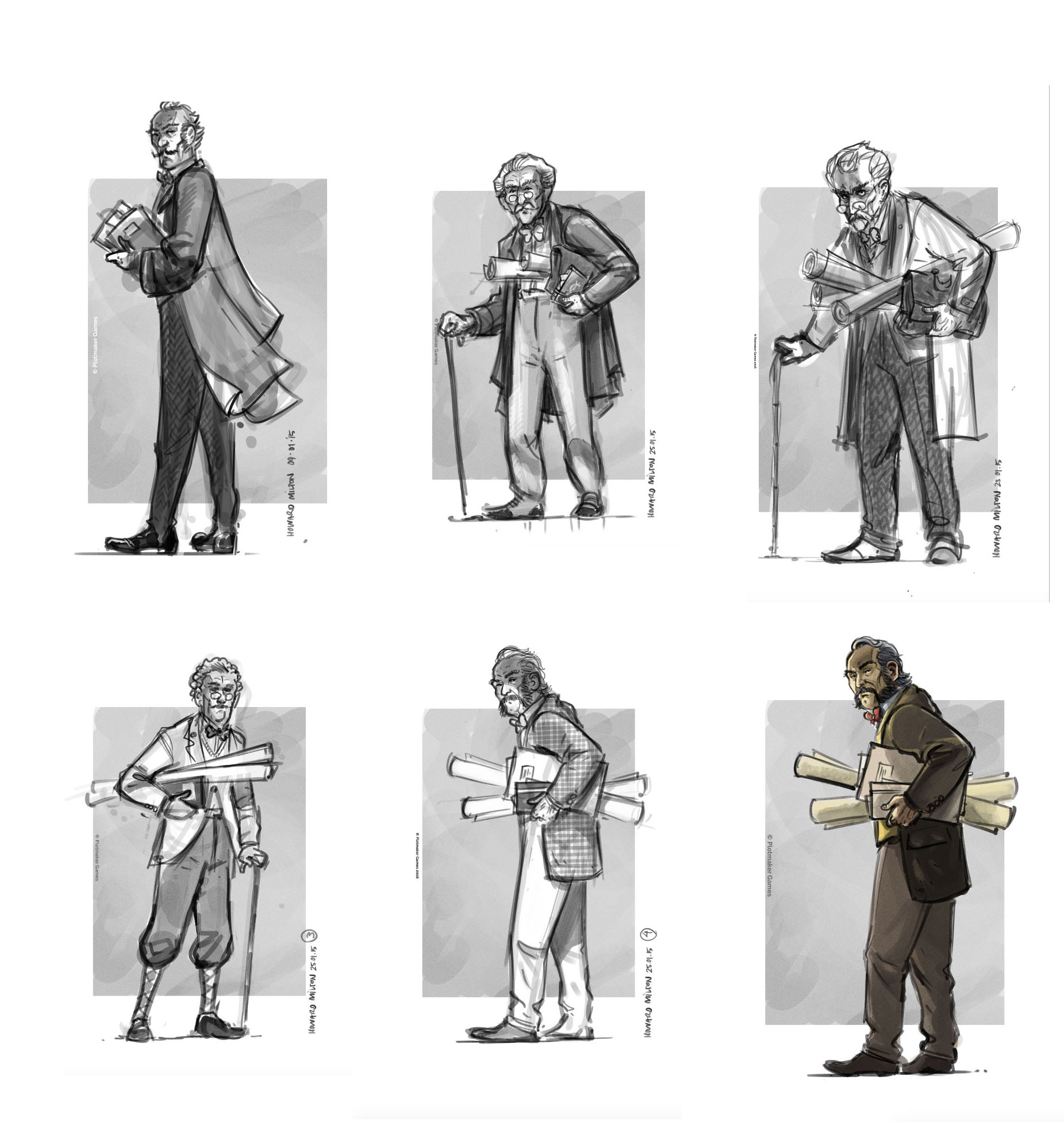
The Journalist is from the very first batch of sketches I made for the Dread Cards. And that hasn’t changed very much. Many others didn’t make it do to how we developed the story. And many new ones came into the story.
What did you learn from making LD?
That you need to believe in what you set out to do. Fail fast – succeed sooner. But also knowing when to make the changes needed to get the process moving on and getting the game out. Having a deadline is very important.
Also doing a work-book or design-book describing story and tone-of-voice can be a great help. For London Dread I didn’t do that. Everything was in my head which was OK since I did all art and art-direction. But on all the new games we are working on I make a design-book as a PDF.
For us we need to set the story and tone of voice early. That will help the process of developing the story and eventually turn it into a game.
Recently you went to GenCon with Grey Fox Games to debut London Dread. How did that go?
It went very well. It was our second time at GenCon so we were prepared for how crazy and hectic everything is. But the release was great. I got to set up a game where Asger demoed it with Zee Garcia and Sam Healey from Dice Tower which went well. You can find their review and thoughts of London Dread on Youtube. So now we are getting set for Essen in October. We are looking forward to that.
What illustration in London Dread is your personal favorite – and which one is Asgers?
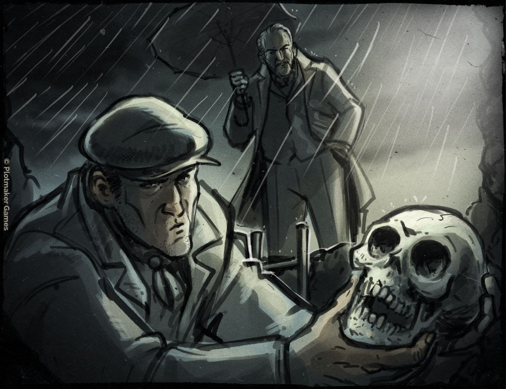
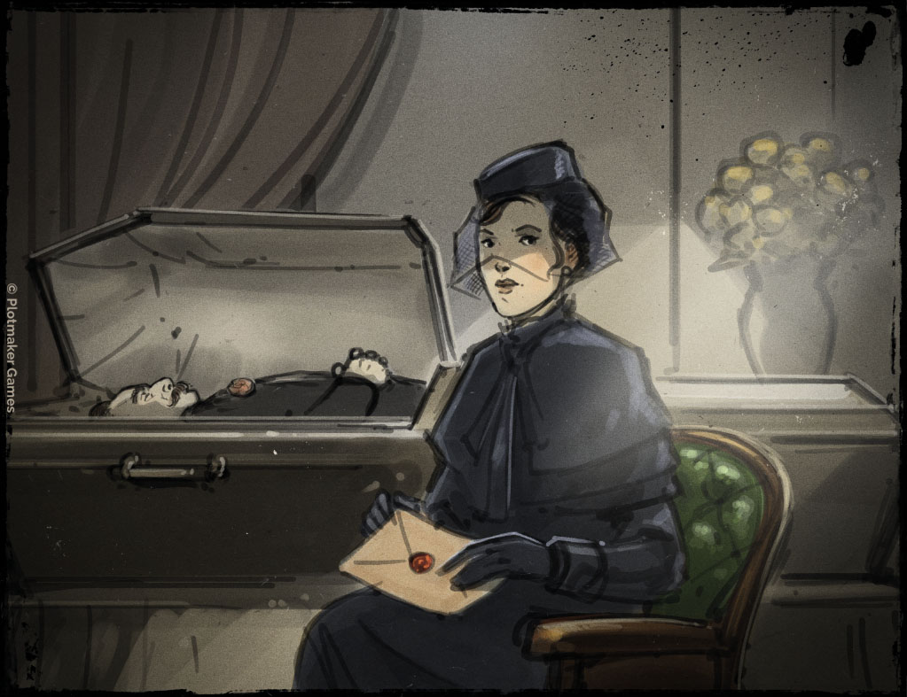
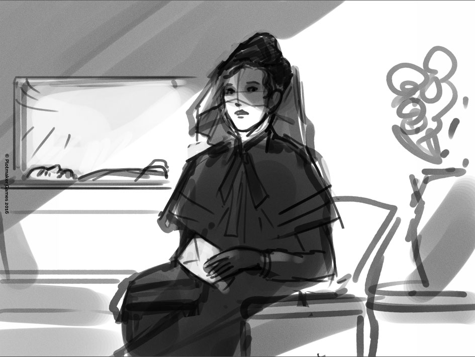
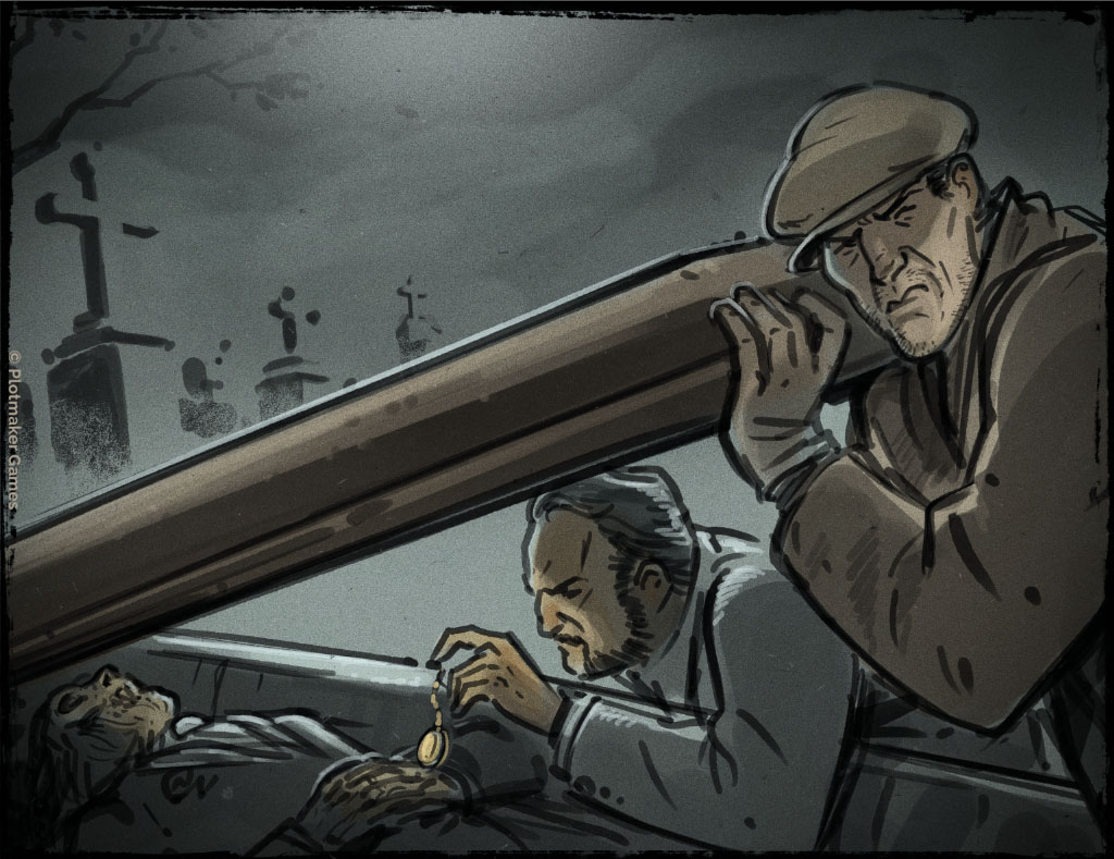
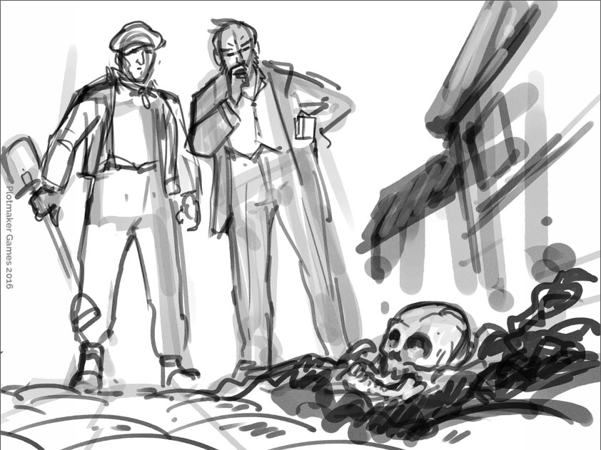
There is a couple. But the Dread Card ‘Grave Robbery’ is one of my early favourites. To me, it captured the style I wanted and helped set the mood for the rest of the cards. I like how simple it is in composition, background, and colour.
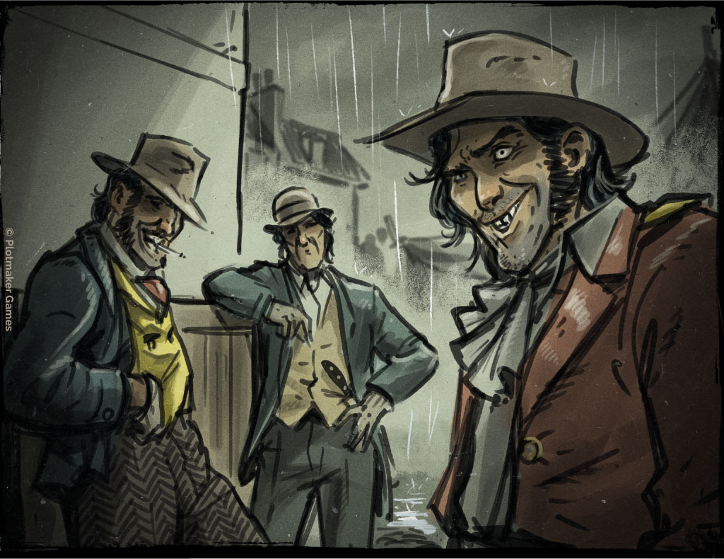
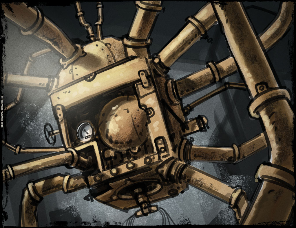
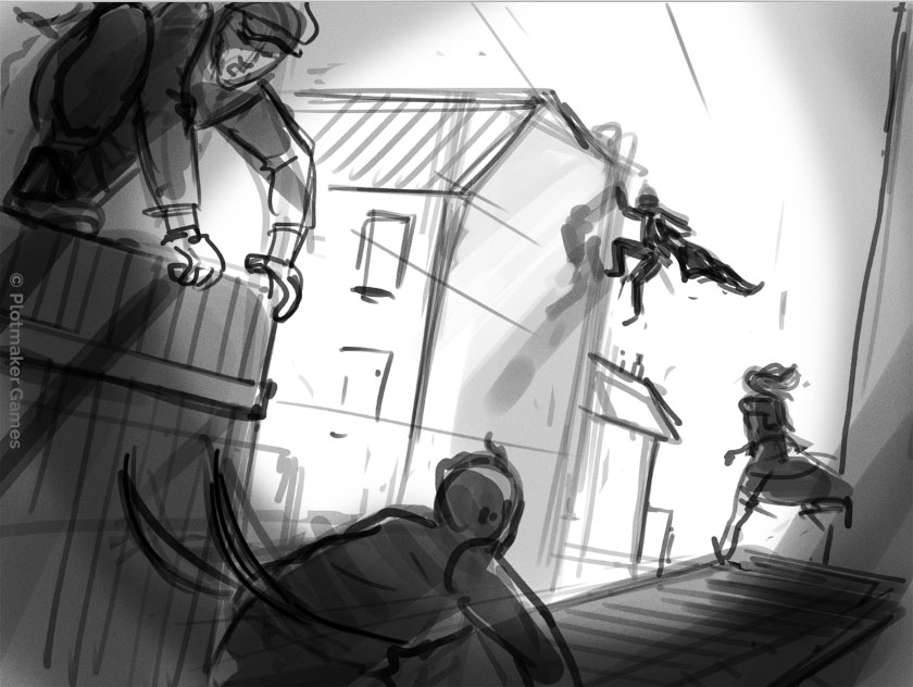
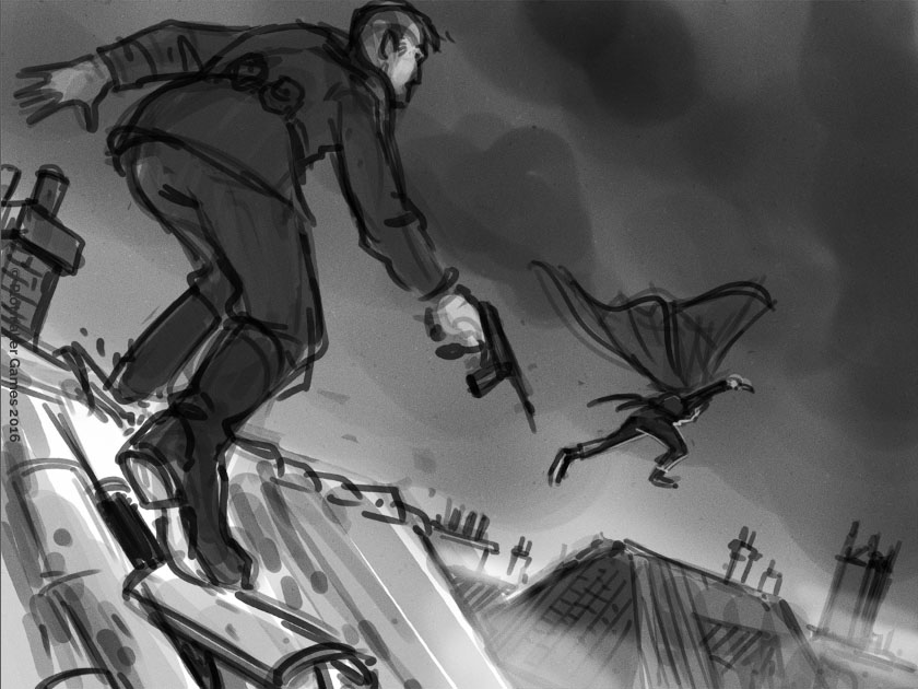
I also like Gypsy Gang and Visions of Madness. And Raid and Rooftop Chase for the action.
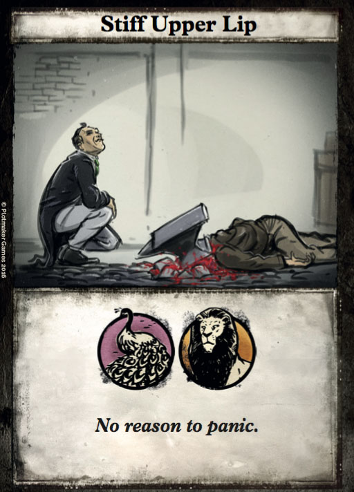
I know Asger likes the Dread card ‘Digging Up the Past’. And Basil’s card Stiff Upper Lip had Asger laughing when I did the sketch. I actually think I made that illustration for a different type of card initially.
Who are your own favourite artists(name 1-3 if you like)?
Loisel, Michael Lark, Jean-Claude Mézières, Herge and Sean Phillips.
Which other board games are your own favourites?
I haven’t played that many. But I have been fortunate to be introduced to some when Asger and I have been traveling. So far Skull has been my favourite. But on my list, not yet tried, I have The Grizzled, illustrated beautifully by Tignous and The Bloody In. Both has a really great art style that had me hooked. I am getting those at Essen this year!
Readers can see our interview with the artist of The Bloody Inn here!
Finally – is there any place for inspiration, tutorials, or other resources you would advocate aspiring artists?
I get inspired by movies, TV-series, comic books and talented artist I follow on IG. I have watched a few tutorials with Sparth, who I really admire for the story and feel he puts into his illustrations.
Anything else personal, like a project, shops, etc. – you want to promote? Maybe lift the veil on what we can expect from Plotmaker games in the future?
I really want to do a graphic novel for London Dread. To get a chance to unfold the universe and the story of all the characters we have. I hope to get started on that sometime next year.
But right now we are working on a bunch of new games. We hope to have Gold Raiders out this year with Quick Simple Fun Games. A small card bluffing game that we are really excited about.
We are bringing 4 playable demos with the visual concept set, to Essen in October. In November we are going to BGG-con in Dallas, where we also have some interesting presentations of new projects.
In the middle of all the new projects we are preparing an expansion for London Dread.
Many game designers say that it can have a negative effect to having finished art when pitching games to a publisher – because sometimes publishes want to change elements. How far was your artwork when you pitched Grey Fox Games and what is Plotmakers view and experience on this?
I haven’t experienced any negative reactions from publishers when it comes to how we pitch and work. We haven’t tried it any other way.
When Plotmakers pitch a new game idea or concept, story, illustrations and tone of voice is what helps capture a publisher’s interest. And if they don’t like the style or can’t see it fitting into their portfolio it makes it clear that it isn’t a project for them early on and we can pitch them a different project and move on. If the publisher is interested in a concept, we then make a playable demo and set up a second meeting for them to play the game.
We work as a creative team and truly believe that coherency of a story, art and mechanics is crucial for the game experience.
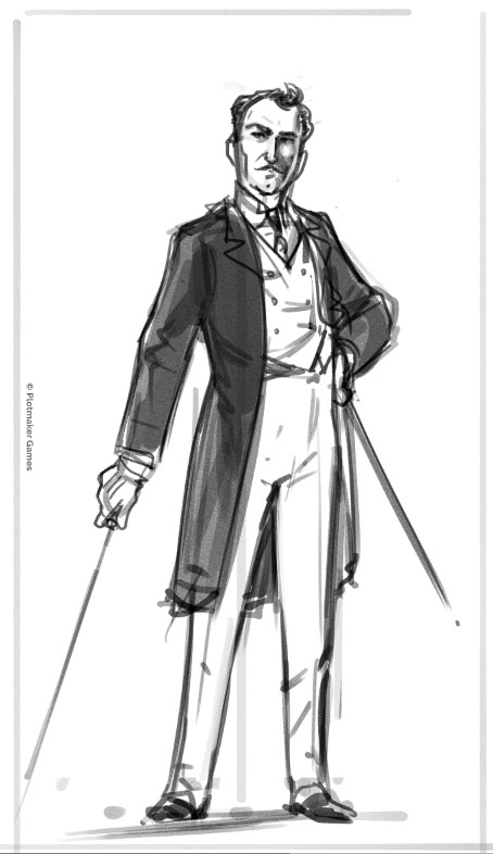
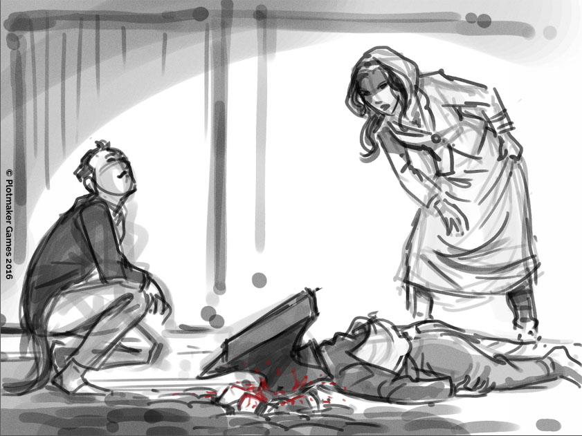
For London Dread the artwork was rather rough and all illustrations greyscale as you might see on the sketches here. The game board was probably what came closest since it had the yellow/ brown look with red blood splats. But the game board was still improved from that iteration of the game. So having the game visual helped improve the game for each iteration.
Grey Fox Games recognised Plotmakers strength from when they tried London Dread the first time and gave us all the creative freedom we needed to make it as good a game as we could. And that is how we work the best. So I didn’t get any comments regarding the tone of voice, the look of elements or illustrations.
I did change the Roman Numerals on the Action Tokens to Arabic numbers based on comments from their playtesters.
Thank you for sharing so much of your process in such a great detail with everyone. I hope others will enjoy reading it as much as I did. Good luck with the games and see you in Essen!
[easingslider id=”836″]

