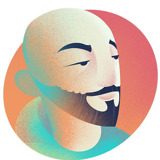
It is not an easy task to create art that draws you closer with a vivid and magical atmosphere that matches the one in the fairy tales of Lewis Carrol. If you attend Gen Con you can experience just that in the game “Hats” designed by Gabriele Bubola and released by Thundergryph Games. Let me present you the incredibly talented artist Paolo Voto from Bologna in Italy.
Tell us a little about your artistic background?
My journey in the illustration world began as a child. I cannot tell exactly when because, from what I remember, I demonstrated a great interest for drawing straightaway. For this reason, I have studied painting at the Academy of Fine Arts for a couple of years. Indeed due to personal circumstances, I did not graduate.
The first professional tool which gave me the chance to earn some money is the airbrush pen. The same I have used to customize several choppers motorcycles. After that, I worked for a confectionary company where I used to decorate chocolate eggs and similar products for many years.
Meanwhile, I came closer to digital, I made my first illustrations with Photoshop getting more and more skilled.
Everything that happened from 2016 onwards is what has made me a proper illustrator: many Italian and international collaborations with creative studios, communication agencies as well as publisher. Last but not least, Hats: the first of many, I hope, board games.
How did you get into making art for ‘Hats’ designed by Gabriele Bubola?
I became part of this project thanks to Pierpaolo Paoletti, Game Editor of ThunderGryph, ‘Hats’ publisher.
I know Pierpaolo since he was the art director of graphic projects while I was not even a proper illustrator. We would share advice and opinions about each other’s works. There was respect between us. Consequently, when he has started working for the boardgames industry, he first asked me to make few sketches to then realize a rough sketch of a ‘Hats’ hat. The enthusiastic Gonzalo Aguirre Bisi, President and Founder of ThunderGryph, was the one who finally tasked me the job.
What do you like to be included in a brief for illustrations and was there anything in this brief you found especially good?
I generally prefer a brief with clear guidelines in relation to the whole message the final illustration wants to communicate. They also give me the chance to better read the subject.
Of ‘Hats’ I have immediately adored the settings. It was very stimulating and challenging to recreate the classic fairy tales, using the memories I had of each of them. Moreover inserting an Easter egg in each illustration was particularly entertaining. I like thinking this ploy will be appreciated by the players.
It seems like ThunderGryph games have a new label they put on games called ‘Made in Wonderland’ (that you made)- that I guess is this something that was in the brief? How did it affect your work?
Made In Wonderland is a game series that Gonzalo wanted to make, inspired by the classic tales.
It is recognizable for both the presence of the White Rabbit stamp, just used for online communication and the packaging in the shape of a book, which is linking all these publications.
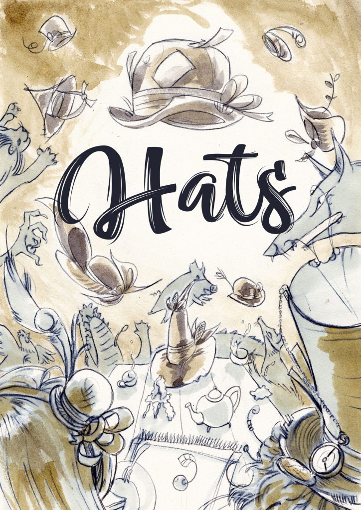
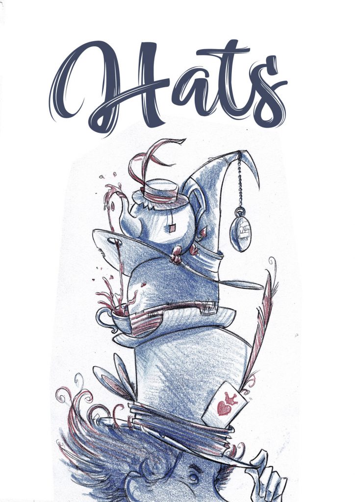
When I started working on ‘Hats’, I didn’t know which other tales would have been added in the series. But I knew there were many others to come. So I Had to look for a graphic style that characterises Made in Wonderland, also in order to be suitable for the other games settings. Fortunately, the first proposal convinced everyone and I could keep using the same style. It took us many attempts to reach the final version. Some of the ideas came to mind during the development of the project. That is why there is nothing in common between the first sketch and the illustration you can actually see in the game.
Where or how do you find your creative source of inspiration?
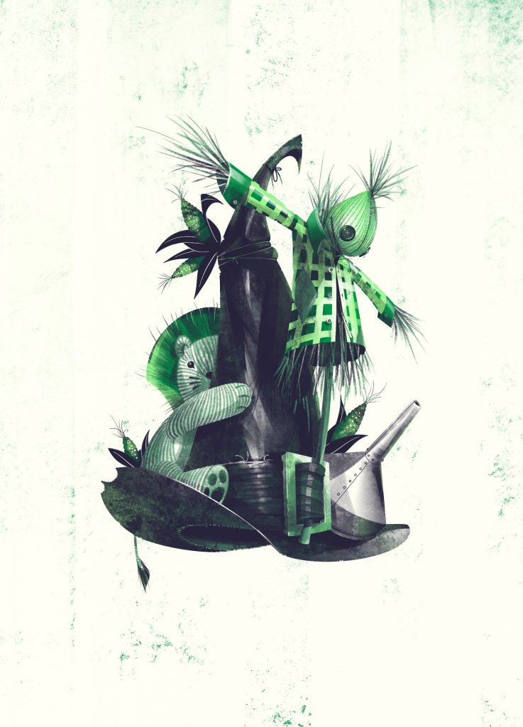
In this case the concept was pretty much defined. Only the illustrations were missing. Because of that, realising this artwork was very immediate compared to others. I only suggested the objects or the characters which I thought would have better suited to the game. Only the cover needed a harder effort.

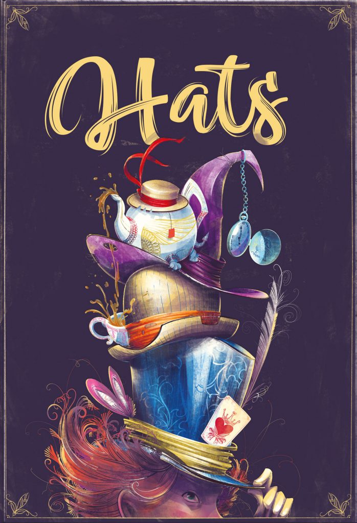
The first idea Pierpaolo suggested was to draw the characters while swapping their hats around the Mad Hatter’s table. This illustration was to be used both for the box and the rulebook.
After being sketched, I walked passed a shop where a bunch of tea cups were one above the other. My first thought was: ‘What if instead of the cups I used the hats?’. That is how both the illustrations were born.
Tell us about every step in your process when making a piece of art for the game from idea to final print?
The idea for a game illustration always comes from a number of suggestions that take shape talking and running some tests. This is kind of what happens every time I work on a project coming from ThunderGryph.
Both for ‘Hats’ and the games that came afterwards, I had a call from Pierpaolo who introduced the theme in question, making sure I know it and I like it. After that I take a couple of days to clear my mind about the job, the color palette, the technique to use as well as the image composition.
Regardless the chosen technique, I make a simple and rough pencil sketch, I scan it and I make it digital. I apply flat colours fills and I work on textures and shading. Based on that I can start sharing files to get the first feedbacks back.
Did you make Hats frame designs and layout as well. What considerations did you make about the frames?
Making ‘Hats’ frames was the most stimulating challenge.
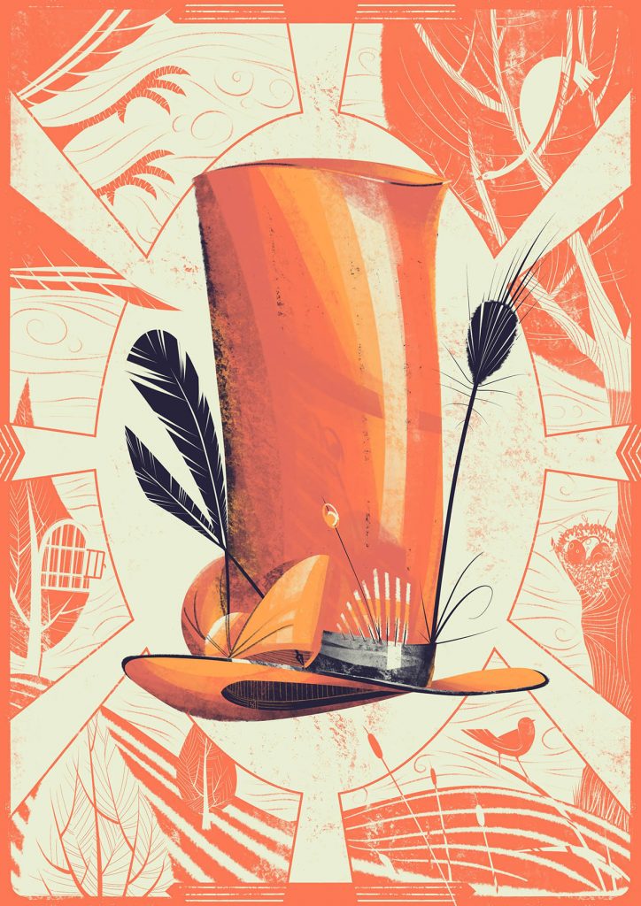
To focus the attention on the central hat, we decided to use a different colour for each card, plus all the elements which evoke the hat’s story.
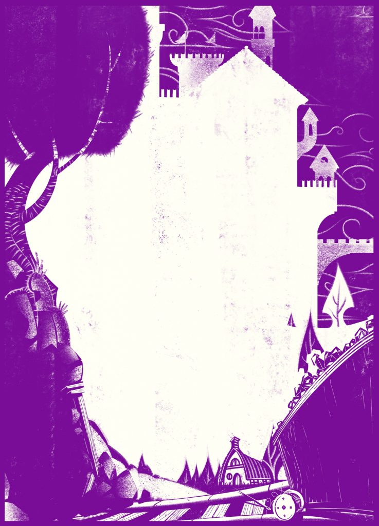
The Easter eggs, which make you think of a different tale not included in the deck, were added only at a later stage. What if they are hints for the next Made in Wonderland’s titles…?
What are your preferred tools in (software/hardware/traditional)
The technique I prefer is a mix of watercolors, colored pencils and ink.
For board games, on the other hand, I use the digital to quickly change the illustration for reasons of game playing during the work in progress. In this case I use ProCreate software for iPad Pro, even though I use Photoshop for the final adjustments before printing.
You seem to have what I would call a very traditional poster style with roots in futurism and art deco – with strong shapes and gradient noises. How did you come up with the style for Hats and what is you thoughts behind the chosen style and coloring.
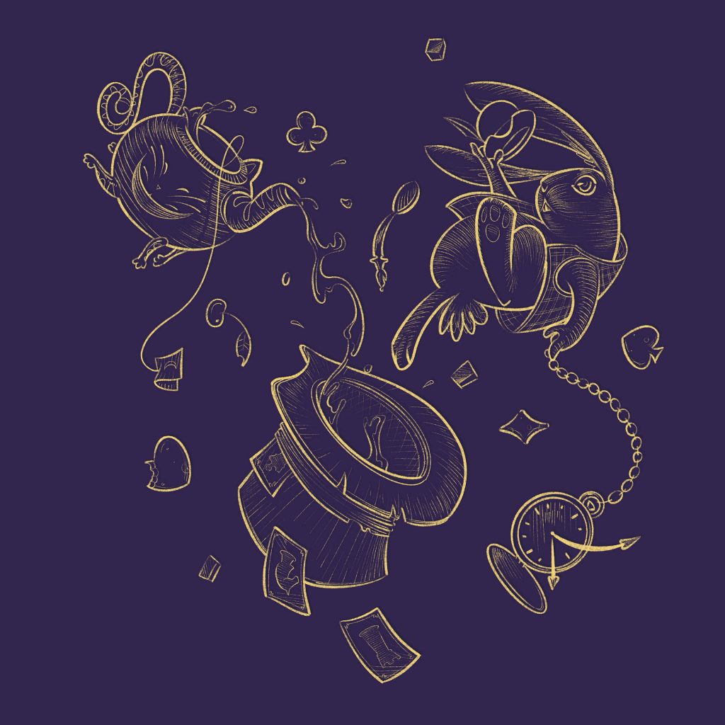
I like using the typical geometries and shades of the Futurism, and I always try to recreate the traditional atmosphere we can see on posters from the ’50s and ‘60s. Unfortunately, however, that technique does not work for every project. But I always try to use a work process that evokes that artistic movement, even if slightly perceptible in the final result.
In ‘Hats’, I started from basic shapes wedged together to make the subject, as I usually do. But then I have added details and pictorial shades outside of my comfort zone (I often use a brush which reminds of the airbrush pen’s shades). Overall the illustrations seem way different from the usual style.
Have you learned anything new from working on this game project?
Illustrating board games has taught me how to reach a good balance between the product functionality and the aesthetic.
…reach a good balance between the product functionality and the aesthetic.
At first my instinct told me to realise images full of details, but they disturbed the game playing; on the other hand, even a too conceptual illustration could not work because too difficult to be read in such a quick match.
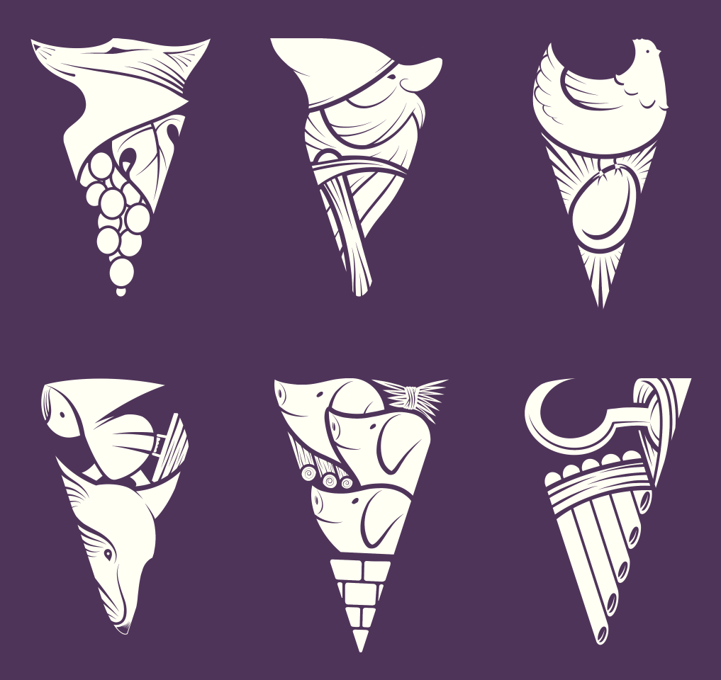
Anyway, between them, this is the field I have more fun with.
Each project leads me to a different adventure, I can experiment new styles that more represent the story as well as make the player enter inside the world I have created. It is never just about illustrating: I can often draw tokens, design 3D thumbnails and packaging. In short, I can not get bored.
Name up to 3 artists you admire?
A case in point is Sergio Toppi. He has been the Italian comic artist and illustrator who made me fall in love with this job.
I adore the classic and never banal style of Will Eisner, as well as the density of the forms of Oscar Chichoni.
The pantheon of the authors I admire would be much larger, but you only asked me for three of them.
Finally – where can people find more about you and what is your next project?
The social channels I regularly update are Facebook and Instagram:
Facebook: https://www.facebook.com/paolo.voto
Instagram: https://www.instagram.com/paolovoto/
Meanwhile I am working on more games under ThunderGryph publisher. One of which will be presented right after the Summer, so I suggest to make some space on Made In Wonderland shelf.
Simultaneously I am working on the proposal for an illustrated book for children, but I can say nothing more. As soon as I have news, I will be glad to share them on my social profiles.
So… stay Tuned ;}

