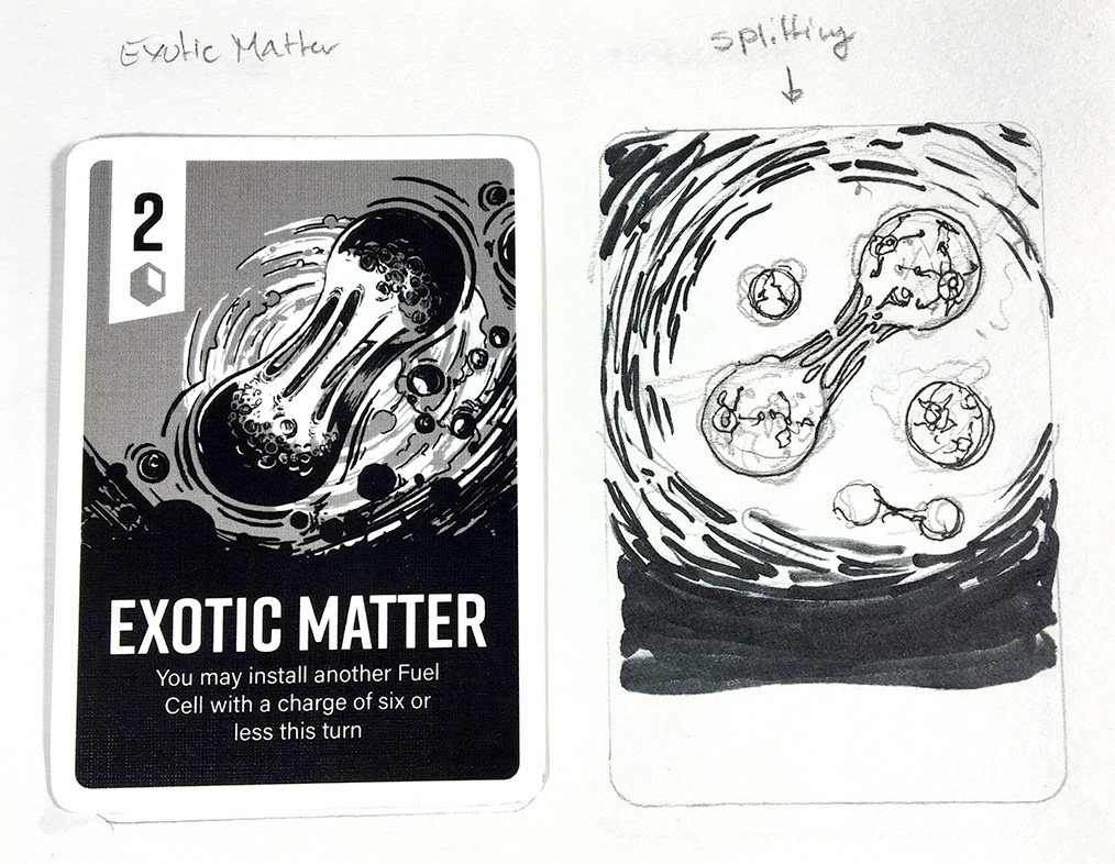
What is the best choice of visuals for your game? Many games could have had a completely different approach to the art and would it still be the same game experience? Control is a new strategic card game, designed by Mattox Shuler and Kyle Key from Keymaster Games. The game art comes across as strong and bold with an graphic novel style wrapped in a sharp and elegant design. With its black, white, gold and silver colored cards – Control stands out as an piece of art itself. We asked the artist Kyle Key about the design and we discover that he does all the artwork on an Ipad Pro. He currently lives in Athens, Ga. USA with his wife Julie and their 11 month old daughter Emory.
A quick visit on your dribble and ink365 page shows a portfolio with strong graphical design items like logos and posters but also some traditional pen and paper skills. Do you think of yourself more as an designer or illustrator? And what was your role on the game Control?
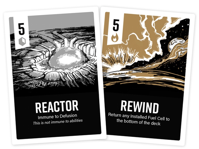
If I had to pick between the two, I’m going to lean towards illustrator.I started with a fine art background and actually have a degree in painting. Design and working on branding elements came after I already had a traditional art background so I would have to lean on my roots. My work on the game Control from an art standpoint has been a great example of me designing and illustrating for the same project. My role included the creation of monoline design elements on the backs of the cards and box as well as the 50’s sci-fi style illustrations for the fronts of the cards. The layout of the cards and typeface was created by Mattox Shuler of Fort Foundry, who is also the game play designer. I served as an advisor to Mattox on the game mechanics since this would be the first game published under my board game company, Keymaster Games.
What is the reason you chose a black and white style on the game and how/when did you decide to have gold and silver in the design?
Once we had applied a time traveler sci-fi theme to the mechanics of the game, We wanted to go after a 50’s sci-fi style of illustration. Images of that style have bold marks in simple color schemes with room for overprint mistakes and keep simple printing methods in mind.We wanted the card design to be simple and elegant so we landed on just four colors for all of the illustrations: White, Silver, Gold, and Black. We gravitated towards the gold and silver colors with the idea of referencing old NASA spacecraft and the metal and gold foil blanket look of those classic spacecraft.
What hardware and software do you use and what is in your opinion the best quality/assets of that software?
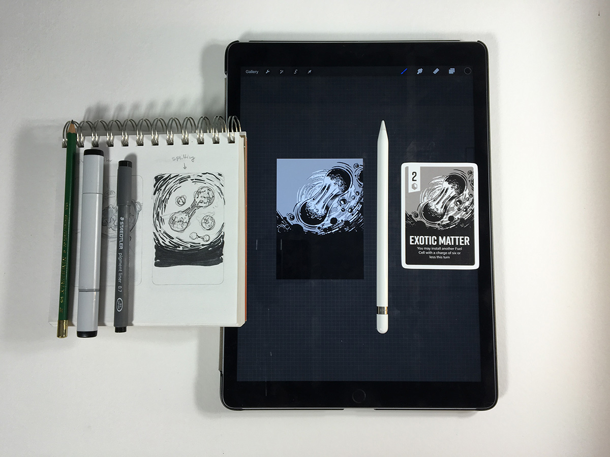
I’m glad you asked this. This project was the first time I used my new iPad Pro and Apple pencil as the only hardware for the illustration of all the cards. Normally I would hand draw all of the illustrations and then convert them into digital form using my Wacom intuos tablet and photoshop, but I had just purchased an iPad pro and Apple pencil and decided this would be the best project to dive in and see how they performed. I won’t go into too much techy details, but all of my expectations were surpassed and this turned out to be the perfect setup for creating the illustrations for Control.
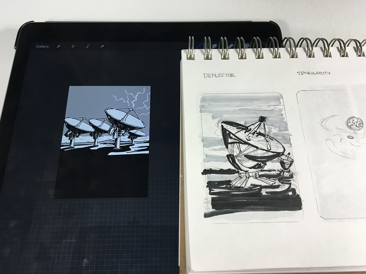
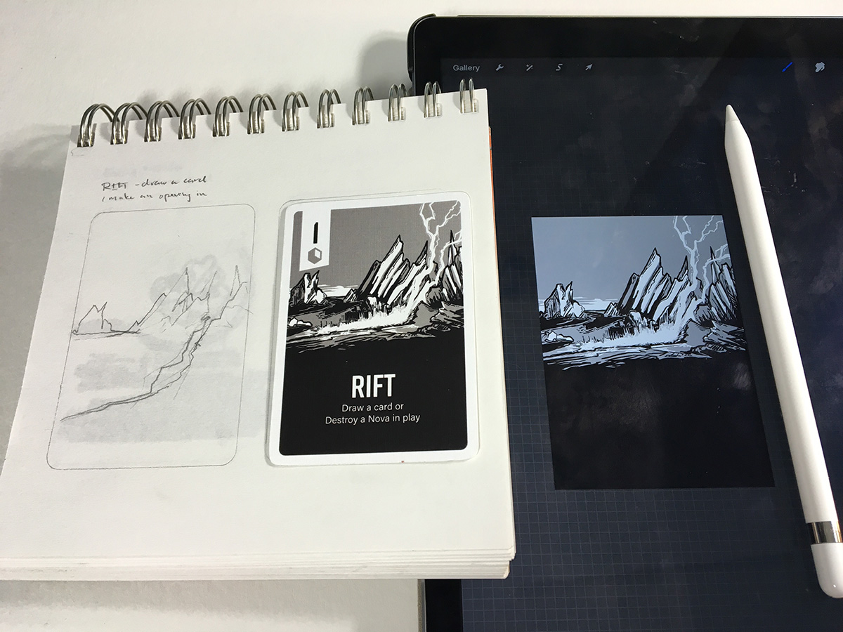
I used an app called Procreate to draw and maintain the separate color layers, and once the illustration was finished, the app can export a fully layered Photoshop file right into my Dropbox folder where it was ready to be added to the card layouts. The backs of the cards required a more precise method of illustration so all of the monoline work was done in Adobe illustrator
Timelapse of the Rift card being drawn on the iPad pro
How did you find the form on the card backs (which in some ways reminds me of designs I the console game Destiny)?
I have played way too much Destiny in the past two years, so I’m sure there is some subliminal influence that has seeped into the illustrations of Control. We knew we wanted the backs of the cards to be a monoline design so that design constraint was already in place. The general form for the card backs came through trial and error with a specific aesthetic in mind. Time travelers would have to have some form of navigation as well as instrumentation and readouts. I wanted to combine the old form of navigation found in the complicated and elegant design of an astrolabe and translate that into a design that a time traveler might consult. Keeping that aesthetic in mind, and adding the monoline design constraint, I found what you see on the backs of the cards.
Have you been involved/published other games?
Yes, I have been working on several games that I plan to publish under my company Keymaster Games. Being a board game designer/ publisher with a background in design and illustration has made the production of games a decently smooth process.
What part in Control is your personal favorite?
If you’re asking about the art of Control then I would hands down say the back of the cards. When it comes to the Gameplay aspect, I love how there is always someone pushing to win and in a sense, they are in control of the game. There is a real delicate dance that takes place in order to get control back into your hands and make a successful push for the win. Watching people play the game for the first few rounds and watching them become more aware of that control is one of my favorite things to witness.
There is a real delicate dance that takes place in order to get control back into your hands and make a successful push for the win.
Who are your own favourite artists out there?
I follow a wide range of artists, and I’m always intrigued by different forms of art. I follow a lot of really amazing plein air painters, and I am constantly trying to understand their use of color and composition in their work. I find lots of inspiration in draftsman like Kim Jung Gi for his ability to freehand draw extremely complex and dynamic scenes, Scott Robertson for his mastery of perspective and architectural approach to drawing with a sci-fi theme, and Jake Weidmann for his hand control and dedication to his craft. I also follow a lot of designers to keep up with what is current in the design aesthetics and try to always keep these things in mind when working on projects.
Do you play board games yourself, and which is your favorite?
I love playing board games, and how games bring people together for quality time spent making memories and growing relationships. That’s part of the reason why I started Keymaster Games. I have always been drawn to the “Gateway” game category because it is easy to get everyone involved no matter how familiar they are with the board game hobby. It’s hard to pick an all time favorite, but the last few games I have played besides Control were , Avalon, Munchkin, Tsuro of the Seas, and Smallworld.
Surely it must be one of the first games illustrated completely with the Apple pen. Control has been backed to success so we will likely see more coming from Keymaster Games.


