We are well into the new year and gorgeous games keep rolling in. Let us sit back and enjoy a short glimpse of the eye candy out there. Here is 4 games we have chosen to highlight. Council of Blackthorn, Neolithic, SillyStreet and Strife:Shadows&steam; ALL producing great card game visuals.
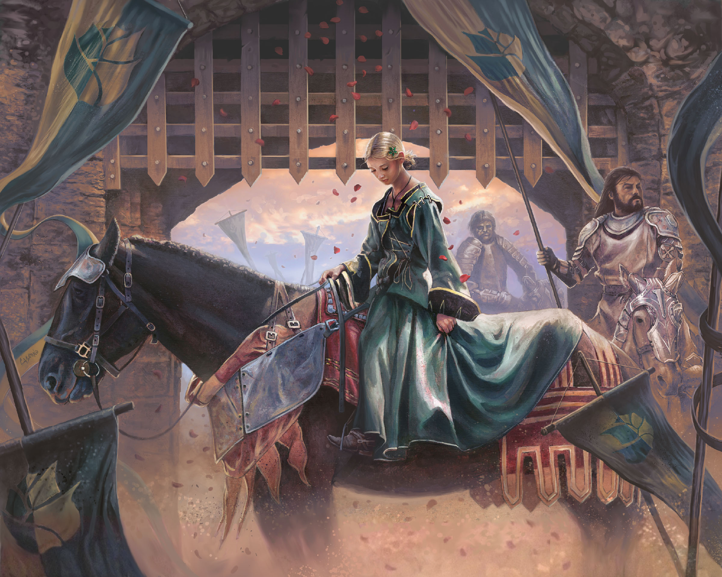
Council of Blackthorn
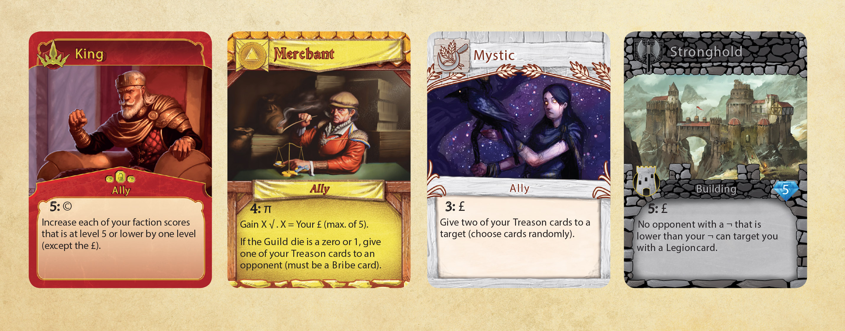
is a game designed by Jay Meyer and illustrated by Alex Stone. Alex captures the medieval atmosphere in striking images like the maid on the horse we see here. Also we think CoB should be recognised for the card design. Look how the fraction borders are very different but still the same family.
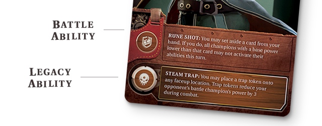
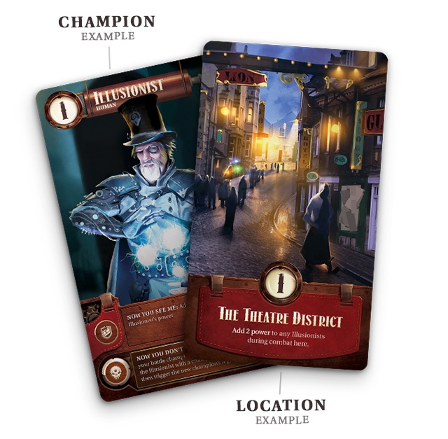
Strife: Shadows of Steam
is in our opinion a top class example well done card UI. The game is from vision3games with promising looking art illustrated by Claudio Pilia.
SillyStreet
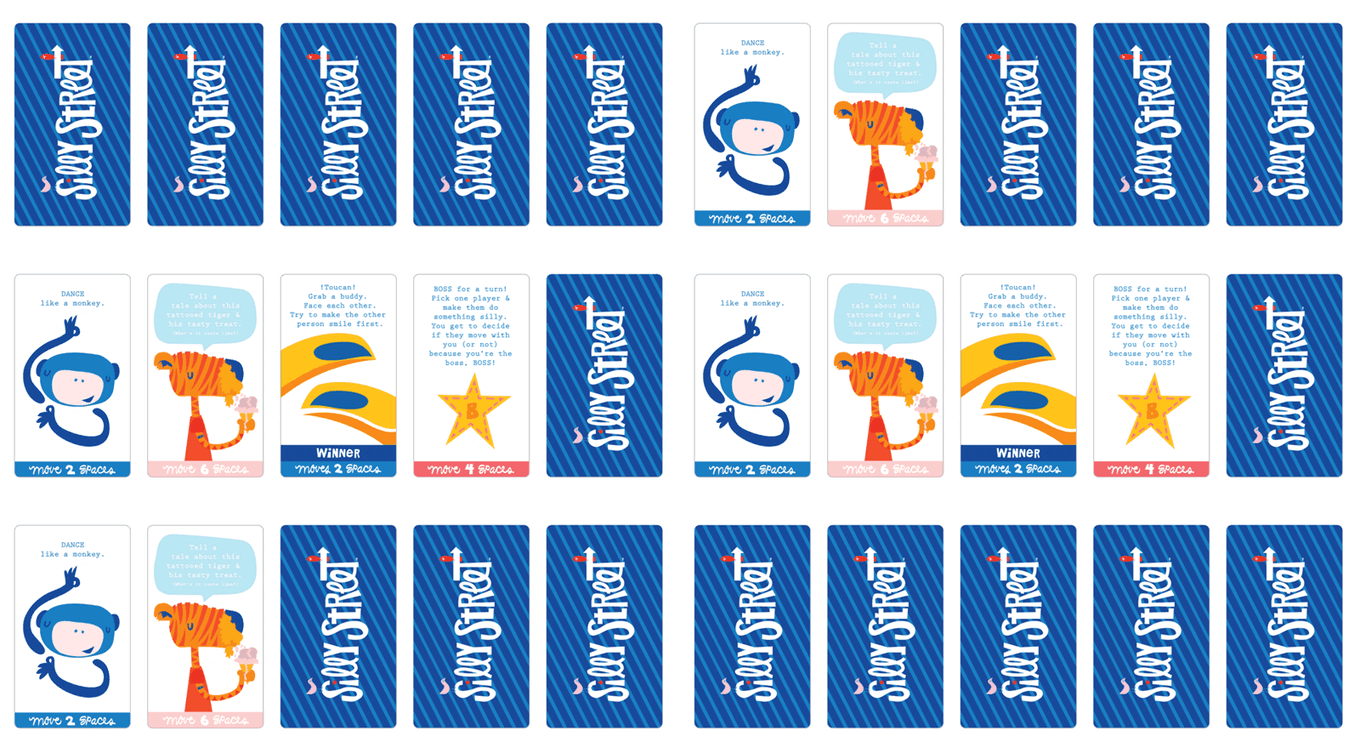
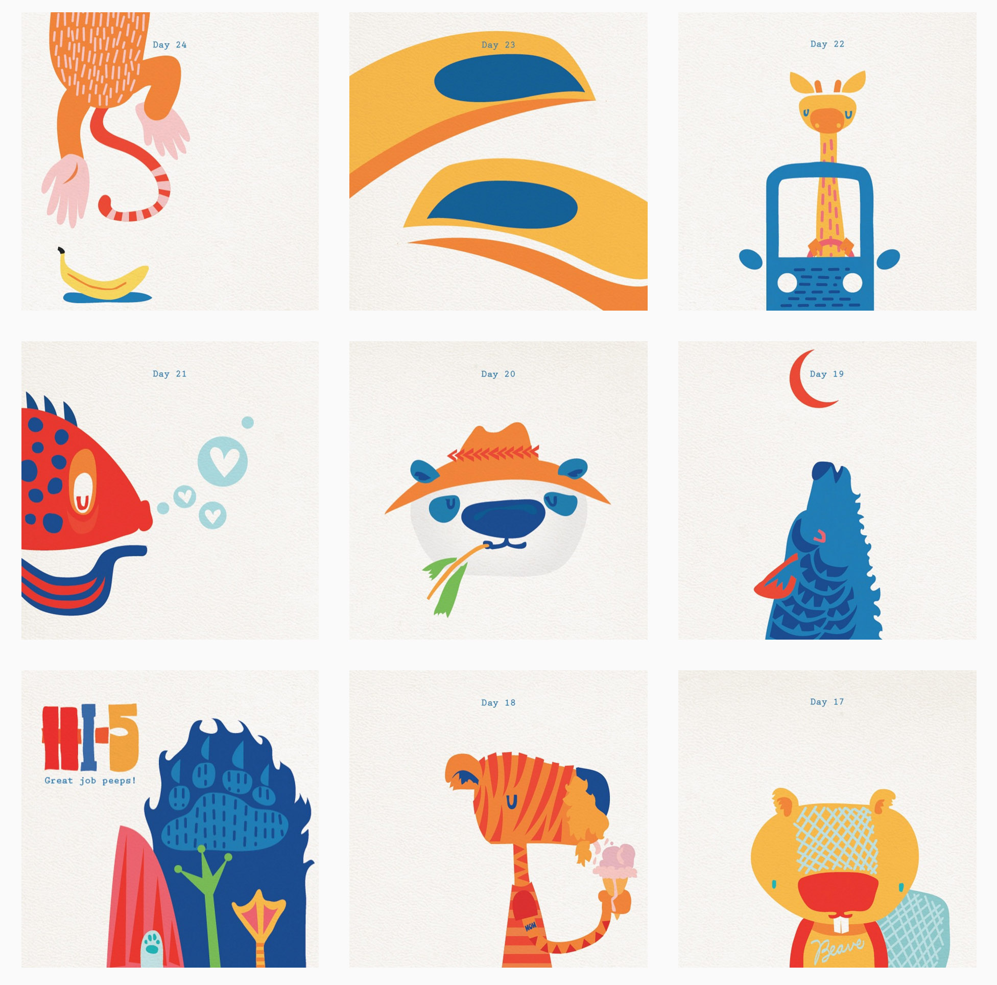
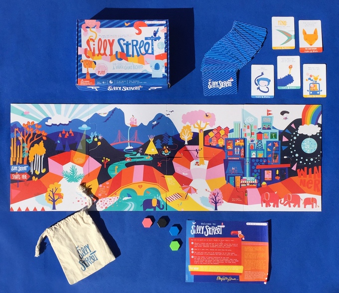
is a game aimed for families and kids age 4+ by Meghan DeRoma (artist we believe) and Christine Peck. With a palette of primary colors in composition with some pastel flavours they bring out a visual universe that will make you happy on the inside. As we can see from the instagram 100 silly images they are some strong minimalistic characters and compositions that fit well to a game aimed for children.
Neolithic
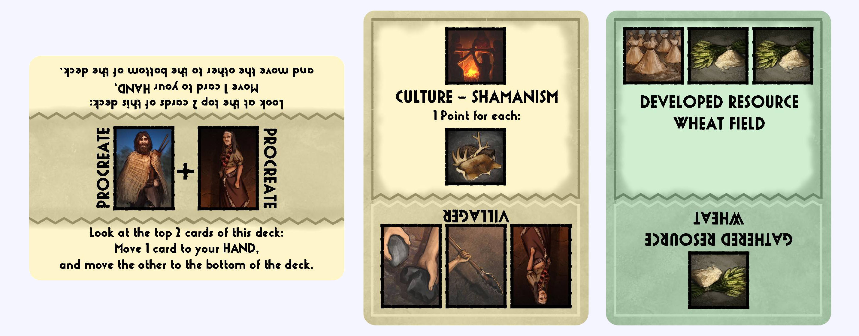
… Actually first it went under our radar. Maybe because at first glance the cards looked a bit “dull”. The small square images caught our attention – wow. Thinking more about it the card style has a low profile, low saturated color palette and gamey feel to it (reminds me of Innovation). So with a indecisive mind about the card UI – this game still creates a great overall feeling that in a way match the theme. Not to forget mention the brilliant small “sketches” is done by “Mice & Mystics” artist John Ariosa.

A last mention should go to the fantastic looking new Climate version of Evolution. And maybe GHG should start take a look at game components like popular minis, so with that note we point to Masmorra.
A Golden Brush to all the mentioned games.
