A Sci-fi story driven game from SunTzuGames

Hello Emil. First of all — congratulations with the successful Kickstarter on you new game Rouge Angels. When this interview hits the reader it is probably very close to the campaign ends – but I am still excited to hear about the game. Tell us about it and also why you think your first Kickstarter failed?

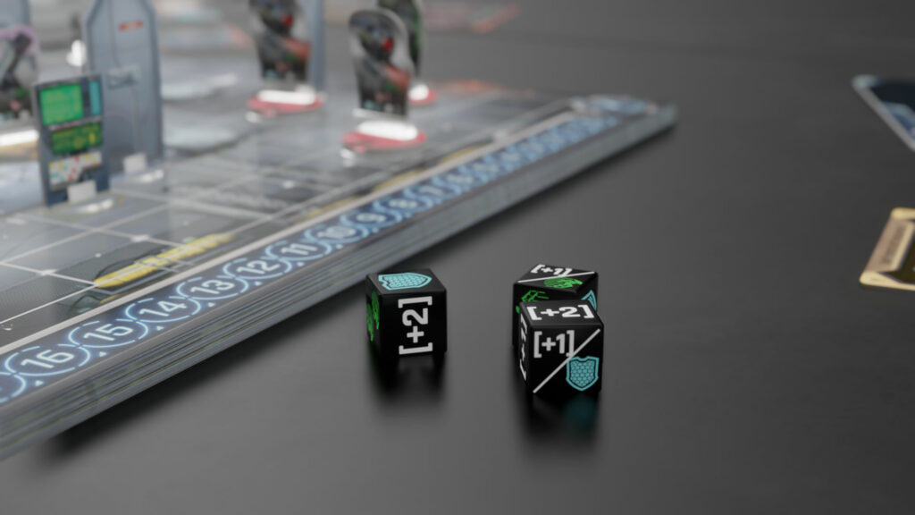
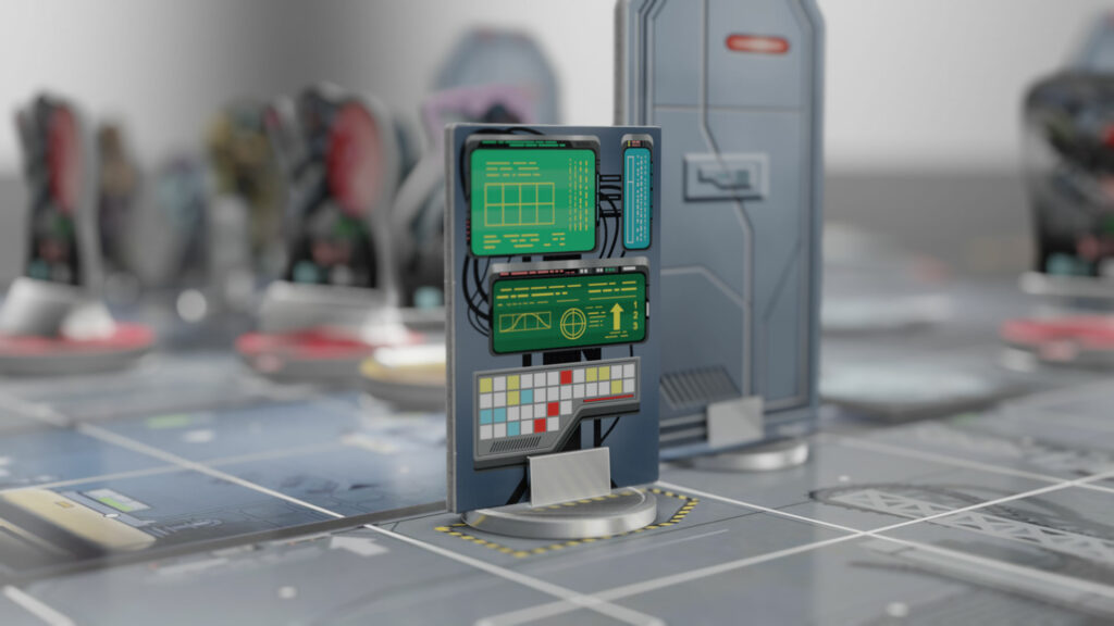
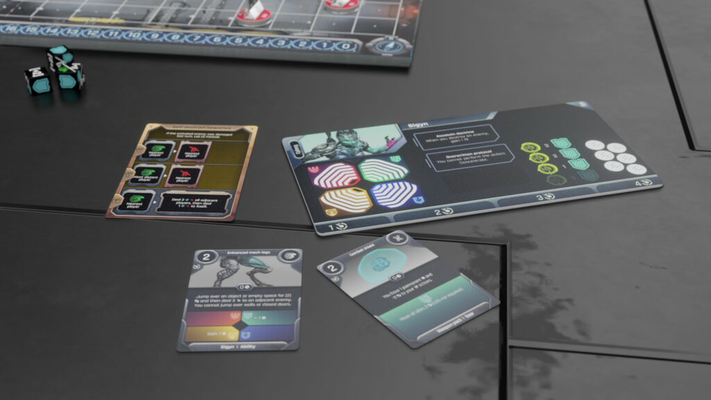
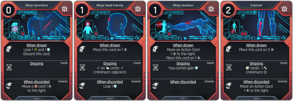
Rogue Angels is my take on how to merge an adventure game with action and RPG elements. I wanted to create a Mass Effect of board games, and Rogue Angels is my answer to this challenge fused with video game inspired mechanics and streamlined execution.
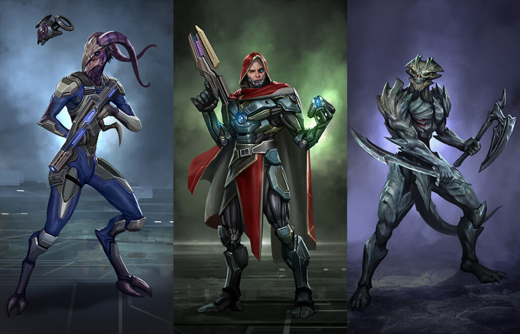
Rouge Angel Art

I think the Kickstarter crowd and board game market has changed a lot over the last 5-8 years. With the rise of direct to shipping campaigns and pre-order marketing style tactics on Kickstarter, the playing field for indies have shrunk and become less accessible.

the playing field for indies have shrunk and become less accessible

My first campaign failed for a lot of smaller reasons that accumulated, but the major issue was me still believing the same crowd could be drawn in. I needed much more visibility, many more reviews, a lot more gamers involved and so on.

With those issues fixed and with a more appealing campaign, it has been easier to gain momentum and have a better campaign overall this second time around 🙂
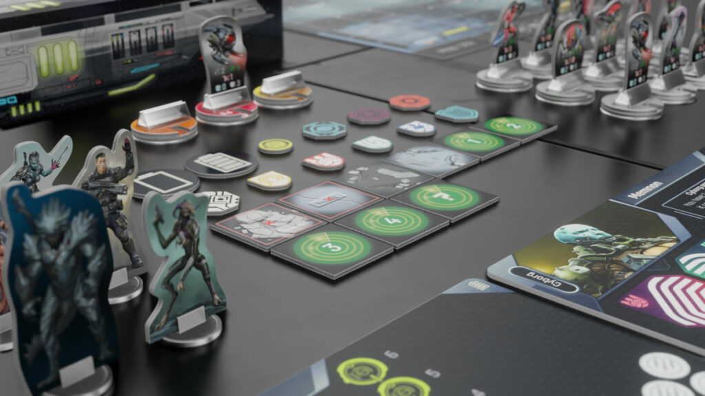
You definitely nailed something looking at the numbers. Here on Greenhookgames you previously featured with your game Burning Rome and you also have some other games in your portfolio. Do you have a different approach to how you got the art for this game made.

Most of my activities related to development, testing, and production have been refined over the years. I would say that my approach to collaboration with artists have remained roughly the same. I have had to learn a lot on many fronts, but my people skills have always been well tuned towards freelance collaborations and such.

I found a few new artists with specific skills for character drawings and map drawings, which has made it easier for me to create outlines and convert prototype materials into more final looking stuff.
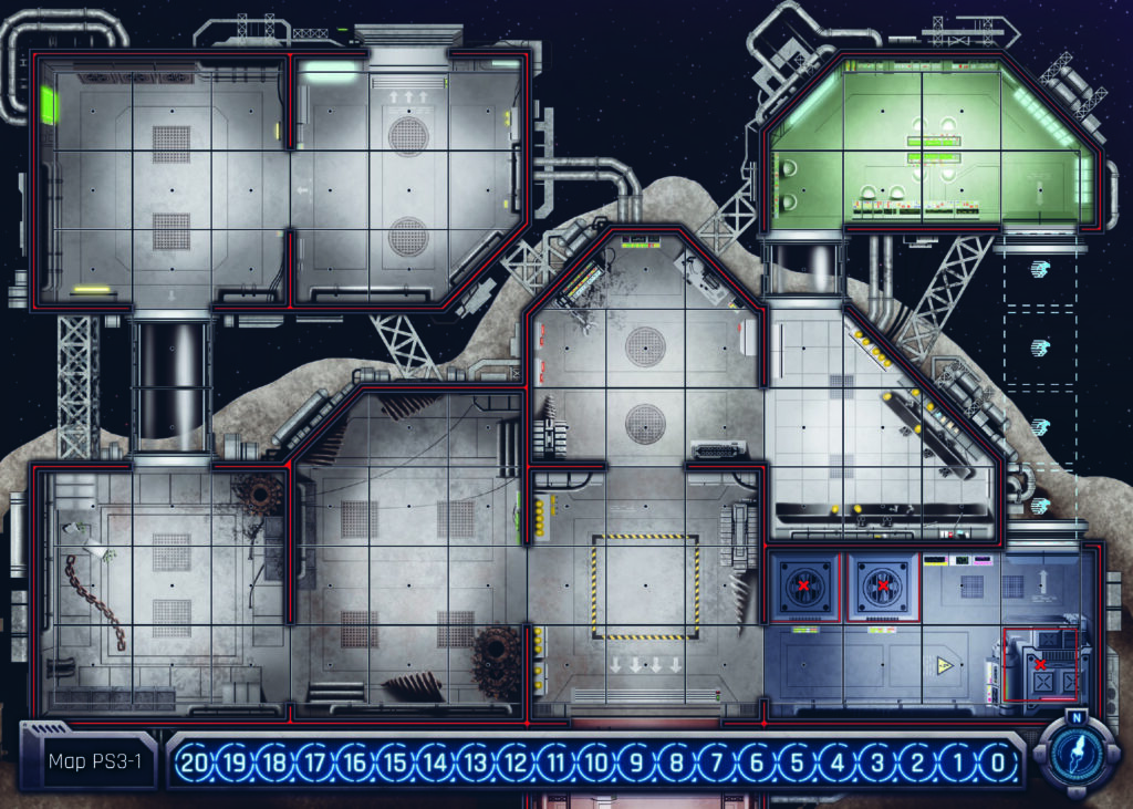
Rouge Angels Map – one of many
Rouge Angels WIP art
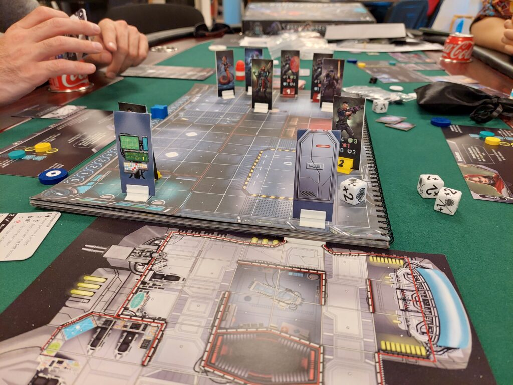
Rouge Angels Prototype Playtest

When in the process did you start adding more final looking art to your prototypes?

After my third or fourth play-through with different gaming groups, who all proclaimed that this game and the mechanics had something special to offer (even though they were just looking at black and white printed paper), I started getting in touch with illustrators.

From around 2020 I started putting more and more artwork into the prototype, also when it moved online to Tabletop Simulator.
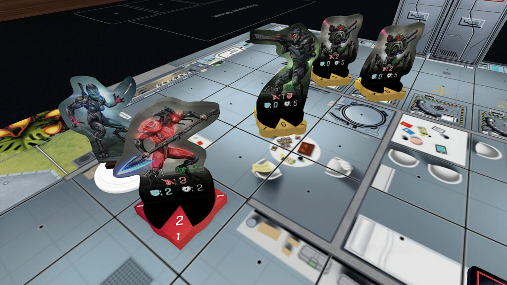
The game also comes with some awesome mini figures. Can you tell a little about why and how that is made possible – are there any things to be aware of when you want to add minis to you game.

The miniatures were not initially part of the plan, but this was also one of the many smaller issues with the original Kickstarter campaign. As it did not have the eye candy for those eager to get some plastic.

I therefore chose to go the Gloomhaven route with miniatures for the heroes (alongside standee if you are more into that) and standees for the enemies. It would have been a much heavier game if I were to create plastic miniatures for the enemies as well, plus it would reduce the accessibility of the game and gameplay.
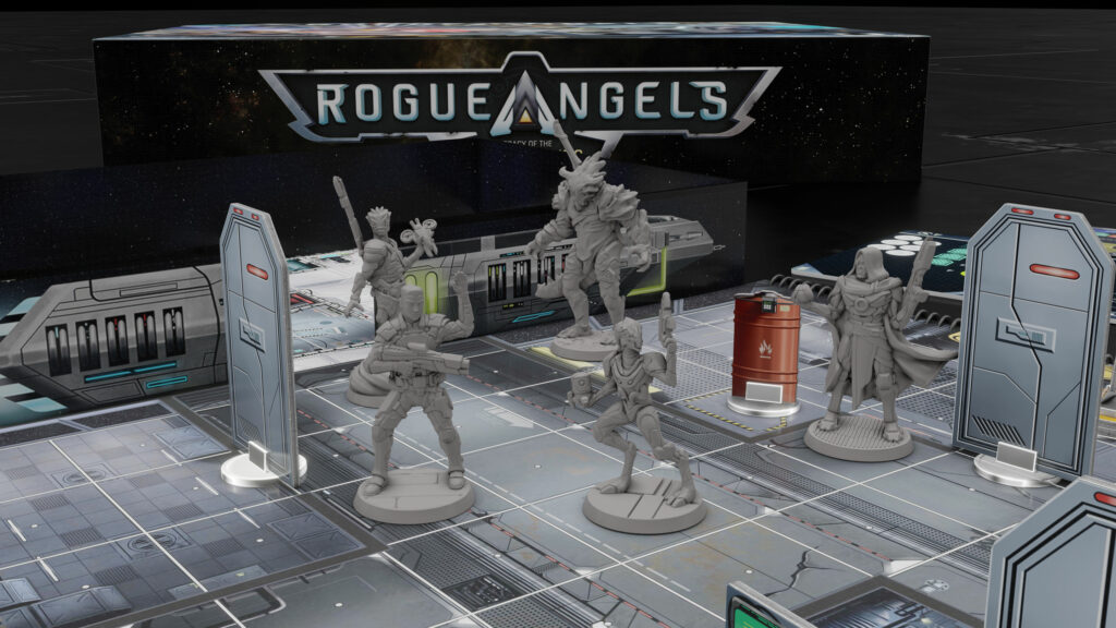
Rouge Angels Minis

The challenging part of creating miniatures for a game is that you must be true to the source material/original illustrations, but also make sure the model can actually be cast in a mould. There are certain limitations to that depending on manufacturing method, so there you should ally yourself with some people who know how to do this.

Thank you for your insights — is there any final things you want to tell to the readers.

Rogue Angels is indie through and through, so what you see is my attempt at making it through a very narrow strait in the middle of a blood red ocean of competition. I would therefore always advice people to do a lot of research before attempting to do the same.

I am always available for a chat, and should Rogue Angels be of interest, please consider giving it a push towards reality 🙂

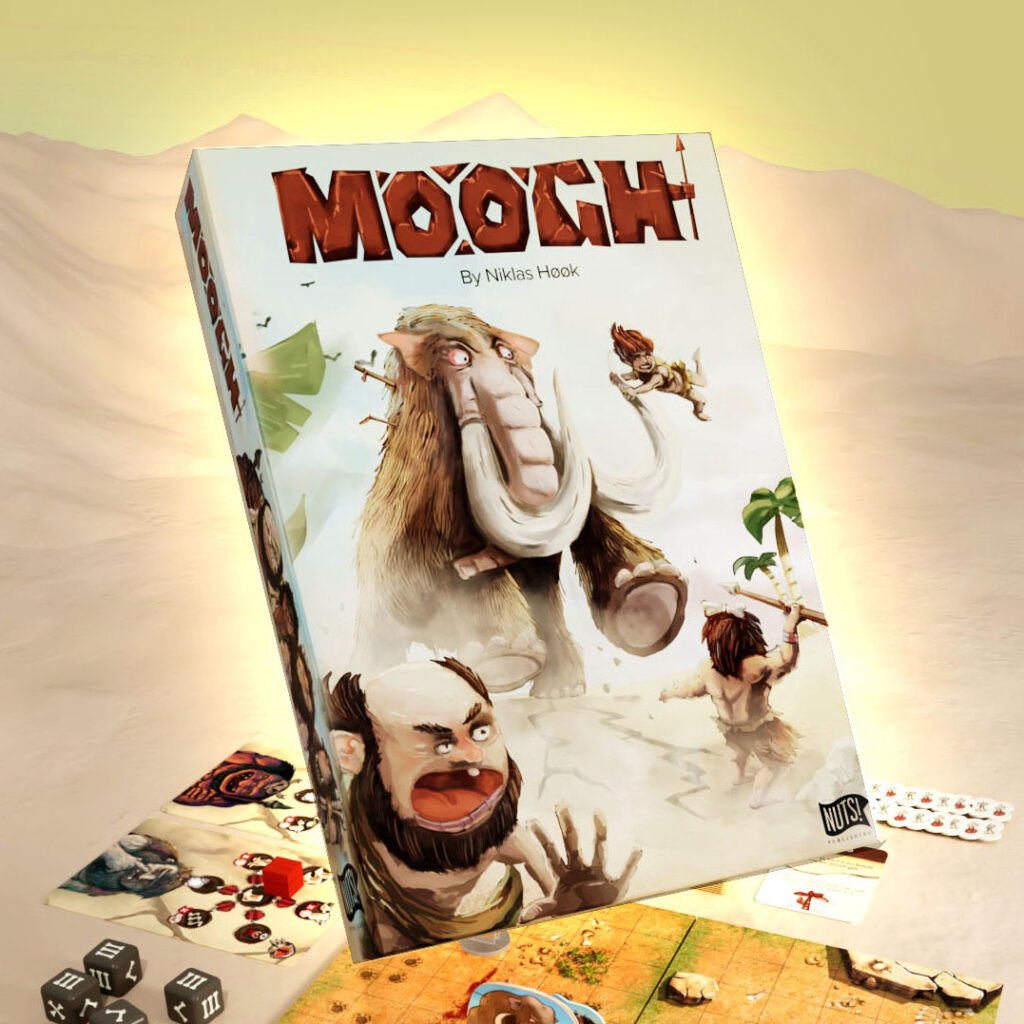
MOOGH – Kickstarting with primal rage

Since Nuts last campaign on gamefound we did a lot of tweaks and simplifying. Now we are live on Kickstarter with an improved MOOGH including new updated character art.

Is 50% bad?

Yes – according to many studies by other designers apparently you almost need to fund immediately. I hope we can prove statistics wrong with your support! I believe you get a lot of fun packed into this game. With a steer away from ‘SEMI CO-op’ to three modes – Competitive – SOLO and Co-op there can be fun for 1-4 friends or family in this crazy prehistoric hurly burly beast hunting game.

LINK TO THE CAMPAIGN PAGE

Updated art

I won the BGG community awards for this game originally. I have done all my art by myself. But up until now it was the original character art from back when I did the first PNP. The art was a bit different in render quality. For this campaign we updated the characters with more detail. Here is a timelapse for the curious fans.

LINK TO TIMELAPSE VIDEO

A Shout-out for Jacqui Davis new project SUL

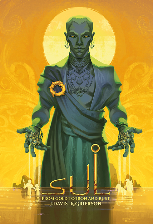
Previously Jacqui shared her story on making art for board games. And she has now contributed to a great number of games, like the latest Almenac – Crystal Peaks by Scott Almes. When I heard about her personal fantasy novel project I wanted to share it here on GreenHookGames even if it is not a game (yet! – keep reading…) I asked a few questions about the upcoming kickstarter for the first book ‘From Gold to Iron and Rust’.

Tell us a little about this project and your co-artist.

Sul started out as a written role-play between a fellow illustrator, Katy Grierson, and I, back in 2007. Since then it has grown to span many, many docs and lots of history. We decided it would be fun to share this with others by writing up a portion of the lore as a novel. Due to life events it got set aside for a few years, but in 2021 I decided to finally re-write and polish up the story.

What inspired you when building the universe of SUL.

I’m mostly inspired by reading, mainly history, and documentaries. When I hear something interesting I love to see how we could apply it to the Sul world and characters.

It is amazing that you both write and draw. How does that work? Did you write everything before you started painting or was it back and forth.Tell us a little about the process.

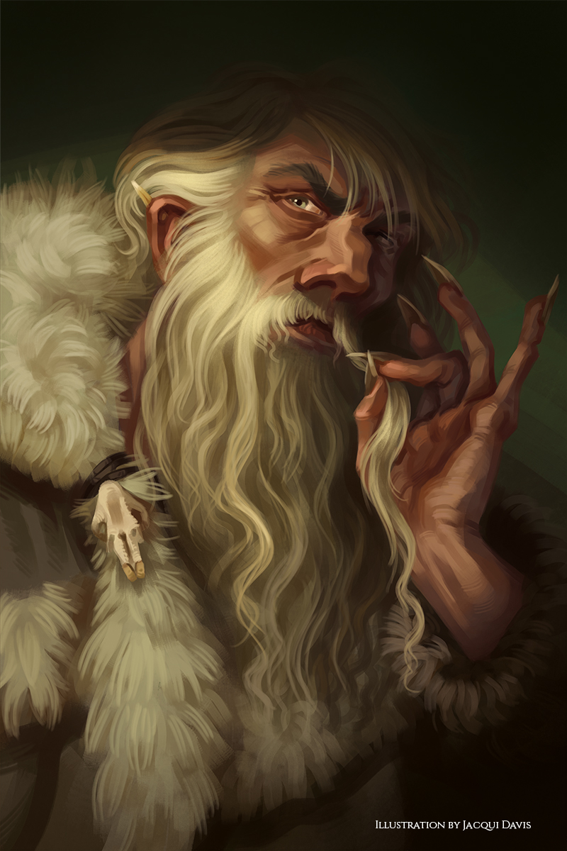
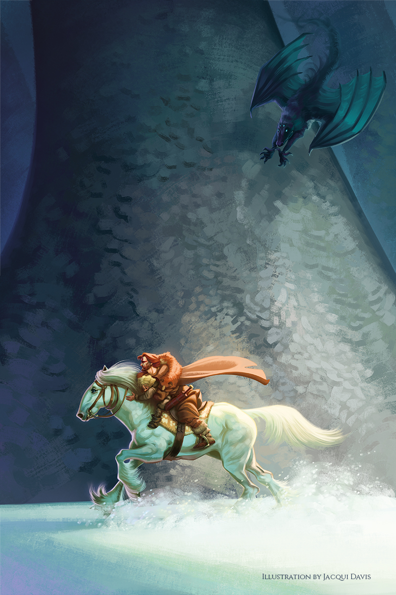
For the book, I wrote everything first. Then, for each chapter’s illustration I re-read and chose the scene that most fit each chapter. Or what stayed in my mind the longest after writing. However, I’ve been drawing the characters so long I don’t really need a description of them anymore.

What is the future plans on Sul?

Well, first I plan on writing and illustrating Books 2 and 3 in this particular story. There is so much history to get through that the problem isn’t running out, but rather choosing what to do next. I’d also love to bring out an audiobook and, of course, a boardgame.

If you find the project interesting you can get more info on the SUL website and sign up for notification when it launches.

Thanks for checking in on Greenhookgames. If you have a project I should know about – feel free to reach out.

The ART (tips) of Moogh

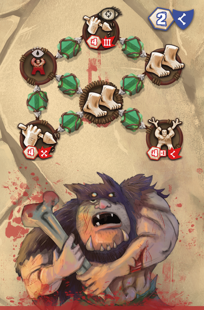
Moogh is a game that I both did the game design but also illustrations and graphic design. The great thing about being 360 is that you shape the story you want. I am so proud that the game is out there being played as Print and Play but I am also very grateful to anyone who backed the campaign.

I want her to tell you how I worked on Moogh illustrations. See the campaign here

Imagining a world long time ago

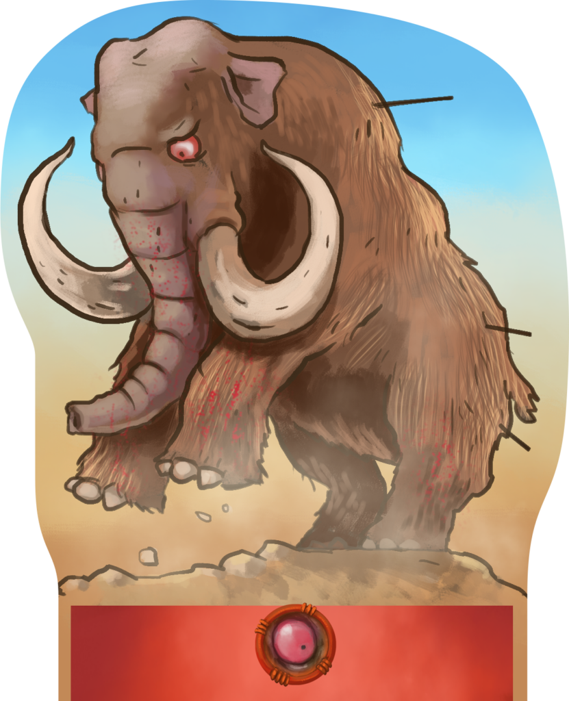
I think one af the big difficulties when illustrating Cavepeople and prehistoric animals is that the preserved history is made of some cavedrawings and archeological findings. So I wanted everything to feel like part of the Moogh universe – all from icons and interface to illustrations. But I also wanted to add flavour to the classic view of cavepeople, giving them more character and funny clothing. During the development icons changed several times but my original caveman laid the style. The following writing is more tips for illustrating than a Moogh specific story.

Size and format

Having to redo artworks can be a pain. I always try to get the right resolution and aspect on my artwork before I start. I Sometimes make sketches to test the full workflow from sketch to game. I often use https://www.boardgamesmaker.com/ to find templates for standard cards.. When all is right format and color space I can start. 

Scale

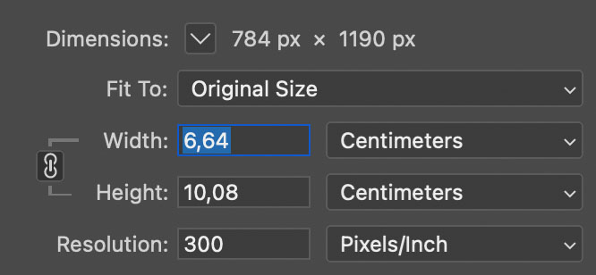
cmyk, rgb, 72 dpi or 300 dpi or a4  etc. This is something many designers want to know. I often hear designers say “ I don’t want pixel size – just centimetres” or “you don’t measure in pixels for print – you use dpi”.  Fact is that dpi, pixels and measure are a holy triangle. Change one and at least one of the others needs to change. DPI (dots per inch) makes most sense for printing material since it measures how many “pixels” will be put on the paper in each axis within one inch (2,5 cm ish)  – so you shouldn’t think or talk about dpi when you make anything online. But a monitor is often 72 dpi or 96 dpi if you really want to have a measure.

Imagine you got a facebook post – which is normally 1080×1080 pixels. How long is that in cm? well it depends on the dpi. If you print one dpi then it will be 1080 inches long (762 cm). So if you change the pixel amount – you either need to change the dpi to keep the length or visa versa. I probably lost you by now.

For print 150-300 dpi is sufficient. Print Shops usually want 300 dpi  . But when you make a standard card this is not very many pixels (about 1122px high). When I say not many – I mean for artwork. If your artwork is only in poker card size 300 dpi.. You won’t be able to scale it much up. So for cards I often use 600 dpi for the artboard – and then I later have the option to crop the image without losing quality (for a 300 dpi print)

Colour

Everyone learns that print art should be cmyk (cyan, magenta, yellow, black). And our game should be printed right? What colour space do I use for illustrations then? RGB. Yes, that’s right. Why? Well because you are probably not only going to show you art on print but also online lots of places. A monitor (since it emits energy from each led) can actually show more vibrant colors that we can put on print. Choose the most saturated pink in photoshop in cmyk and then change to rgb and you will be able to make it even more vibrant. This is the simple reason you make art in rgb and converts it to cmyk – because if you go the other way you will not have the best looking images.

rgb (lots of colors) -> cmyk (less vibrant colors)   /  cmyk (less vibrant colors) -> rgb (still not vibrant) 

Sketching

For Moogh I tested to sketch in Clip Studio Paint instead of Photoshop. I just love CSP – it is super responsive with your pen and has awesome functionality like using sketch layers lines to control fills on different layers or gap closing lines when you fill. I am also thrilled about CSP blending brushes – but with Moogh I exported the sketches with some fill layers to photoshop for painting.  Over time I have collected and sorted photoshop brushes and I keep trying to make groups of brushes that relate to a project so I can always go back and ‘replicate’ the initial style.

Coloring

Go wild. In moogh I really played with many different tones of skin color – and I really like that. 

Import to indesign

Sometimes I import a photoshop with several artworks into illustrator. The problem is that if you at a later stage change anything in layers visibility – InDesign will lose the connection and all images already placed will often swap. That is why it might be better to export each separate artwork in the file..

Moogh art has been done with care. I really tried to incorporate a lot of stone, plants and leather. And the characters should range from cool to dumb. I really hope you like the art and will have fun playing Moogh.

Secure your MOOGH copy here. Campaign is live

Best Niklas

How to Improve Your Digital Paintings (for Board Games): Part three

How to Improve Your Digital Paintings (for Board Games): Part three

Did you miss part I & part II ?

PAINTING

Focus on that brush

This was a big help to me. I used to have a big library of brushes and I always ended up testing every one of them when I was painting – making me unfocused on the essential part: PAINTING. I never relly knew what kind of brushes I had in my inventory. Often when you paint traditionally you would know the capabilities and how your pen or brush works and feels. It was time for a clean up! 

I made a new brush set with my 100 favorites (20 would be even better). With this limitation, I suddenly started to know how almost every brush worked when I was swapping brushes. Having one, two, or three main painting brushes can help you focus on the important stuff: volume and distance made with value and color.

Having one, two, or three main painting brushes can help you focus on the important stuff: volume and distance made with value and color.

Learn from traditional

In my early years, I started painting miniatures. One of the main rules in painting tin figures is not to start with the color of the object (like painting the hat yellow), but to start with giving the whole figure a base color. This brings harmony and depth to all the colors you choose to apply afterward. 

Most artists that have tried traditional oils or acrylics know that putting a so-called imprimatura (a base color layer) to the canvas before painting will help you choose more unified colors and values. Next time you are coloring your digital painting, start by adding a medium gray or brown on the background layer. You could even try starting out by taking a big rough brush and adding broad strokes and some tone variance in the background.

Build colors and shapes from big to small and from dark to light

You can actually go both ways, but, usually, it is much easier to define shapes and create hard edges when you make silhouettes in a darker color and then add light to the peaks in the shape volume. With miniatures, you sometimes have to go the other way because you could not layer a light color on top of a darker one.

Colors are an illusion of the mind

Using colors right can actually lift a simple drawing to something extraordinary. If you are not working in Corel Painter, which already has a color wheel, I would get the plugin ColorUs for Photoshop. I like how easily I can see the color relationships and how I can work in a small part of the color triangle and jump to extremes for emphasis.

In your next piece, also try to mix a color palette before you start and stick to it. Listen to this great podcast from Board Game Design Lab speaking to Ryan Laukat about art in games and if you want to have a give a real gaming experience check the info at cdwow.ie

Simple method of coloring

https://www.behance.net/gallery/28622315/Character-Design-Coloring-Tutorial

How colors can lift your work

https://www.behance.net/gallery/45289043/Casperade-winter-backgrounds

Great detail is not always great

At least for games. Of course, this is very subjective. Many players love details and can’t have too many. Personally, I like game elements less when they use huge pieces of art for their card design. It seems disproportionate to me. Next time you look at the images in your favourite game components, [2] examine the level of detail.

Unless you are a master artist, too many details can ruin the overall feel and energy of your image. This is also  a lot of hours wasted on something that may not have added value to the game.

I would advice to select only a few areas to add details to and instead work on contrast and light sources in the image. You could use contrast sparingly if you want to direct attention to a specific area of the image. If you browse art on artstation and deviantArt, you will see that many character paintings have much finer details in the face area and a lot less detail around the shoes or in the background.

Layers give options

Yes – but next time, try to work with only a few layers. With limited options, it is easier to focus on the important stuff. Try merging your linework and color layers and start painting on top of it so that your lines eventually disappear. Depending on the look you are going for, it can be fun to try.

MUD – a new pill in the box?

Pillbox Games – the creators of the beautiful Side Effects are launching something new. Last we talked with Ben Bronstein about his art – which you can read here. So I welcome Pillbox back on GreenHookGames to tell us more. Digital marketing may include a full suite of methods like social media advertising, email newsletters, affiliate programs, online trade shows, marketing video etc. With so many methods and techniques, you may have a hard time developing a marketing strategy for your business. That’s why you should narrow down your options and choose the best strategy that works.!!It is best for your to read this post here, for the best marketing services.

Start by telling us how Side Effects was received. 

I couldn’t be happier with the reception we got, especially considering it was our first game. Every person who worked on the project gave something special to it. Have to give credit to Panda GM for how fantastic the final product came (especially the pre-press team).

Work in progress

Good – now let’s hear about the new game ‘MUD’. Why did you make it and what is it about?

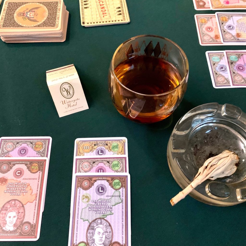
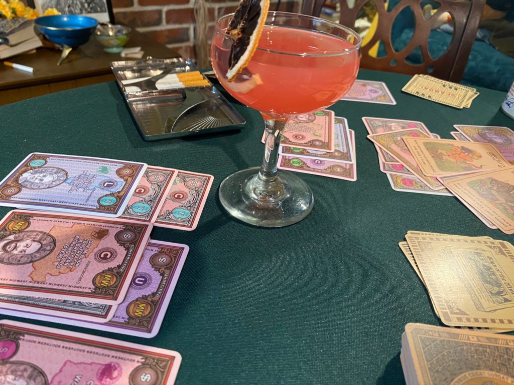
I think it was inevitable that given our interest at Pillbox Games in making real world systems into games that we’d eventually make our own spin out of the ultimate real life game: Politics. Especially given the current environment there has been constant fodder for game scandal concepts. That being said, we made a concerted effort to draw bipartisanly from a wide range American history and not to focus too much on current events.

MUD by Pillbox
Work in progress
Sketch
Work in progress
Work in progress

That sounds wonderful and explosive 🙂 Looking at the images we see that you are somewhat staying true to your elaborate and perfected graphical style. It looks great. What considerations have you done about which art style to go with?

I think if you enjoy tabletop gaming to any extent, you have to enjoy systems, and figuring out a system to convey the information we had in mind was incredibly fun. First we wanted to reference actual American documents, so government emblems, campaign posters, vintage ballots, political cartoons and currency were the first thing we collected and referenced.

Then we had to figure out a system of conveying numerous parallel suits to our cards without confusing the player too much. (A little confusion can be a good thing, as it allows a player to sneak by or deceive their opponents during gameplay). Rather than having multiple suits in the style of a poker deck, we realized that utilizing the entirety of the card was the best solution, click to see the game and start playing. We basically have 3 suits; political leaning, economic class, and region. After a lot of tweaking, we realized the background pattern was best for political leaning, the border was excellent at conveying economic class, and then a central piece of art could clearly show a regional map. After that, we just had to figure out unique and differentiable color schemes for each category. 

Work in progress

Is there any place to go if we want to stay updated on the release and your works?

  • Instagram @Pillboxgames
  • The PillBlog on our website (pillboxgames.com)

I’d say Pillbox’s official instagram is the main place you should stay updated for all our games. Once we launch, I’m sure our Kickstarter page will also be just as prominent. My personal social media postings have basically dried up since the pandemic. 

Kickstarter launches on October 6! And you can still buy copies of Side Effects at pillboxgames.com.

THANK you! We will keep an eye out. And thank you for sharing a print and play here.

Print & Play: 


On the cover with James Churchill

You know those box covers that just seem to not only capture the atmosphere of some distant place – but also are soo well balanced it is the perfect board game cover? That is how I feel about James Churchill’s illustrations. I hope you can be inspired by this interview about his art. Welcome back. If you changing your home or office the most important things that you have to consider is the moving company.

Tell us a little about your artistic background?

I studied Graphic Design and Fine Art for 6 years at University from 1985 to 1991, which included life drawing, illustration, painting, photography and sculpture. For the past 30 years, I’ve been working in Theme Parks, Feature Films and other areas. I’ve only been working in the game industry for the past five years. 

Continue reading “On the cover with James Churchill”

Illustrations on the border to board games – by Evgeny Viitman

Is a digital board game a board game? Where do you look for artists for your game? I find inspiration on behance.net among other places – and that was where I found Evgeny. I immediately fell in love with his strong expressive comic characters – and several of his works looked like digital games playing with analog references, while if you want to play games to make money online there are options like robin roo casino for this. I hope that he will be working on a board game project soon – his art rocks! If you enjoy board games you may enjoy to online gambling at http://cityout.lt/what-are-no-deposit-bonuses/ you can find all what you need to know about this kind of games. Check out the casino seuz to enjoy this game.

Check this website vipcasinosites.com it is a great casino online that has a lot of options for you to have fun and win prizes while you do it.

Hi Evgeny – where are you from?

Heyo! I was born in sunny Alma-ata in Kazakhstan which is right on the border with China, surrounded by beautiful Tyan Shan mountains. When I was a teenager my family moved to Siberia (still a big mystery for me, why), at the age of 23 I moved to Europe, to Prague, where I spent good 6 years of my life, then moved to Berlin, now me and my family are based in Barcelona.

Tell us a little about your artistic background and how did you end up working with art for games?

I am coming from a family of theatrical artists (my parents are scenographers and character designers working for theatre and also teaching painting, drawing and sculpting at the Art Academy, so I was exposed to art since I was born. Nevertheless, because of my teenage rebel feelings I wanted to become everything else but an artist, I chose to study physics, but life has directed me to follow the path of my parents and with time I switched to art anyway. My first experience as a game artist was in 2006 when I was working for Unigine.corp as a 3D artist/animator. Then it all started – I tasted the gamedev and dived under it’s muddy waters.

Have you ever worked on any board games or card games? 

Continue reading “Illustrations on the border to board games – by Evgeny Viitman”

Vibrating lines from Cam Kendell

Illustration by Cam Kendell from the game 5-Minute Mystery

Some of my favorite game art is polished yet expressive and distinct at the same time. When I came across the board game 5-Minute Mystery I knew that we needed to feature the vibrating lines from the illustrator here on GHG. The name is Cam Kendell and he is from Utah, USA.

Tell us a little about your artistic background? 

I grew up drawing countless Ninja turtles, He-Man characters, and an endless supply of Jim Davis-esque animal characters. Comic Strips were my main form of artistic outlet. I drew a lot up until High School when I slowed down to focus on Music and learn to play the accordion.

Continue reading “Vibrating lines from Cam Kendell”

Zoom in on Sophie Wainwright

Just before Essen, I was contacted by a Núria Casellas, from Cucafera Games. She was curious if I would take a look at their newest game ‘Zoom In Barcelona’. If you attended SPIEL19 you might have seen the game. I am always happy when designers or artists contact me about their project so I Zoomed in on the game. It is with great joy that I share this interview with the English artist – based in Barcelona: Sophie Wainwright.

Tell us a little about your artistic background? 

Without sounding like too much of a cliche, I’ve always been interested in art. I was drawing at a young age and it’s something my parents have always encouraged. 

As a teenager, I used to play online games and would sell illustrations of players’ avatars to make gold etc.

Continue reading “Zoom in on Sophie Wainwright”