The 10 best looking FREE titles in the Hookbox Challenge

How big a role does good art play? I decided to select my 10 favourite best looking games from the 129 entries in the Game Crafters Hookbox challenge. Showcase them here to later see how many of them that advance to the semi-finals. Many designers did not put up a download PNP which I think will be going against them in the rating…or will it? To also investigate that I will select a few of the most visually interesting looking games and write in the end.


And off course like in life it is what is inside that matters most – but this is an art investigation. Sorry.
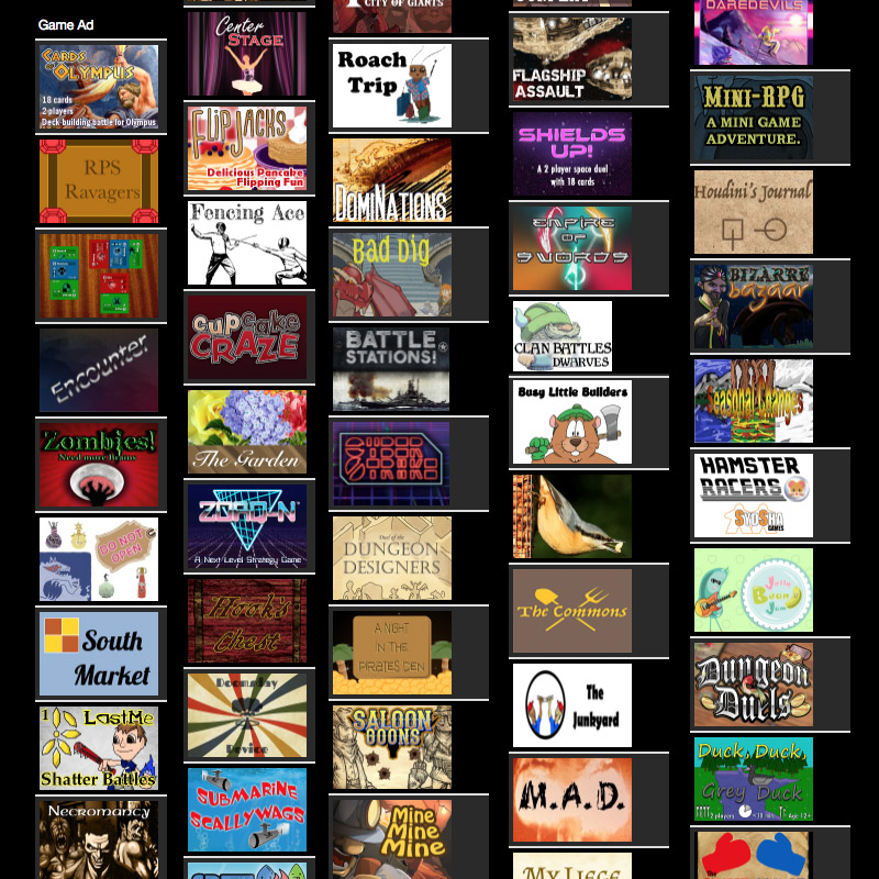
 

129 entries in the Hookbox challenge

Art is generally a problem if you are a solo designer with no art skills. Many designers will find good places of royalty free images they can use for the cards – and that is a great idea to do for your prototype.  In many cases I feel this unfortunately make the game impersonal and generic – but it  depends also of the graphic design. But how important is the looks of a game? It is safe to say that people will generally agree on good art but in the many cases also be very affected by taste in themes. This is a few reason you need to find someone to help with your art.


  • The theme and story of the game will be more saturated – making the game more immersive
  • If you got good art – you probably invested time in the game, making it more likely to be tested
  • The game will be more unique and memorable
  • The art can be explanatory, and help players to understand the game rules.
  • Maybe increase your chance on a vote in a competition like this – we will see?


You could have a very illustrative game with few graphic elements, visa versa or a combination. I consider myself as an versatile artist that is quite good at both but definitely not the best (The best artist out there you will find in the Interview section). Sine I like game designing I usually tend to do a more clean graphic style in the game art because it is quicker and more flexible to work with and it can be pretty & functional at the same time (like the classic Innovation) . Unfortunately this usually sticks with the game and it is hard to find time to redo the art. There are many of the games that got handdrawn or more of an amateurish style but this can actually be really cool and authentic. Just be sure to keep it consistant.
For my own game I payed for the community art review that you can get on TGC. I payed because I was sure to score high and I wanted the badge to be an eye-catcher on the shop page. I only scored 80+ which first surprised me but when I thought about it made good sense. I have no story telling and different artworks on my cards. They might be pretty but when you see 9 almost equal looking cards on a page with no real motif it is not better than 8or9 of 10.


Now let’s get to the top ten – there was a lot of close ones to get to the list like, DomiNations, Commons, Canyon Racers, Heist, DuelofTheDungounDesigners, Starfighters, Shilds Up, Armour Up, Inconceivable,

The top 10


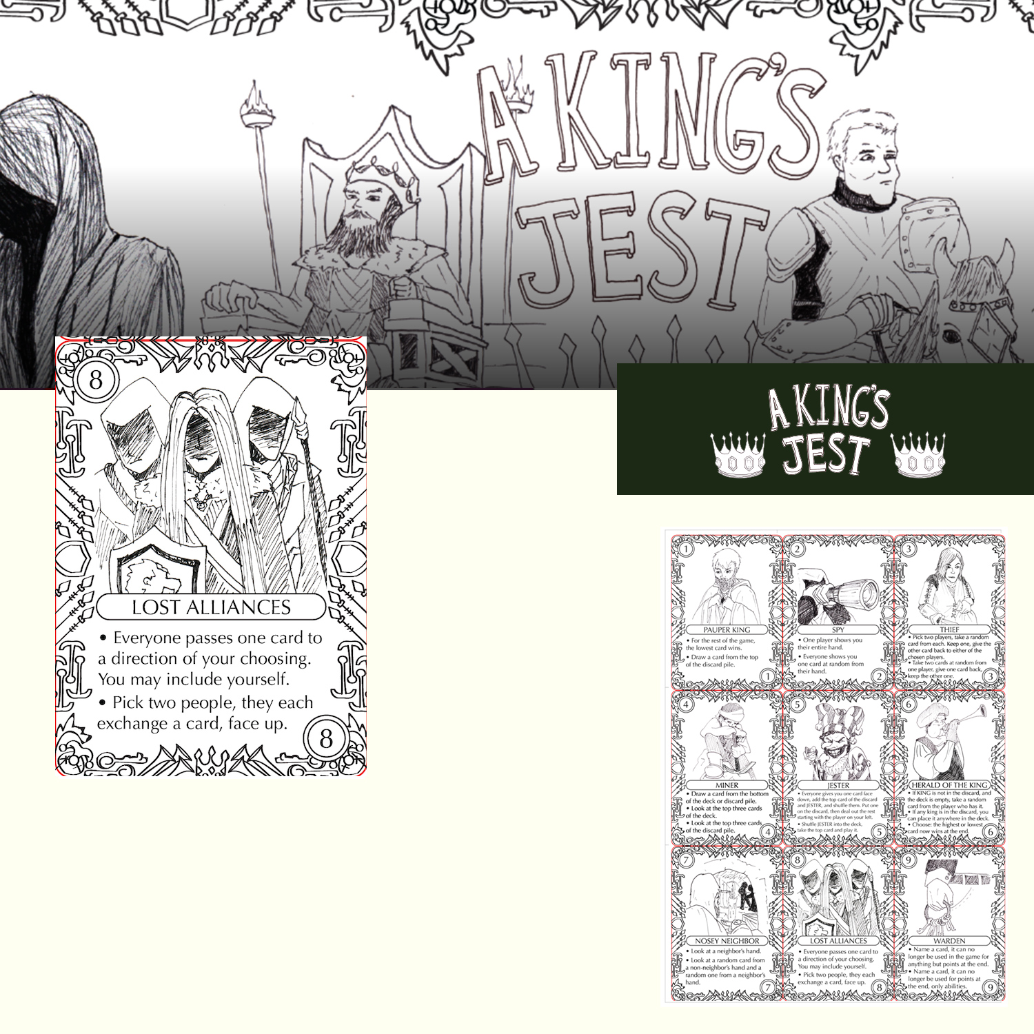
Nr. 10a A King’s Jest

Illustration:3

Graphic:3

Vibe:4

Even it this is not high quality final art – it really shout ‘indie game’.  And the work is detailed and consistent  – which make is vey appealing.
 

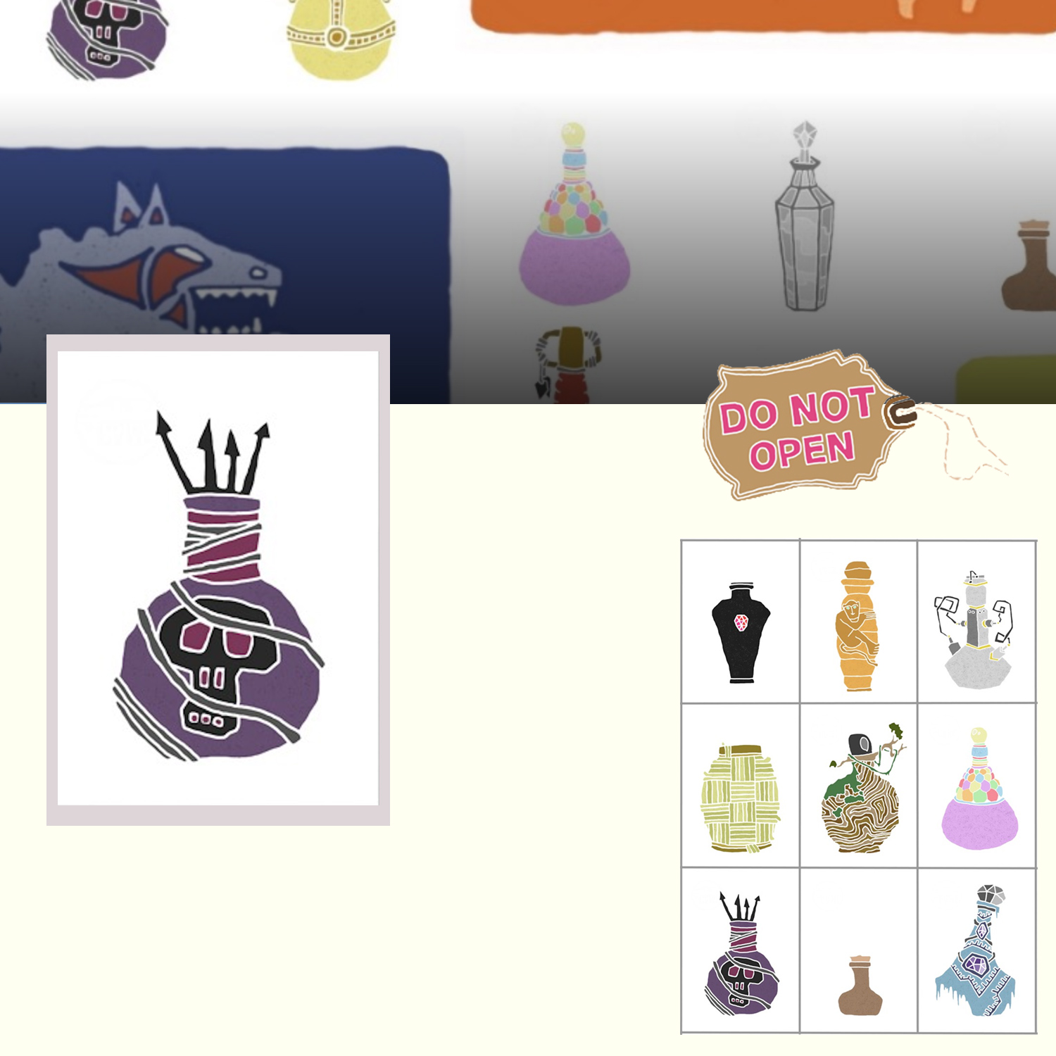
Nr. 10b Do not open

Illustration:5

Graphic:-

Vibe:2

Absolutely gorgeous illustrations. Also a bit ‘naive’ – which I like.
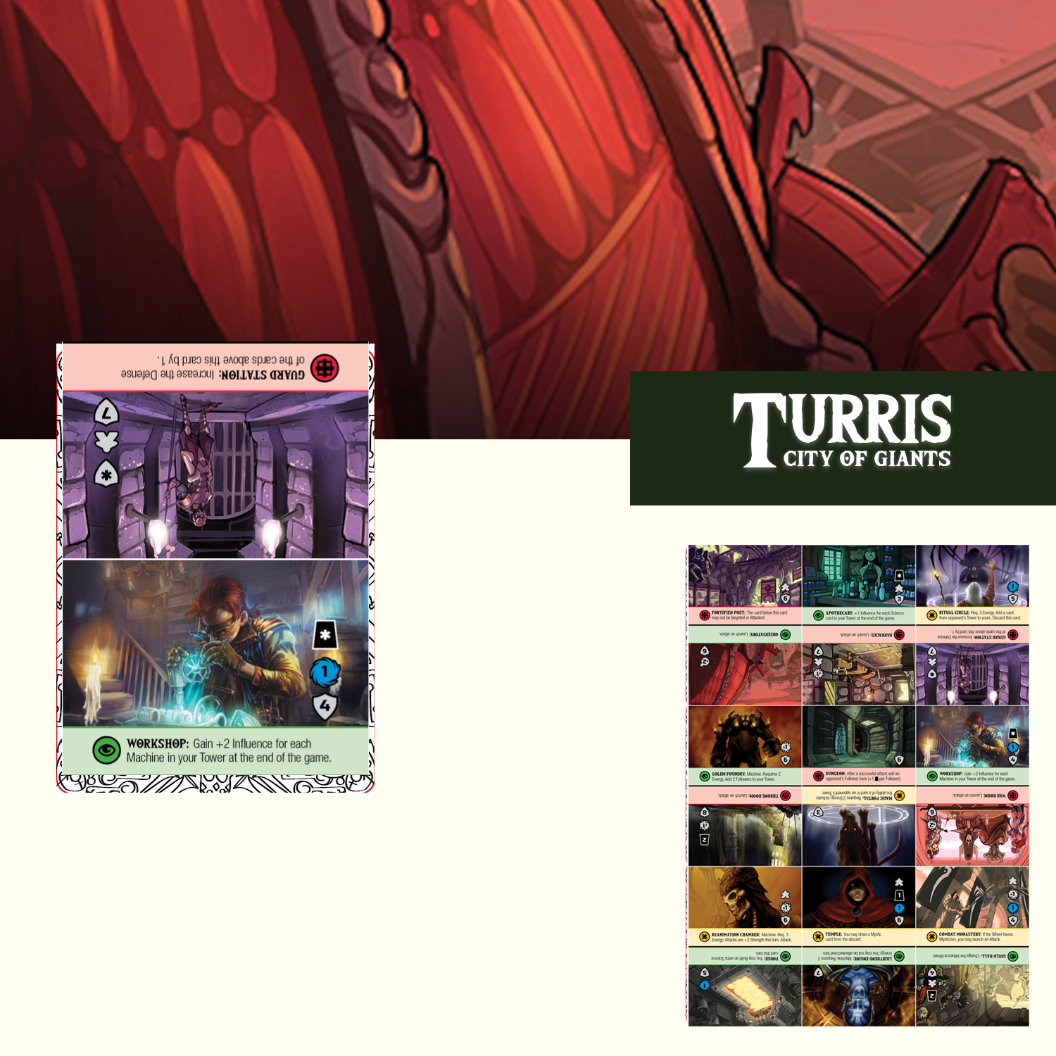
Nr. 9 Turris – City of Giants

Illustration:4

Graphic:3

Vibe:5

I do not know how much of this was painted for the game. It seem like a lot of collages with paint on top -BUT hey! it looks fantastic. And there are so much going on it really triggers your curiosity.  
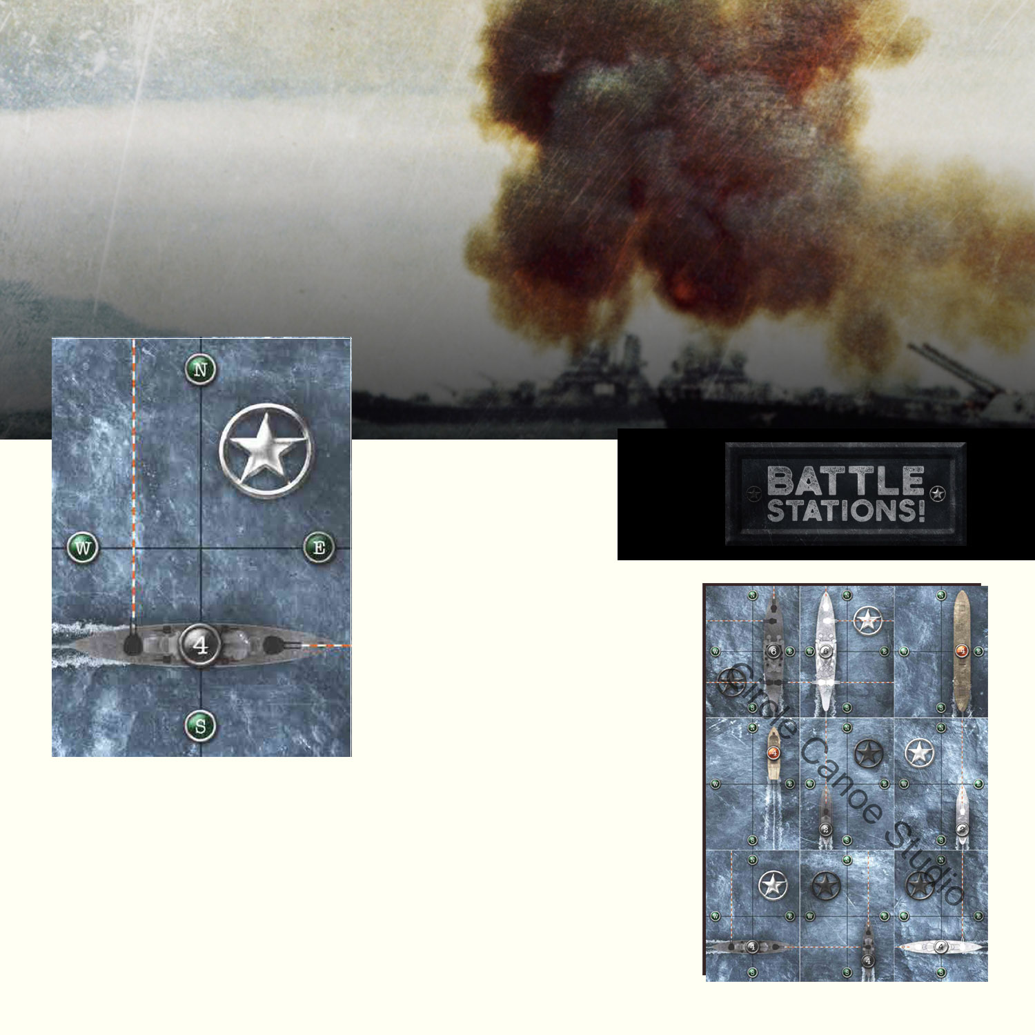
Nr. 8 Battle Stations

Illustration:3

Graphic:4

Vibe:3

I was in doubt with this game. I think it really captures a war atmosphere. The design is very nice – and I LOVE the water.
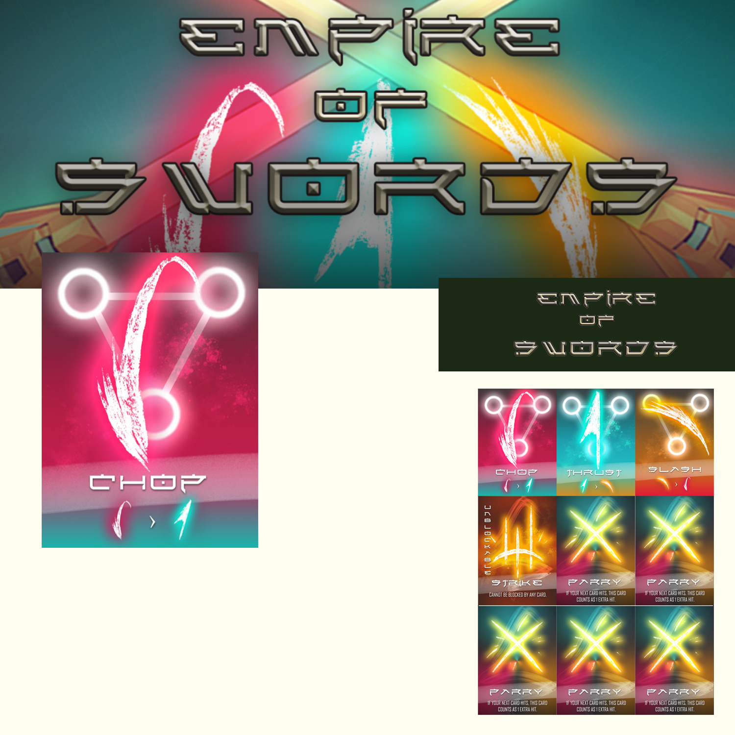
Nr. 7 Empire of Swords

Illustration:3

Graphic:5

Vibe:5

The use of glow, colors, hard lines and grunge brush strokes creates a very strong and appealing visual style.
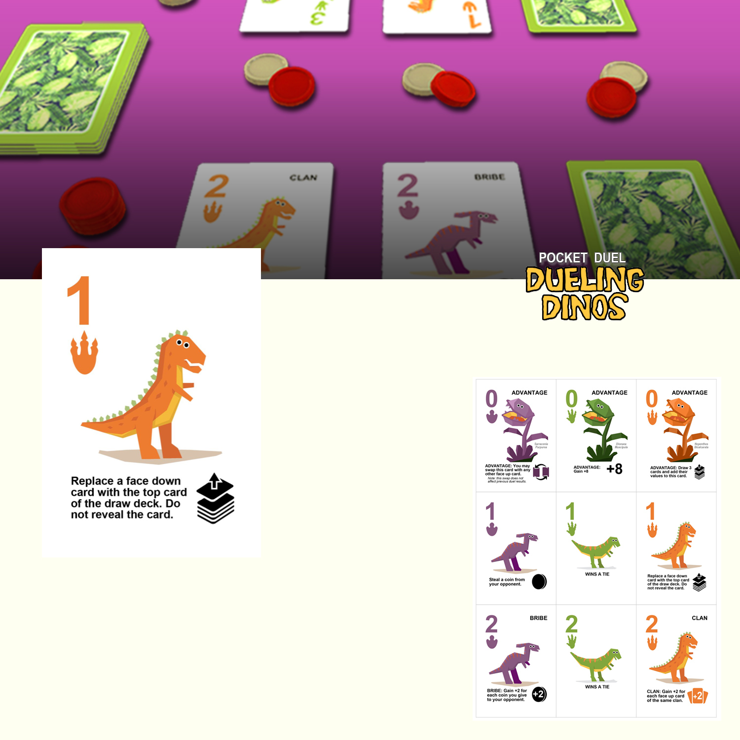
Nr. 6 Dueling Dinos

Illustration:3

Graphic:4

Vibe:3

This leans to how I would normally approach a competition. It works graphically and got some cute looking Dino’s. I like!.
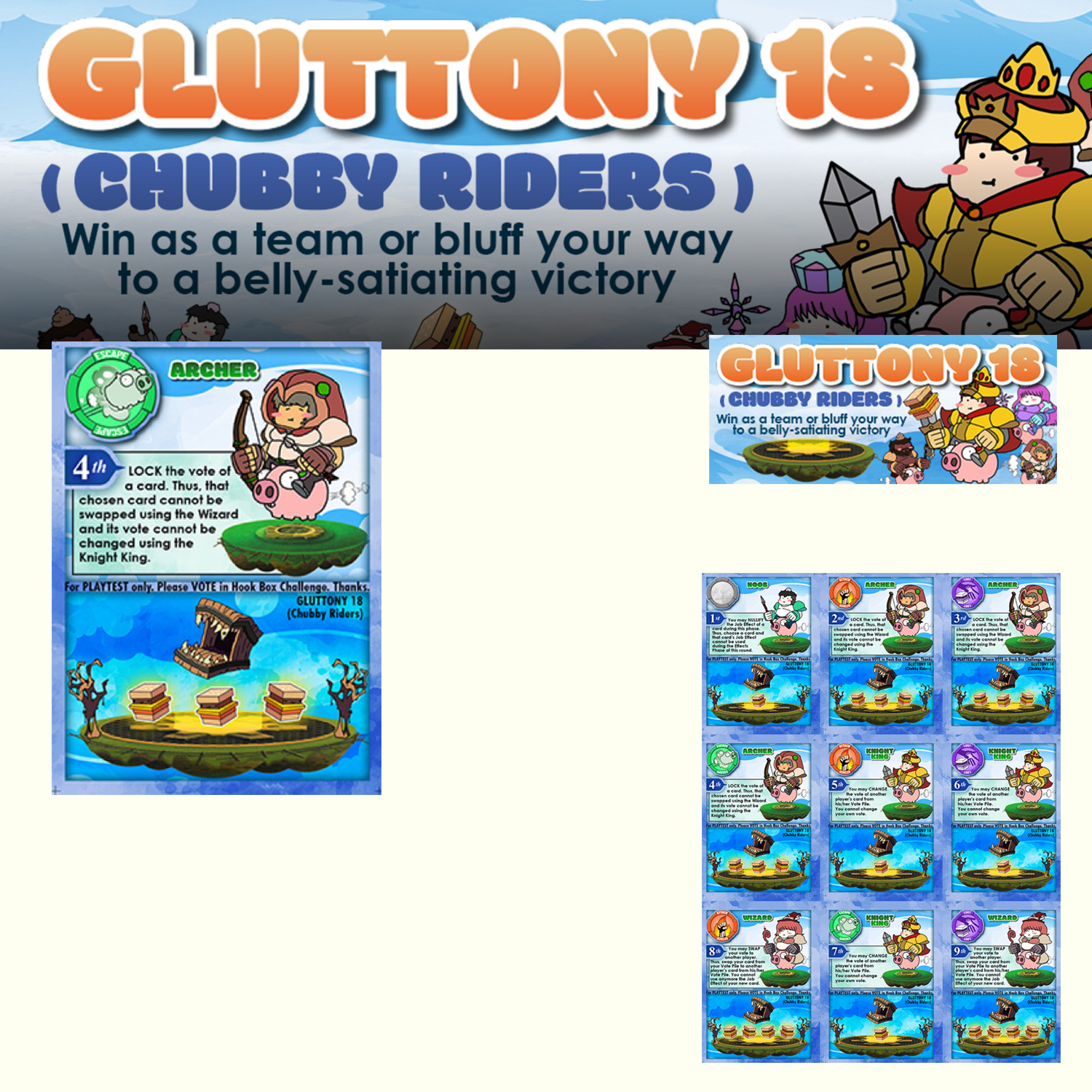
Nr. 5 Gluttony 18

Illustration:4

Graphic:2

Vibe:4

This oooze of fun and gameplay. I get digital associations especially to “The Fat Princess!” on my Playstation. 
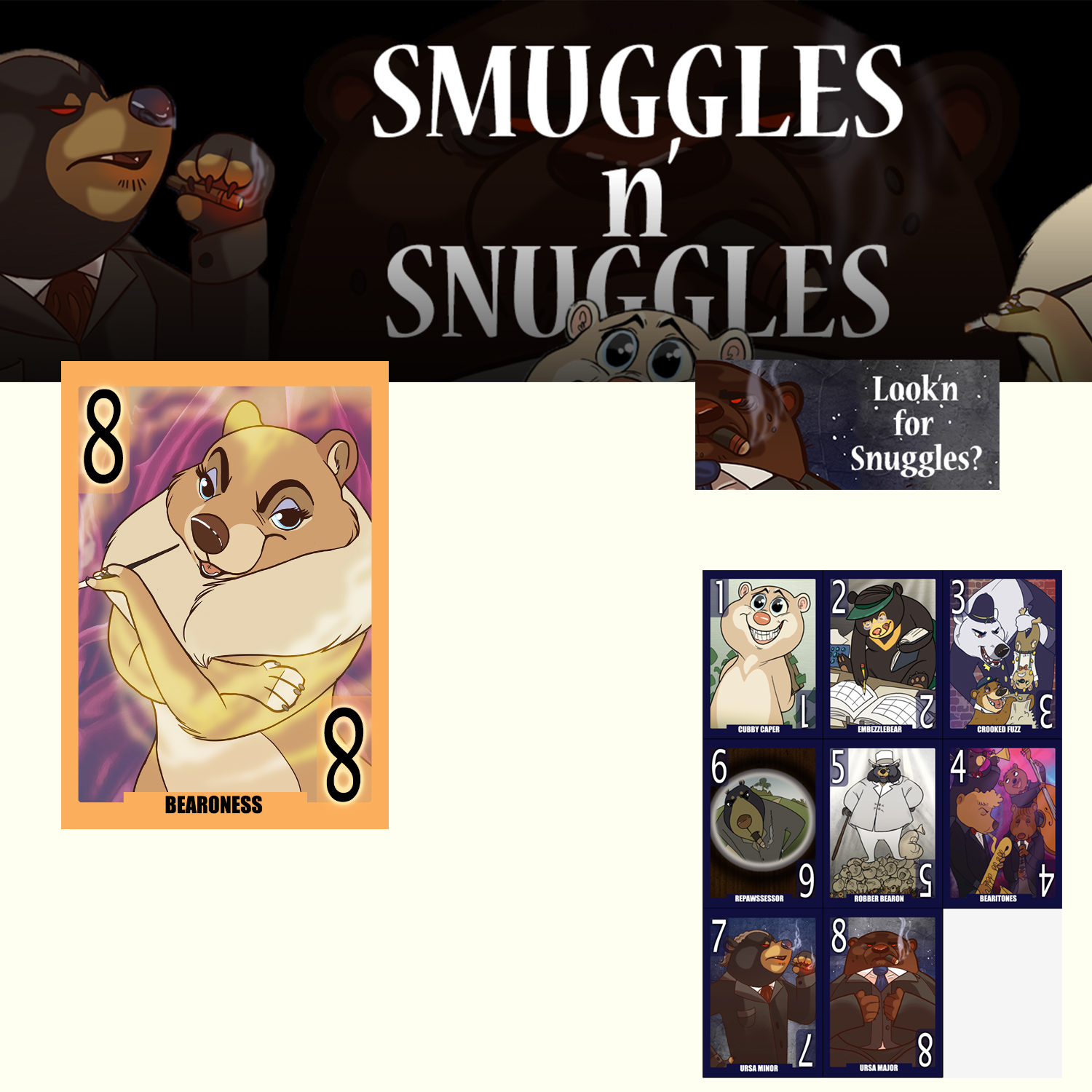
Nr. 4 Smuggles n’ snuggles

Illustration:5

Graphic:2

Vibe:2

This is really fantastic character design and linework. It lacks a bit in the graphic design and colouring IMHO. 

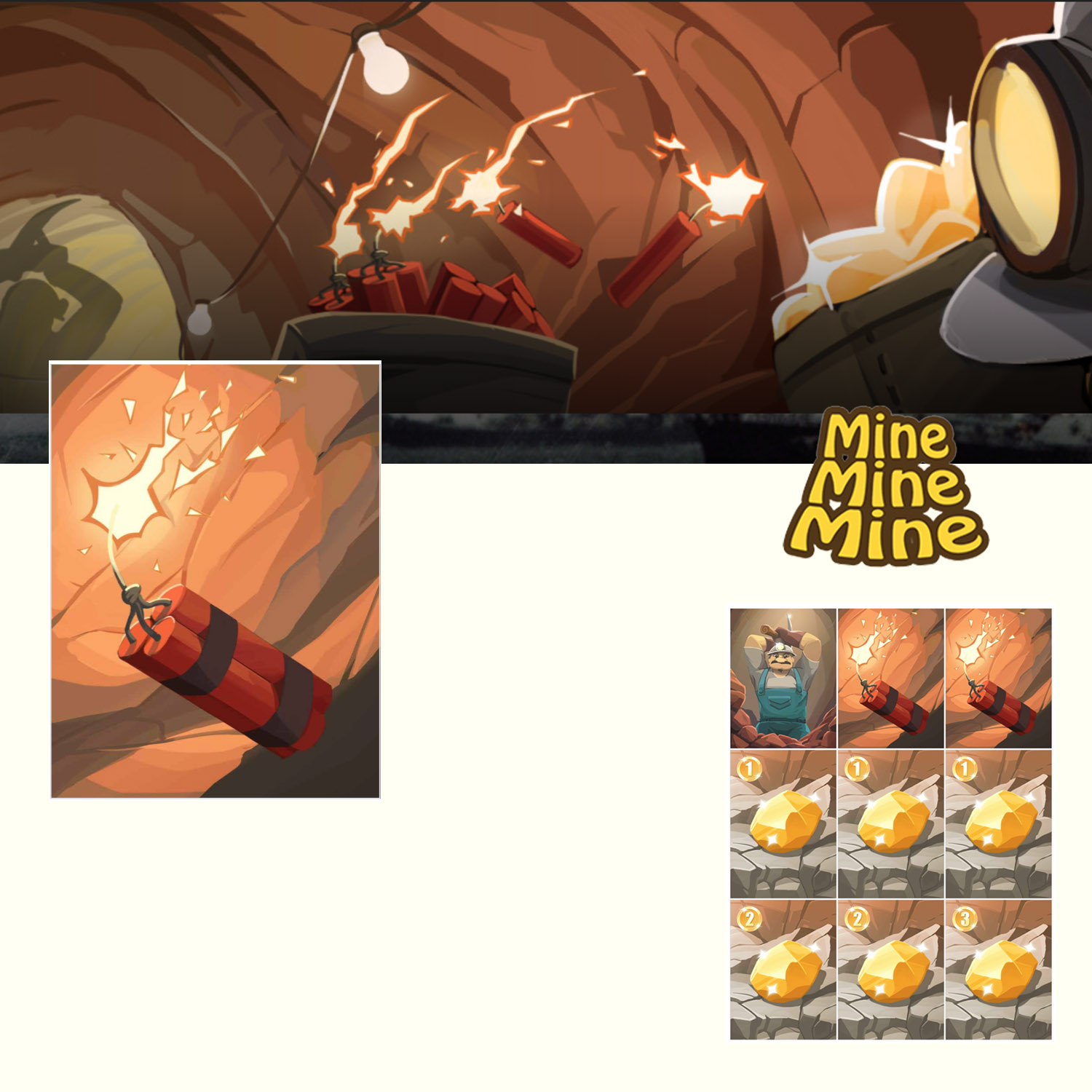
Nr. 3 Mine, Mine, Mine

Art by: Moy Shin Hung

Illustration:4

Graphic:3

Vibe:4

Strong illustration. No outlines and in your face coloring. It really pulls you in.
Nr. 2 Mission Control

Illustration:4

Graphic:4

Vibe:5

Spectacular style. Even if it might be a collage of images that has been given an series of effects it is consistent and very cool looking.

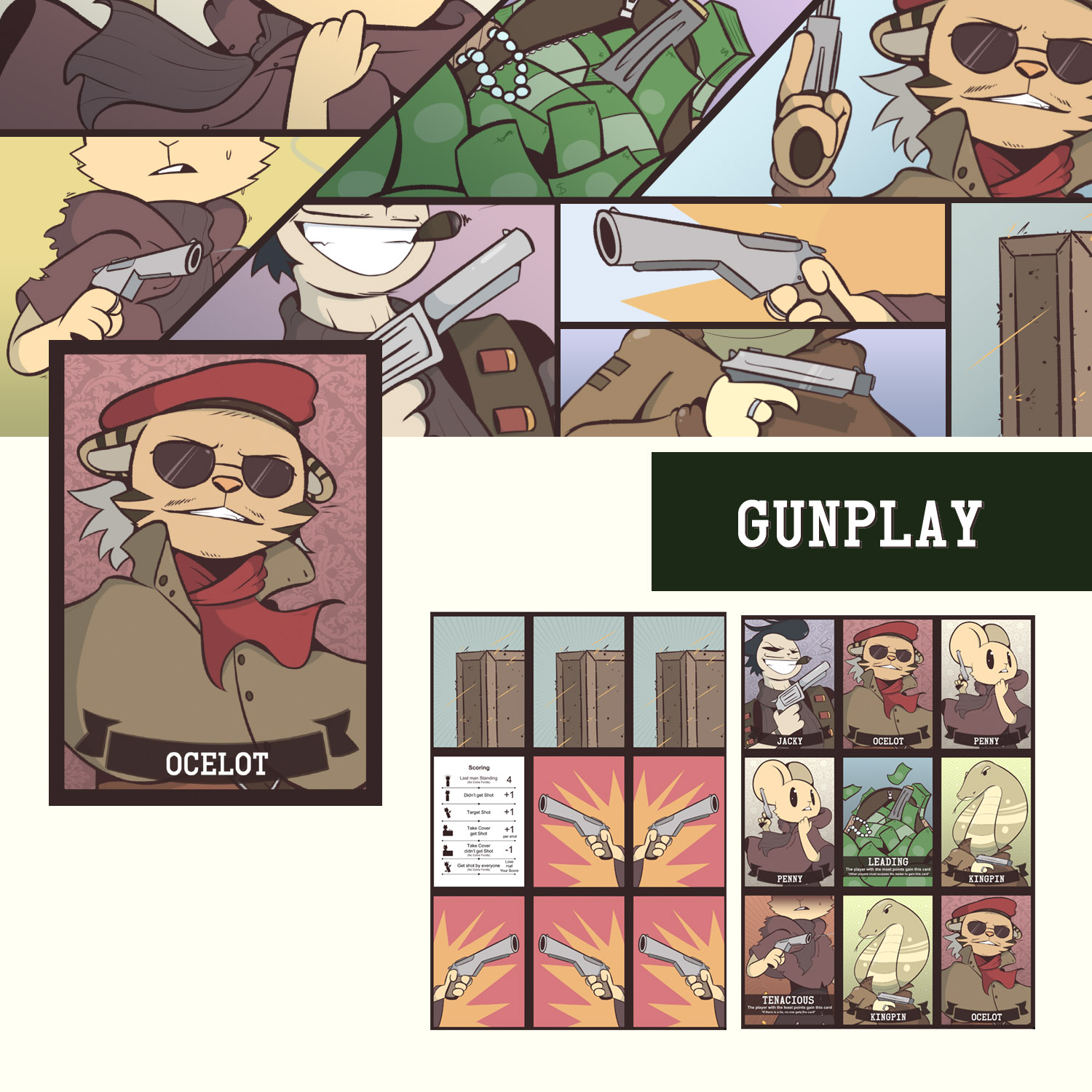
Nr. 1 Gunplay

Art by: Pha Chau – theArtManor

Illustration:5

Graphic:4

Vibe:3

Wonderful images. A harmonious color pallette. Nice type and elegant layout. Clean and cool character design
 

And to the many games that looked really cool – but had no free PNP – sorry!. I will write som here to see how they do.

Doomsday Device

Saloon Goons!

The Coup

Totem’s Call

Fury Road

Crazy cat laydy

To all the winners – all 11, are free to use the Gold Hooked award badge.

By Niklas Hook


Enhance your game design with sensory words

Sensory board game design

Each year the game developer Chris Hansen host the Children’s Game Print and Play contest on Boardgamegeek.com. A contest where you can make a game for kids — together with your own kid. This year I really wanted to take part in the contest again this year. The beauty about this contest is that since you have to make a SIMPLE and FUN game that even kids can play it forces you comply with an important design concept – simplify towards the core experience. Which too me can super difficult.

‘Got it kiddo?’ Illustration by Niklas Hook

The idea I chose to work with is based on a behaviour rooted in human nature — “the Hunt”. I have always wondered why most kids instantly get the adrenaline flowing, smiling and shouting when we shape our hand as a claw and say

now I am coming to get you — you little rascal!!

sometimes you don’t even need to say anything! My goal was clear; could I translate the excitement of a chase or a Hide and Seek to a board game?

‘Hide and Squeak’ — Illustration by Niklas Hook

What adds to the feeling? When I see my kids feet stick out under the bed I usually stomp hard and heavy in the floor while slowly moving closer. So times I mutter “ Wheeeerrree is she hiiidinng?” The fact that the kid feel like she is hidden but know any movement or sound could giver her away and let the beast capture her and then… Well that’s another thing — they don’t think rational on what happens if they are caught. Is anything happening ?— will I be tickled….eaten maybe?

In my search for a core mechanic I found — Onomatopoeia! Words that imitate the sounds they refer to, like purrr or bang. Not only would using Onomatopoeia make a fun hidden move game but it would build on the imagination of sounds which I later realised is a perfect match when trying to build immersion in a paper game.


I will send my readers a PNP of the game when it is done. If you haven’t already – you can sign up here


In my further search for sound words to use, I realised how important the use of sensory detail can be to game design. Sensory words is words related to all our senses  like sight, hearing, touch etc. Using sensory detail in your text will light up different parts of the reader’s brain compared to non-sensory words.  Like writing  ‘The dark n’ damp Catacombs’ compared to just ‘The Catacombs’.


Read the full story on Medium here and give it a clap 🙂

https://medium.com/@mailhooked/sensory-game-design-a030fd545ea9

Trick on visualy formatting your data sheet

Google Sheets is increasingly becoming my go to tool in game design. It is a great way to get an overview of your game data, do quick changes and calculate on balance. But sometimes it can be too crowded to get a quick overview. Sometimes it can be nice to get a visual aid to indicate when row of a new type of cards starts or see how many positive versus negative effects you got. And to do this there is a little trick called “Conditional formatting” found in the menu under “Format”. This let you select a text, word og value to look for in your cells that you then can define a special color styling for.

In this mini video example I show how I use it to mark different resources, and that way I can quickly see which type of resources I use the most.


Cathedraw a roll & write for GenCan’t

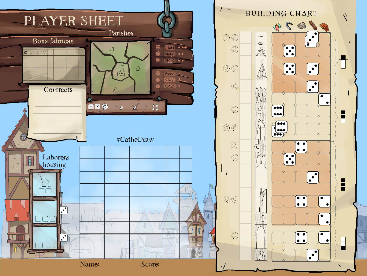
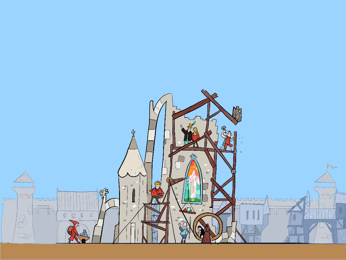
GenCon is far away when you live in Denmark. That is why I liked the idea of the GenCan’t Roll&write contest and felt I should make a design for this incredible fun format. This is how I got to start on Cathedraw. It is a game where you draw a Cathedral in 9×9 grid. After finishing the game I wonder if it can be called a Roll&write since it does have some cards that needs to be cut out (optional though). The game is purely about optimising the use of your dice rolls to create most victory point value. If I should do an expansion I would definitely make some bad stuff the player needs to avoid. I will happily try to answer any rule questions you got – just mail or tweet me.


GenCan’t release all games for you to play on their page – and it is a magnificent collection. I am looking forward to play the winning game Welcome to DinoWorld by James O’Connor but I also had an eye on the game ‘Raise The Shields‘ by Lucas Gerlach.

I hope some of you will give Cathedraw a spin and I would love to get any type of feedback.


Go to game page


Files for game

(Sing up for the newsletter to get a code to download the full color & multiplayer version for free.)


Thank you,

Niklas Hook

How to play video

7 visuals styles that I would like to see in the future

7 visual styles I would love to see used for board games

The visual style of a game can make just as much of a difference as the choice of theme that a creator choose. Within animation and video games, there have been a wide exploration of different visual styles.


Bound from Plastic Studio


Board games has a tradition for classic illustrational work topped with some graphic design. Probably because games must be decodable for the viewer -high contrast between flavor and information is great.

Continue reading “7 visuals styles that I would like to see in the future”

How to Improve Your Digital Paintings (for Board Games): Part two

Sketching

It is much more important to make good sketches than good inking. You could either sketch directly in color or start in greys. Fix proportions, composition, anatomy as much as you can in this phase before moving on.

Start broad and stay broad

Starting out very rough can improve the final product a lot. Make a small canvas in the proportions that you plan to do the final artwork in. When I say small, I mean like 10% the size of your final image. Take a simple brush that can put down a thick line. Often it fuels imagination if you set the brush to use pressure-sensitive opacity, but not necessarily variable size at this point.

In this step, you should do several quick sketches of all the different ways you can think of composing the image. Work quickly with shapes and composition – draw loose lines, use the lasso tool to quickly create shapes, or fill your lines. You may insinuate detail, but only very roughly. Try to make a lot of scribbly lines quickly when you draw. Often the eye will later see shapes within these lines.

Do not hesitate to quickly select an element and cut, flip, scale, position, or rotate it to get a better composition.

Think series

Since we are talking about images for board games, you will probably be doing more than one image. Maybe you need 22 hero items or monster cards, and for sure you need to know everything about games and you can get all that in oneclicksports.co.uk

Try designing several at a time, thinking about how they are all part of the same visual language. This may include size, distance to the viewer, details, and colors.

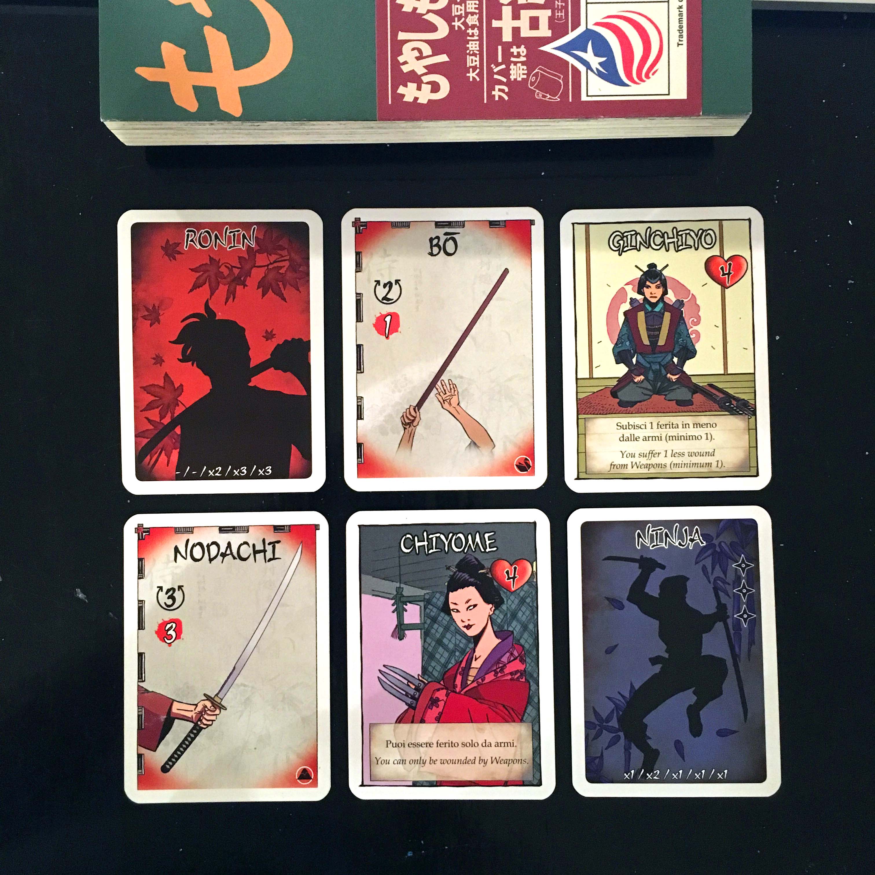
Samurai Swords

In the example above from Samurai Swords, there are two characters, two role cards and two weapon cards. Apart from the motif do you spot any similarities on icon positioning, background patterns, element behaviours?  This might seem obvious but it is a great benefit to think game readability in designing series.

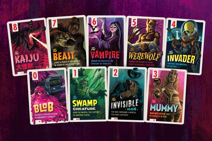
Campy Creatures from Keymaster Games

Look how well the series is made from Keymaster Games latest game Campy Creatures.

Series have rules – too much deviation from these rules will break the benefit of the series.

Remember that elements of the game can be tied together using the same type of composition or colors. Series have rules – too much deviation from these rules will break the benefit of the series. If all item cards have a red color palette, you cannot suddenly make one card another color unless there is a specific game-related reason.

Tschak by Dutrait

Play with series of images. My favourite example is Dutrait’s character cards here. You can also give the players stuff to discover, like the vials in Apotheca by Del Cid. This is the power of game art – often there are multiple of the same type.

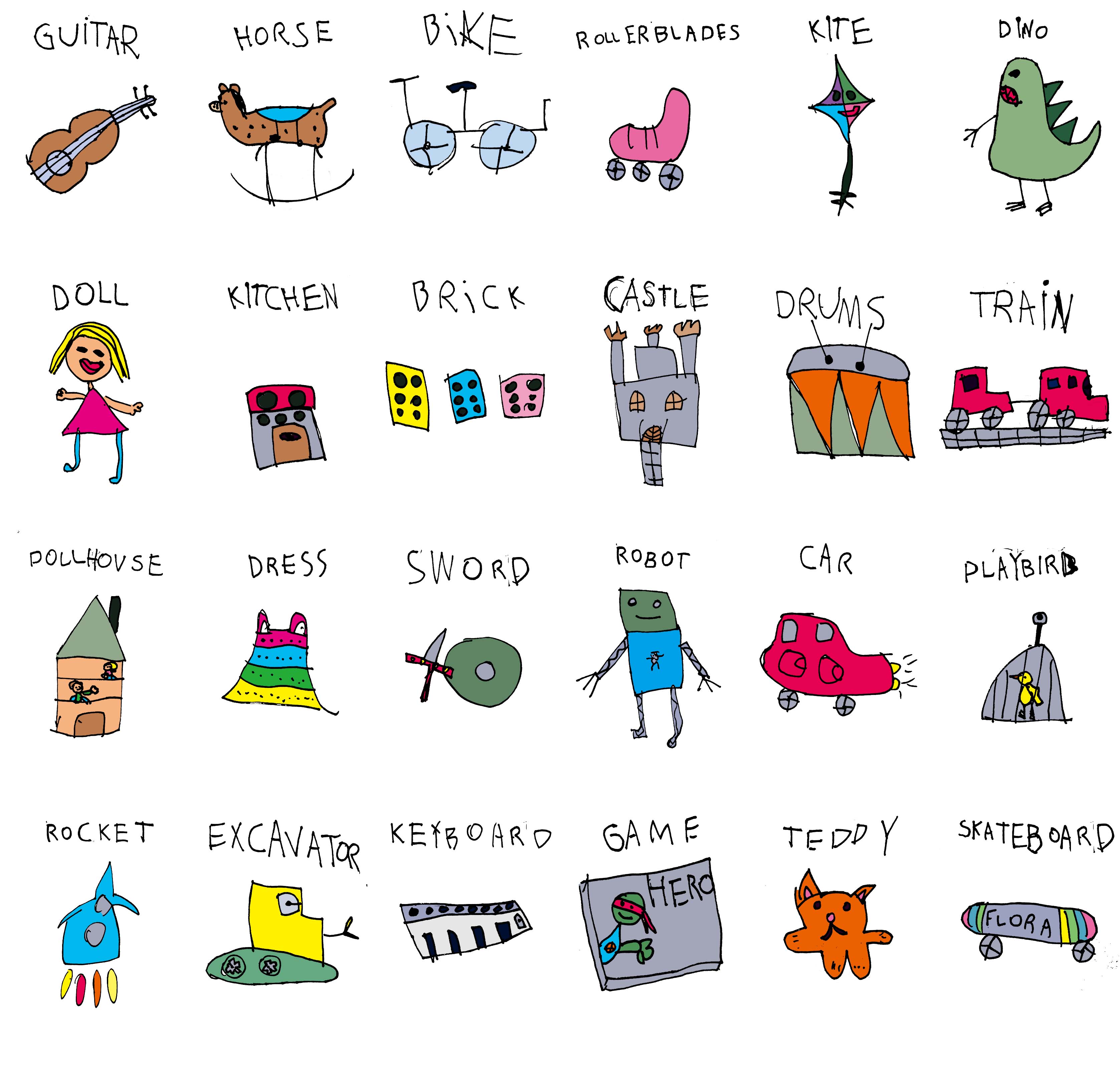
Have you ever done a nice drawing and hung it on the wall? If you have ever tried making 5 similar drawings, but with some variations, then you probably know how awesome a series of images look together (even if it is stickmen).

My daughters drawings for the game ‘Dear Santa’

If you are working on a series of images it might be a good idea to start up several illustrations at the same time so you can jump between them with “fresh eyes.

2. LINES

If you normally tend to do very precise inking of your sketched drawings before coloring I would advise you to try and skip the inking. Maybe just ‘clean’ your sketch. 

If you are going to ink your piece, I would select one or two brushes beforehand to use. I would make one brush, that is a little rough on the edges to add life to the painting. Try to have a lightsource in mind when inking so you can make the edges towards the light thinner. If your tablet causes jittery brush lines, I recommend HejStylus, a small mac software that can steady your “mouse” across all your applications. Some programs like Clip Studio Pro or Zbrush has this feature implemented. I found that it is a strong tool to have in the bag to turn on/off with a simple shortcut for making awesome linework.

Getting another artist brush can sometimes inspire you to paint in a new way. Here is a small selection of my brushes for Photoshop that you can download and try out. There is a sketch brush thick, a sketch rough, a lineart brush and a paint brush.

Here is a small selection of my brushes for Photoshop that you can import and try out.

Click image to download

A good B/W is “easier” to color, but more graphic than a non-outlined color painting.

Sketch from a game in development “Skrald!”

One of my greatest inspirations was the Danish artist that me and my family travelled with when I was younger. On every trip we made abroad, he constantly drew images with his Rotring inking set. He taught me the importance of building up contrast between all elements to pull the audience closer and make the elements stand out. 

Stay tuned (best option for this – is the one signal button in the lower right corner) for the next part of this series where I will touch on painting.

How to Improve Your Digital Paintings (for Board Games): Part One

Learning to make great digital art is hard work. I would like to share a few ideas and tips that have helped me and could improve your digital painting for board games.

Personally, I have always played and experimented with a variety of styles. In some ways, this has hindered me from progressing in one direction. I often end up using time on something irrelevant to the actual painting. I have found that if I want to improve, I need more focus.


When painting with traditional ink on paper, you concentrate on every stroke you make. Many times when we illustrate digitally , there are too many options and noise between your vision and the final product – like suddenly wanting to setup new shortcut keys, check tutorials, or search for reference images.


So get rid of any noise that interrupts your workflow. Work in broad strokes, do not get caught up in details, and create a clean working environment that will free the creative process.

Continue reading “How to Improve Your Digital Paintings (for Board Games): Part One”

Moogh is not dead yet

I can see there is some activity on the print & play files for Moogh, and on that note, I want to share the current progress on Moogh 2.0.

I am working on an extra set of cavemen so that it is possible to play 3 players with each 2 characters. From the feedback (if you played it – I will be soo happy if you took a minute to fill the form ) I got on the game I will try to make the abilities more co-operative.


Maybe I will make one character able to get the wounded back into the fight. I am considering to have 3 leaders and 3 sidekicks that can be combined to 9 possible group setups. I do not know if I need some kind of initiative. Currently the phases are: caveman a1+b2  -> moogh -> a2 + b1 -> moogh.  But if we say a1+c1+b2 ->moogh -> a2+c2+b1 ->moogh, who will then go first?


Well anyway here is a sneak detail from the work in progress of the new female  character and the brute:)

brute shaman


On an end note I gotta back this!! Cavemen miniatures.

https://www.kickstarter.com/projects/1959627361/flytrap-factory-presents-caveman-vs-wild-the-big-c?ref=category

I am afraid the game is an ideaclone but this one is not really 🙂

Prehistoric card game on KS 

or this –

Caveman game nr 3

What makes great tabletop and board game art?

You all know that feeling when you look at a tabletop game while  drool drips from your lower lip because you forgot to close your mouth in mere awe. That is the result of great tabletop and board game art?


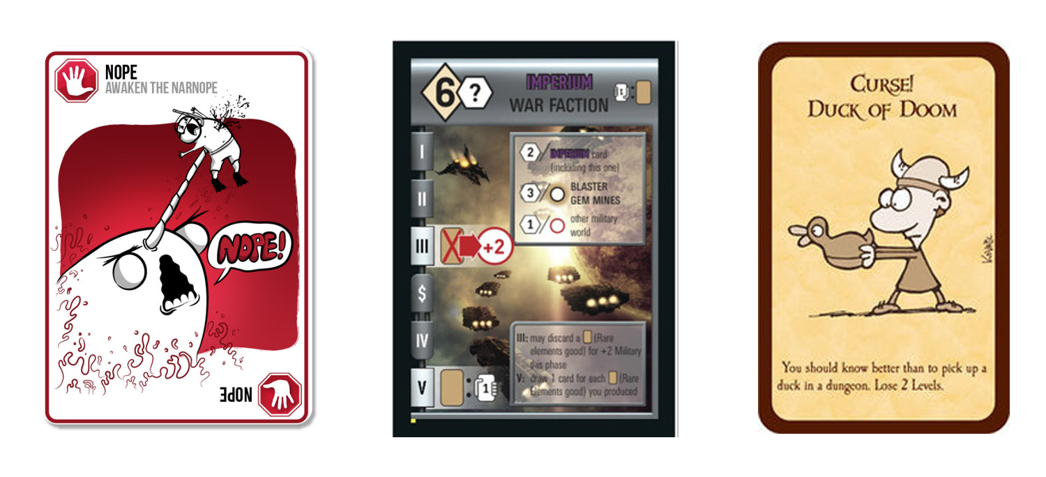
The question ‘What makes great tabletop and board game art?’ is almost as subjective a subject as ‘What is great art?’. But there is a small difference. Unless you buy board games exclusively to exhibit on your shelf as an art piece, there is a purpose to the art of the game. Games are usually an interwoven web of design and illustration that holds the objective of helping immerse you into the game’s universe, guiding you along with the rules, without working against them. Take a look at some cards below from three very succesfull games – is it great board game art?? They all create a feeling that match gameplay.


Three succesfull games. From left to right: Exploding Kittens, Race for the Galaxy and Munchkin
From left to right: Exploding Kittens, Race for the Galaxy and Munchkin


Continue reading “What makes great tabletop and board game art?”

Diverted.

Often when I work on a game my mind gets overheated of thinking mechanics over and over. And often when I need to work on one thing my mind drifts and solves a problem on another game/idea.


This happend yesterday when I was thinking about my Solitare entry that is now under the working title (Hantshire huntress or house hunter) I got to think about the 24h game submission I made on “kittens”.


In my first draft I had cubes representing energy. The cubes was then placed in diffrent ares depending if you moved down or up. I addition there was power cards you could play from the hand. Now thinking about it a couple of weeks later I get the idea. Why not only have cards.. and the cards represent the energy when you play the and at the same time they are special powers. Maybe its hard to visualize.. but I got all jazzed about it and went straight home to design on it. Maybe there will be a kitten game soon 😀


So on an end note.. which is better for a fun and cute experience.. A or B ???


Continue reading “Diverted.”