Learning to make great digital art is hard work. I would like to share a few ideas and tips that have helped me and could improve your digital painting for board games.
Personally, I have always played and experimented with a variety of styles. In some ways, this has hindered me from progressing in one direction. I often end up using time on something irrelevant to the actual painting. I have found that if I want to improve, I need more focus.
When painting with traditional ink on paper, you concentrate on every stroke you make. Many times when we illustrate digitally , there are too many options and noise between your vision and the final product – like suddenly wanting to setup new shortcut keys, check tutorials, or search for reference images.
So get rid of any noise that interrupts your workflow. Work in broad strokes, do not get caught up in details, and create a clean working environment that will free the creative process.
When starting a new piece of artwork, you might fear making bad or wrong lines. If you make progress on a piece, you probably worry of ruining what you have already made.
SOME DIFFERENT APPROACHES
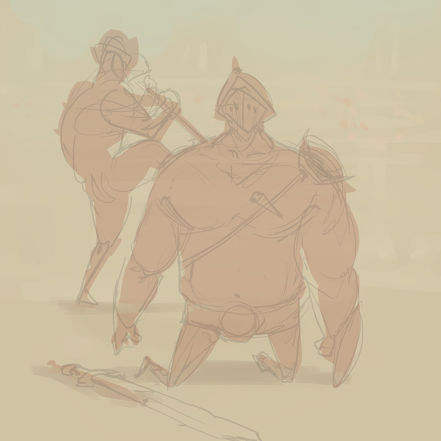
I usually see two opposite ways to approach a new piece of artwork. One way is the color book style, where you work very methodically, from linework to coloring. The other way is a very iterative and intuitive single layered approach, where you add stuff to the canvas and continue adjusting until you are satisfied with the results. I do not think one method is superior to the other, but I do like when art pieces vibrate and feel rough up close but in unity at a distance.

To get the creative flow going, you could try to split up the process in confined parts, where you forget about the other steps. You might listen to the advice from comic artist Snorre Krogh and work in confined time slots. Divide your session in 4 steps: composition, volume, lines, and colors. Another positive effect of working within a limited time frame is that you are more likely to be able to finish all of the art you need to make.
Before you start
Try not to go Googling all the time during your session. You can do some initial research on what a parrot or carrot looks like, but try to do it before you start or, even better, another day! Using reference images like photos found on the internet or setting up a rough 3D scene in your favourite software can be a great help for that million dollar cover you are going to make, but in your next piece, you should forget about all that and just concentrate on your own skills.
Hardware
If you are working on a very small tablet, I recommend investing in a bigger one. Lines will be better and you will be able to move your arms more easily, which will improve your work. I am working on a medium wacom. I found the 13” cintique to be too small and I can only dream of acquiring one of the bigger ones someday. Check out Matt Korr’s tablet comparison.
ctrlpaint – tablets compared from matt kohr on Vimeo.
Start out in correct format and size.
This might sound obvious, and you could always work bigger than the final product and just deal with it in the layout, but having an idea of the component’s final size gives you an idea of the amount of detail (work time) you need to put in it. Also, knowing if a card UI might block part of the illustration will help you make the best composition for the painting.
I would always work in at least 600 dpi in case you might later want to use the illustration in another context.
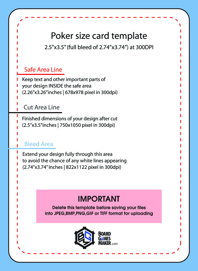
Normally, the standard for illustrations made for print is 300 dpi. This means that a regular poker-sized card 2.5 x 3.5 inches would be 750 x 1050 pixels. That is quite small for a digital drawing so I would always work in at least 600 dpi in case you might later want to use the illustration in another context. And don’t forget the bleed. Make the drawing bigger than the card to compensate for any misalignment when the card is cut at the printshop. This would the make the regular card 2.74” x 3.74” (1644 px x 2244 px). Here is a template image from Board Game Makers.
Paint in RGB and convert it to CMYK in your print files. Then you have the RGB images to use in online marketing, which are the ones with the biggest visual spectrum of color gamut. When you convert your painting to CMYK in Photoshop, it might look weaker than the original. But it is often impossible to know the outcome by looking at the screen, so make a test print and adjust contrast and color balance afterwards.
Stay tuned for the next part: Sketch & Line work


