All games that passes Ian O’Toole’s hands has a superior level of art. Ian is both a talented board game illustrator and graphic designer which shines through in his work. The ability to create a variety of styles, equally beautiful, like Lisboa and Khan of Khans – takes a special talent. He already made the art for several great titles and I am sure that with his skills we will see a lot more. That is why, I am thrilled to present an interview with one of my favourites in the industry – Ian O’Toole from Perth, Australia.
Tell us a little about your artistic background and how you got into making art for board games?
I’ve worked as a graphic designer, illustrator and Art Director in all sorts of industries and environments for about 15 years. Advertising, marketing, animation etc. In 2013 I started to work for myself as a freelancer and decided to dip my toe into creating illustration and design for boardgames. More as a hobby project at the start, but it quickly gained momentum and now the majority of my work is board game related.
You are the artist on several big titles as Khan of Khans, Lisboa, The Gallerist, Vines deluxe edition. I recon looking at your portfolio that you did illustration as well as graphic design on many of these titles – is that correct? Do you ever work just as either graphic designer or illustration artist?
I always prefer to create the entire game if possible, as it tends to lead to a more cohesive result, but I’ve worked as only an illustrator or graphic designer on games as well. For Instance, Stockpile (and the upcoming CrossTalk, both from Nauvoo Games) are collaborations with illustrator Jacqui Davis.
Usually we’ll discuss some reference images before going too far into design, just to make sure that we’re speaking the same language.
How do you prefer to be briefed on a new assignment?
If it’s a game then it’s important that I understand how the game works first. There are often opportunities to address issues or improve gameplay in the early design stages and this can’t happen unless I understand how players will be interacting with the board. Other than that it’s important that the client is clear on their key points, whatever they may be. Usually we’ll discuss some reference images before going too far into design, just to make sure that we’re speaking the same language.
Can you tell us about all the steps in your creative process when making a piece of art?
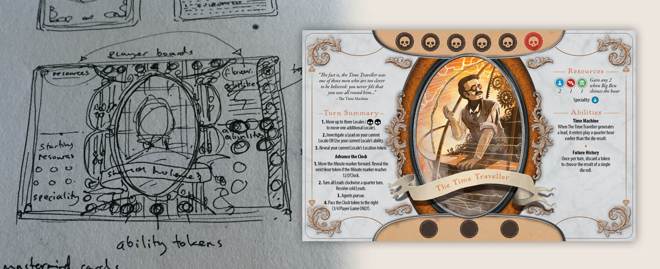
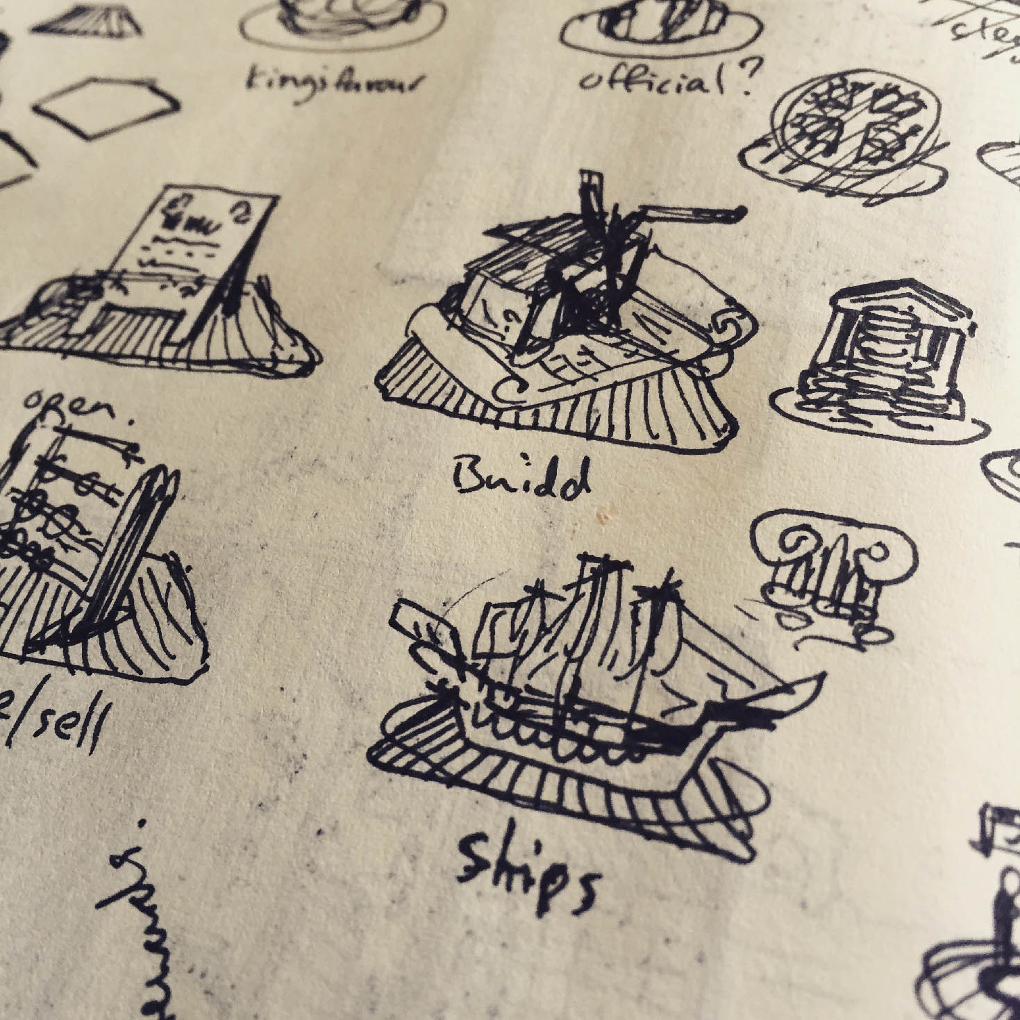
It varies greatly, but almost always begins with some sketching. It’s still the quickest way for me to get ideas out and test them. From there it really depends on what the project needs. Sometimes that means jumping into 3d modelling early on, other times working on iconography to establish the game’s visual style, while other times I go straight to the box cover.
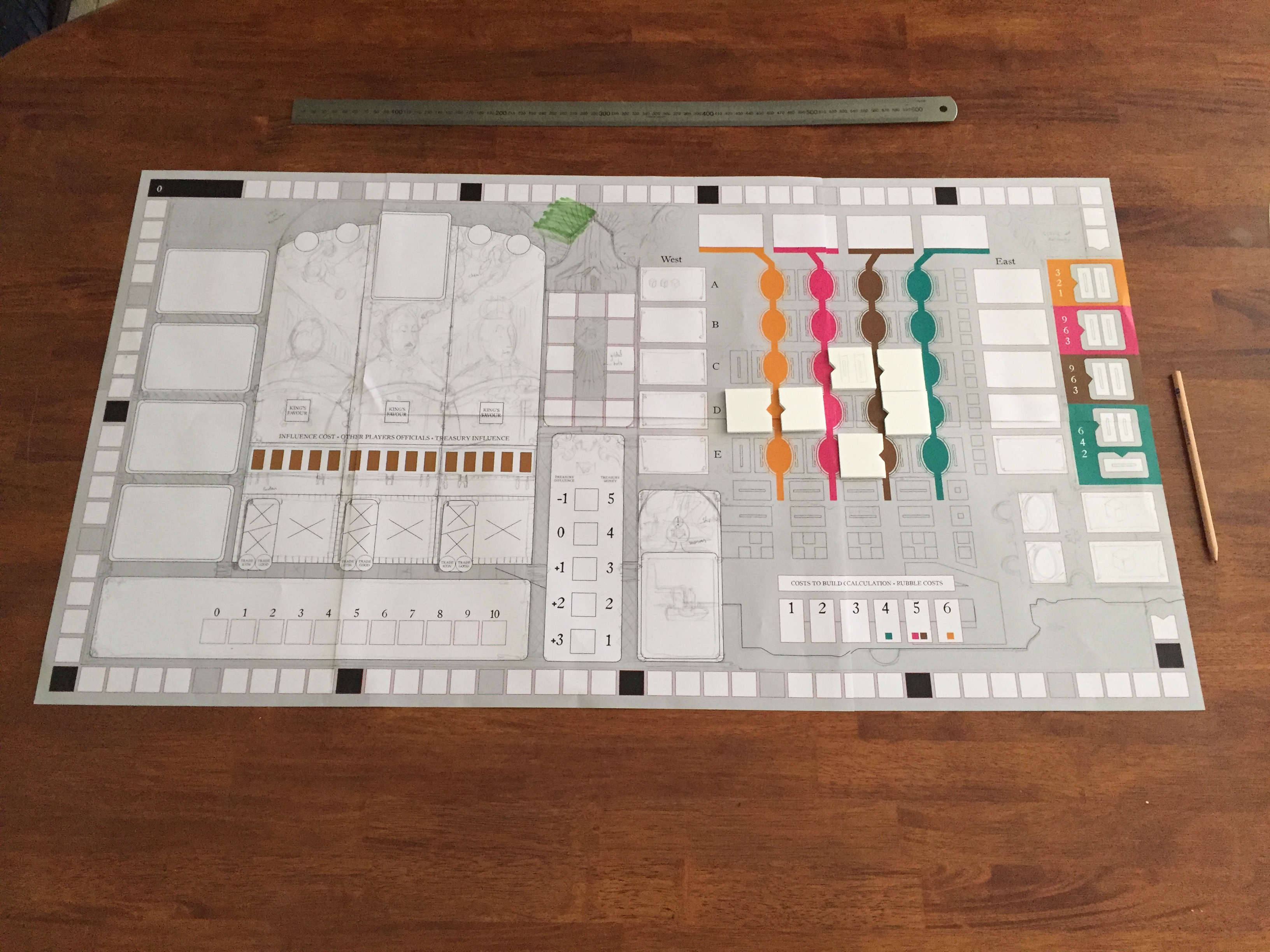
I believe that, in boardgame work, graphic design trumps illustration, so it’s really important that the pieces, and the important spaces on the board that they interact with, are very clear
I find the colors schemes in your art are very harmonious. How do you choose colors and do you have any personal preferences?
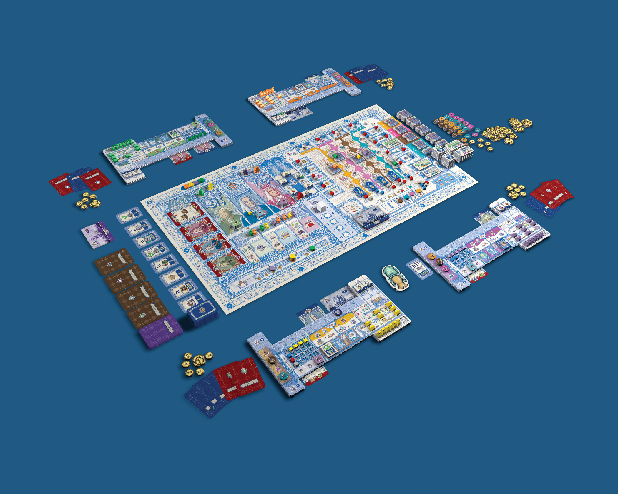
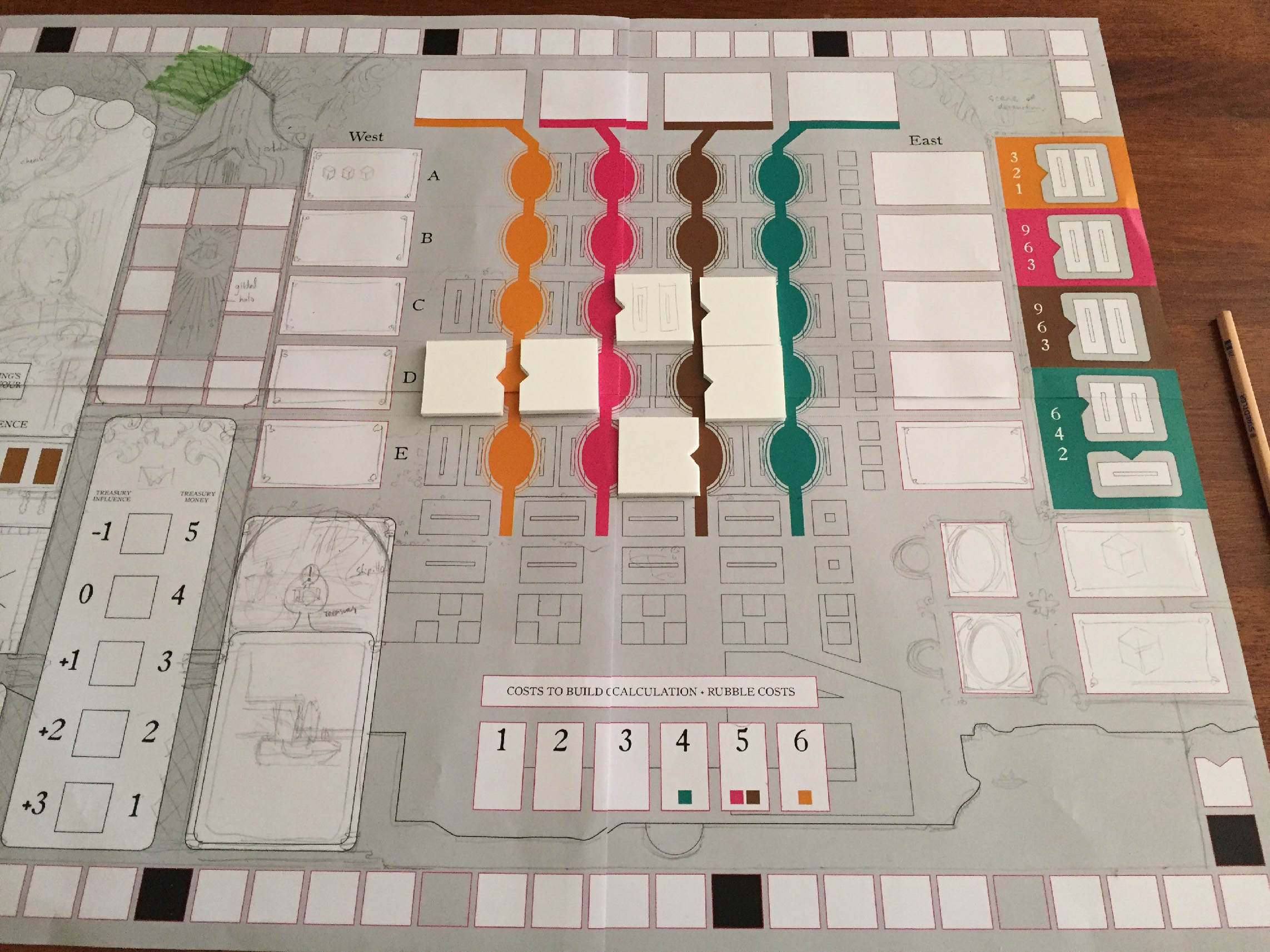
Colour choices in games are a pretty unique aspect, and often challenging. In a game with many resources, as well as player colours, and possibly differently coloured regions on the board, it can be difficult to create a sense of overall harmony while still maintaining readability during gameplay. I believe that, in boardgame work, graphic design trumps illustration, so it’s really important that the pieces, and the important spaces on the board that they interact with, are very clear. While on element is being created (the board, for instance), I try not to get too caught up in trying to balance the colours too much, because that will all change once the other pieces are placed on the board. So there’s typically a stage near the end of the project where everything is assessed in unison, allowing colours and contrast to be tweaked. As regards a personal preference, I play blue, but that’s just out of habit really. I don’t really have a favourite colour when it comes to anything else.
In you opinion what makes a strong or good game art ? and are the something important to remember when making art and graphic design for games?
Clarity, first and foremost. Design for boardgames is an exercise in ergonomics and information conveyance. If something’s unclear, or in the wrong place, or otherwise confusing, then the design is struggling to be effective. Once these aspects are in place and working well, then it’s really important for the artwork to portray a sense of the game. There’s nothing more jarring than mis-matching artwork style to gameplay style.
What has been your biggest challenge as a game designer and artist?
Really, it’s been great fun working in boardgames so far. Living in Australia, my hours can get a little wacky though.
Is there any pitfalls game artisans should try to avoid ?
Not playing the game before you create the artwork for it! Especially for complex games, it’s essential.
What are your prefered tools (software/hardware/traditional)? And can you tell us about your workplace?
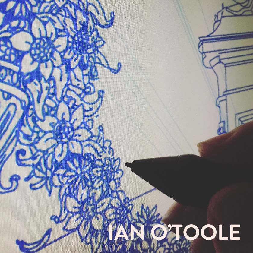
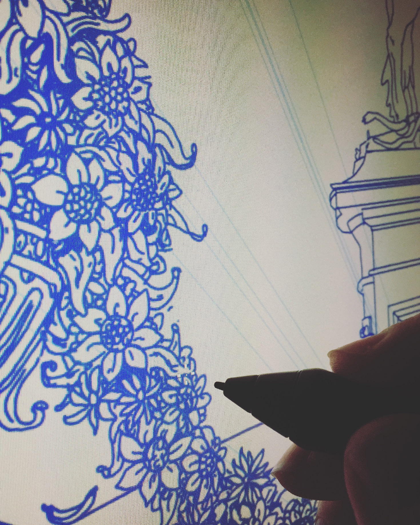
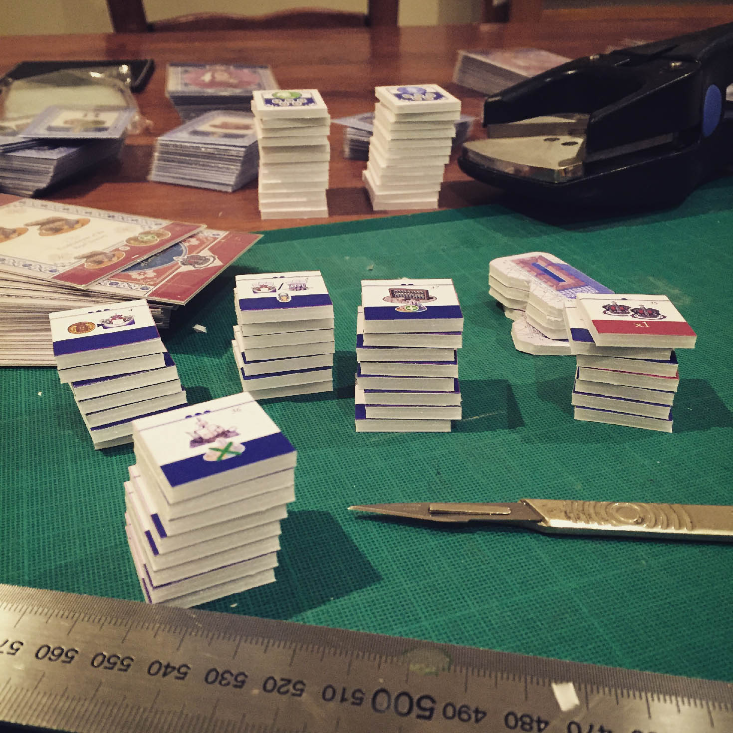
Besides traditional pen/paper/ink/acrylics, I primarily use the Adobe Creative Suite, as well as Cinema 4D for 3D work. I work at home, in a room I’ve set aside as a studio. I work on a Cintiq screen for everything I do, running off an iMac. Other than that I have a drawing table, and lots of shelves full of boardgames
You seem to use CG images to visualise your cards. Do you use 3d in your work in other ways?
Yes, all the time. Almost the entire board for Fool’s Gold is a 3D render, for instance, the same for Victoriana. It’s a great tool, once you get creative about how you utilise it. I rarely want anything to end up looking like a 3D render, though, it’s just another means to an end.
I like your board for Fool’s gold. I did a similar test in Cinema4d making a classic fantasy map with sketch and toon renders. What’s the best piece of advice on making art you’ve been given?
Never work with people who undervalue your work.
Can you name up to 3 other artists/designers you admire?
Bernie Fuchs, James Jean, Bernie Wrightson, lots and lots more…
Do you have a favourite game (you did not make) where you find there is a greater visual unity between the elements of the game ?
Glory to Rome is my favourite game, and I think the Black Box edition takes a great approach to the design. I don’t think it’s perfect, but it’s distinctive, visually clear and suits the style of game very well.
What are your current and future projects?
I’m currently working on lots of exciting projects, including CO2 Second Chance from Vital Lacerda and Eagle Gryphon Games, Hand of Fate (adapting the video game) from designer Barantas and Rule and Make Games, a new edition of Reiner Knizia’s Stephenson’s Rocket coming from Grail Games, as well as The Reckoners (based on the novels by Brandon Sanderson), by Brett Sobol and Seth Van Orden at Nauvoo Games.
O.O that was a mouthful. What is your dream project?
I have lots! I’d love to work with the 2000AD comics license, some of my favourite properties ever originated in their pages. Part Mill’s comic Charlie’s War is also a big inspiration for me. I’d love to work on an adaptation of some of my favourite novels: Moby Dick, Watership Down, John Wyndham’s books. As regards non-adaptation work, I’d like to work on a big sci-fi game (although something like that might be coming up down the road a little…).
Finally – is there any place of inspiration, creative tutorials, personal shop links or other resources you want to advocate?
There aren’t that many that I use, honestly. But Youtube is a fantastic source of tutorials for anything you can imagine. I guess I tend to hunt out resources as I need them, rather than always returning to the same places.
Thank you for sharing your process and work with us.
[easingslider id=”836″]

