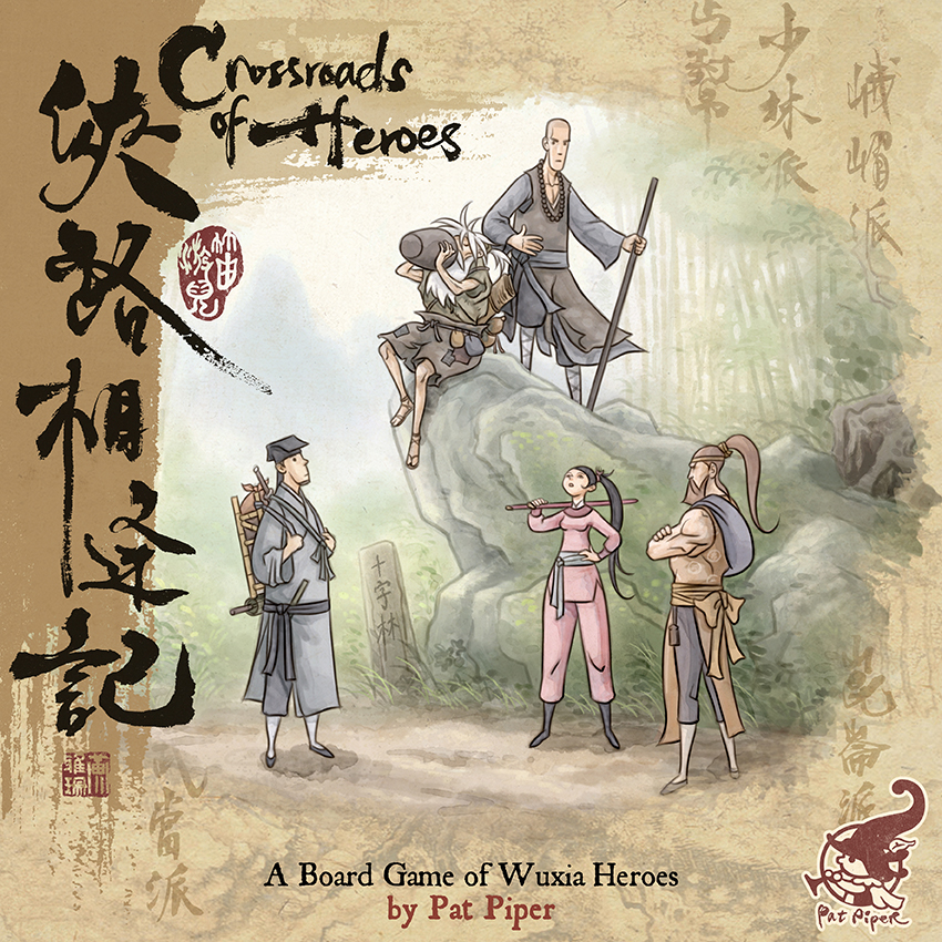
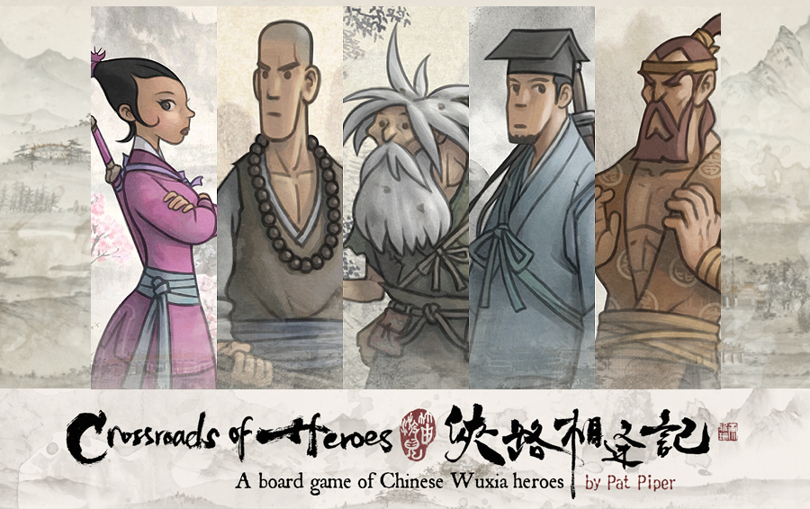
In a little booth in the far end of the annual board game convention Essen Spiel – something caught my attention. Crossroads of Heroes pulled me in, not only because of the kung-fu theme but also by the beautiful banners filled with loving characters in a harmonious color scheme topped with fascinating Chinese Hanzi calligraphy.
In a little booth in the far end of the annual board game convention Essen Spiel – something caught my attention. Crossroads of Heroes pulled me in, not only because of the kung-fu theme but also by the beautiful banners filled with loving characters in a harmonious color scheme topped with fascinating Chinese Hanzi calligraphy. I enjoyed a few rounds of play of a game that seemed really hard and fun. The game is the sole project of one man and his wife both currently residing in Hong Kong. His name is Patrick Lee and work under the artist name Pat Piper.
How did you get into making art for board games?
I studied art and classical animation. Crossroad of Heroes is the only board game I have ever worked on and the single reason why I got into making art for board games.
You are currently running a campaign for your own game Crossroad of Heroes – tell us a little about what that game is about?
It is a 2-5 player strategic board game. In the game, you play as a martial arts hero who goes on a personal journey, seeking adventure and renown in the world to gradually attain the honorable title of Grand Master of *Wulin (Grand Master of The Martial World) and restore peace and honor to it.
But during your journey, if you should choose to employ wicked methods (to harm your opponents) you may turn evil and take a dark path to victory.
Your wife did all the beautiful calligraphy in the game? Does the calligraphy text affect the game if you play the Chinese version or is it just flavor text for decoration?
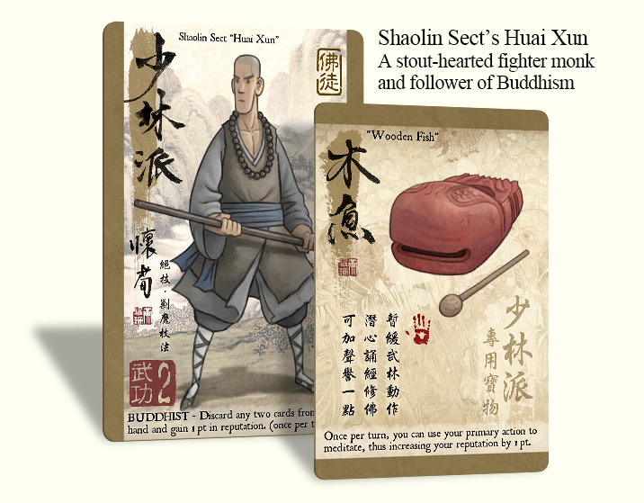
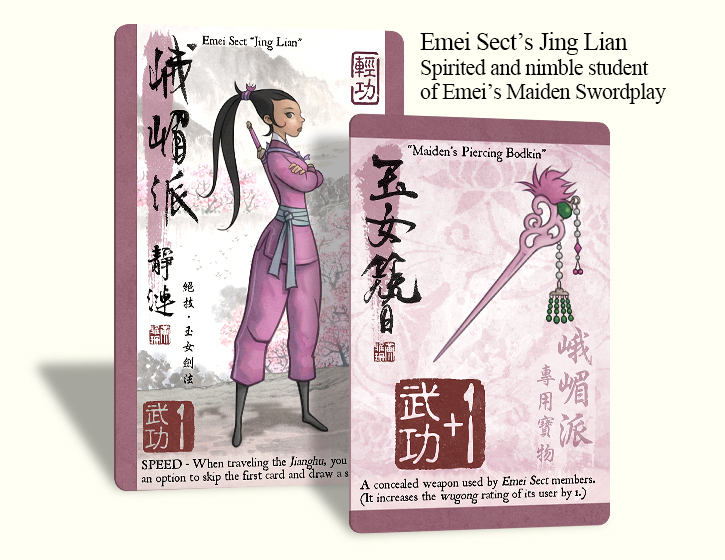
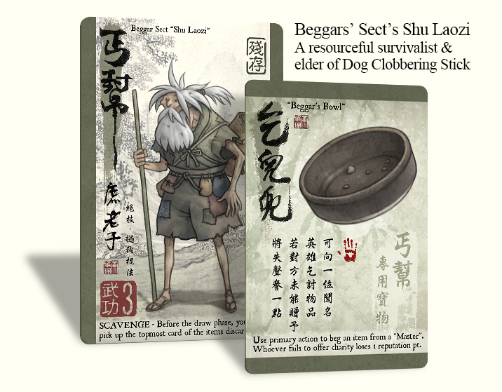
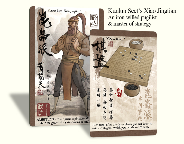
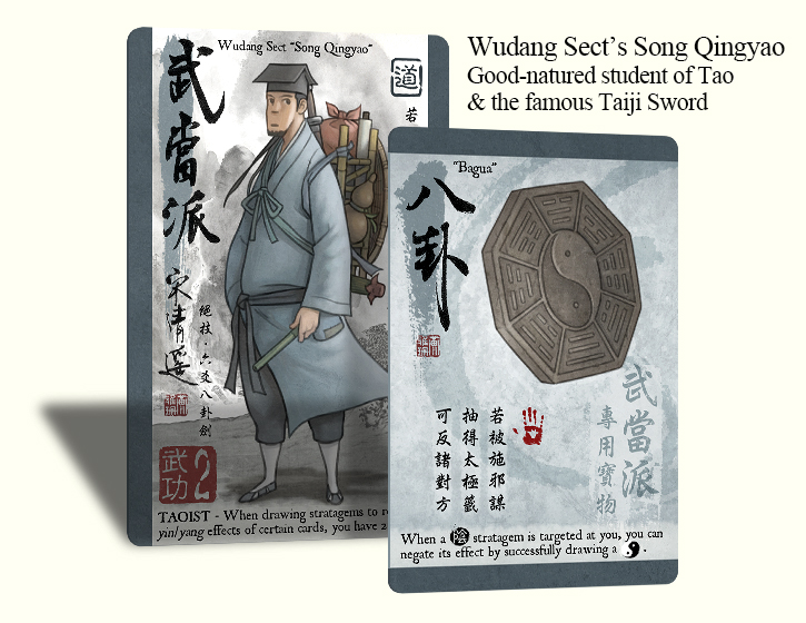
The large characters on the left are names of the cards, whereas the much smaller ones on the right are actually card text that describes the card effects. So yes, they are more than just flavor text, since the final game cards were designed using only Chinese text first, and English text was added much later.
It is great that the English versions also have it! As I understand you did all game design, illustrations, and graphic design – that must be a lot of work?
Yes, it was, but that was also the fun part for me. Haha.
How early in the game development did you start creating final artwork and would you have done anything differently if you could start over?
Quite early on in fact. And yes, I would’ve done it very differently now. For starters, I won’t be doing it all alone or spend another seven years on my next project.
Can you tell us about your creative process when making a piece of art?
I guess it’s easier when you are working for yourself. I would make a rough draft of all the artwork I need for the game and then just go ahead and do it. Nobody was there to tell me what color I should use or what my target audience would like to see.
Before I start, I like to listen to music that can help transport me to the world that I wish to create. But that is only during the concept stage. All other times, I mostly prefer to work in silence.
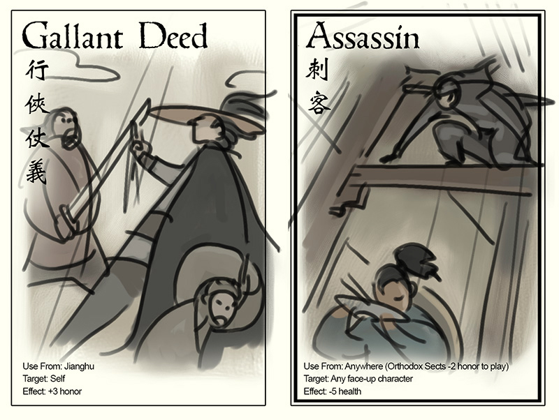
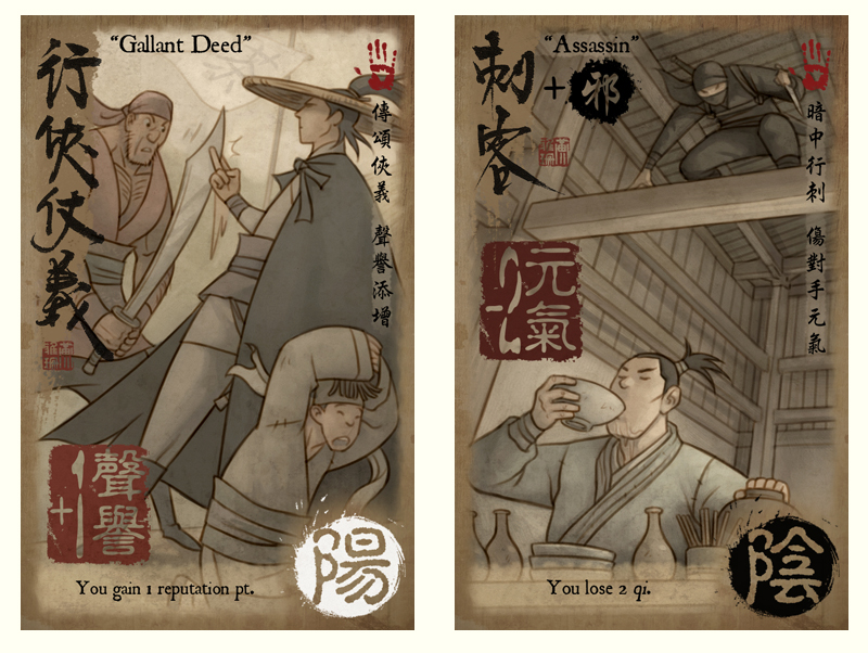
The atmosphere in Crossroads of Heroes is oozing of martial arts. Your colors scheme is a lovely desaturated browns and grays. How do you manage to keep a consistent palette across all of your images?
I really don’t know. I think it really has something to do with my physical vision. It’s almost like a deficiency. While I love looking at high-contrast and brightly colored images, I can’t look at them for long when working on a screen monitor, where I create most of my artwork.
I guess that somehow explains it?
For me, good game art is anything that captivates me and stops being a 2D image. It comes alive without having to move.
Well – they look awesome 
That’s really quite subjective and I am still learning what it is.
For me, good game art is anything that captivates me and stops being a 2D image. It comes alive without having to move.
What is most important to remember when making art and graphic design for games?
Art is to be honest with yourself. Design is to communicate with people. What do you wish to communicate to people about yourself? Just be honest about it.
What do you wish to communicate to people about yourself? Just be honest about it.
What was your biggest challenge on Crossroads of Heroes?
Lots of things. But learning to be a better person tops it all. When I feel that I am not a good person, I feel that what I create will not be good either.
Is there any pitfalls game artisans should try to avoid?
Again, I am still learning that myself. I may be 42 years old, but sometimes, I still feel very much like a child who knows nothing of how the world works.
I wish I can give better advice here, but I really don’t know.
What artwork in CRH are you particularly happy with?
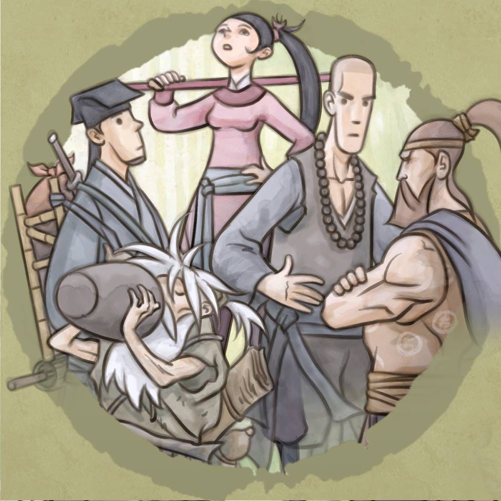
I think most of the characters.
What are your prefered tools (software/hardware/traditional) – tell us about your workplace?
Corel Painter (2016), occasionally Photoshop and Clip Studio Paint.
What’s the best piece of advice on making art you’ve been given?
Technique, is secondary to design.
Is there one game you think is particularly beautiful (you did not make)?
The Banner Saga, although that’s a PC game and not a board game.
Are you planning for more games in the future?
Yes, definitely!
Finally – is there any place for inspiration, creative tutorials, personal shop links or other resources you want to advocate?
Nothing in particular. I mean look around you, inspiration should come from everywhere. Don’t just focus on one place to get it. But know when to stop, because there’s a point when looking too much can actually hurt your creation.
I agree on limiting yourself when searching inspiration. In the second part of this article, I try to advocate the same. Good luck with the Crossroads of Heroes campaign!



Thank you for writing this interview, Niklas. I will share it with all my friends!
Thank you for sharing your story with me and my readers:)